12 Unpacking Mechanisms Driving Inequities: Multivariate Regression
In Chapter 11, we observed how a legacy of redlining has left some communities warmer than others. This is an inequity that makes it harder for local residents to stay cool and safe during summer heat, leading to more medical emergencies. This is just one of many inequities stemming from the history of redlining. But once we know about an inequity, what can we do to address it? Clearly, drawing lines on a map did not make certain neighborhoods hotter, nor can we go back in time and undraw those lines. Instead, we need to understand how the patterns of investment that followed instigated forms of community development that created hotter places. In understanding that history, we might then craft strategies that counteract its consequences.
A thorough “equity analysis” aims to uncover the specific mechanisms that are creating or perpetuating the inequity. This entails leveraging additional information to reveal which mechanisms are driving and sustaining said correlation. In the current case, we would be able to better understand why redlined neighborhoods are warmer, thereby guiding us toward effective interventions that might fix the issue. There are three infrastructural features of neighborhoods that have been found to be particularly important for heat. The first is the amount of canopy cover from trees. Canopy can deflect sunlight and create more air flow, each of which have cooling effects. The second is the amount of impervious surfaces, which is largely synonymous with pavement, as they trap and emanate heat. The third is albedo, or the tendency of surfaces to reflect light energy, which has its own additional cooling effect. For example, white roofs have become popular because they help cool off communities by reflecting large amounts of heat. Figure 12.1 maps the first two of these variables across Boston.
An equity analysis requires unpacking the relationships between multiple variables to understand which are most responsible for the phenomenon at hand. The most common statistical tool for this task is a multivariate regression, which assesses how multiple variables explain variation in a single variable of interest. Because the levels of canopy, impervious surfaces, and albedo are all interrelated, we will use regression to disentangle their relationships and better understand if and how they explain the differences in temperature across neighborhoods, including whether they account for the effects of redlining.
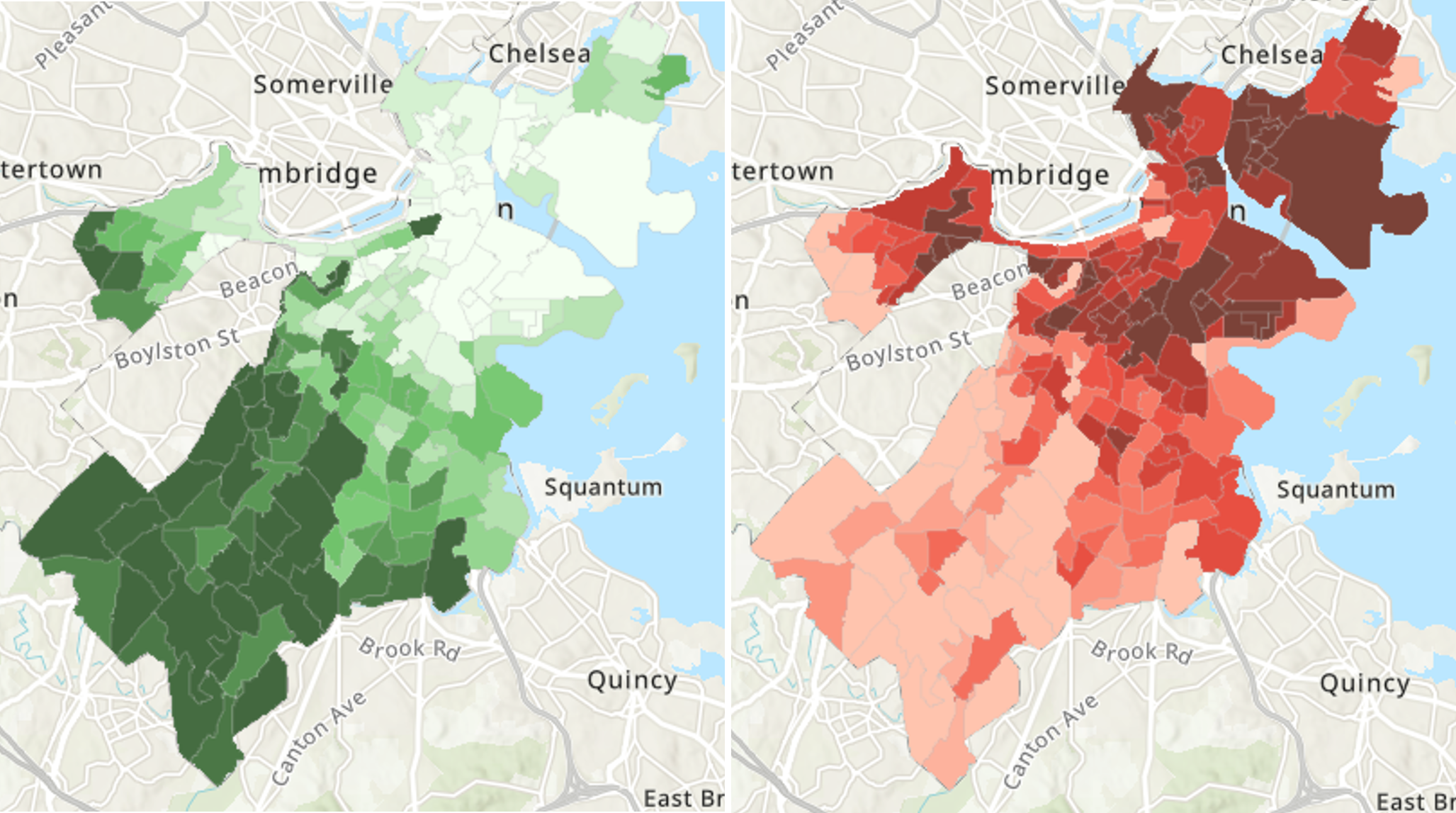
Figure 12.1: Maps of canopy cover (left; darker green indicates more canopy) and land surface temperature (right; darker red indicates higher temperature) across the neighborhoods of Boston, MA. (Credit: Urban Land Cover and Urban Heat Island Database, the data set used in this chapter)
12.1 Worked Example and Learning Objectives
Building on Chapter 11, we will examine three infrastructural features and their role in driving the urban heat island effect: tree canopy, pavement (i.e., impervious surfaces), and albedo. We will then evaluate the extent to which they explain the correlation between heat and redlining. In doing so, we will learn both conceptual and technical skills, including how to:
- Propose and test potential mechanisms that might account for inequitable conditions, generating insights that might guide action;
- Conduct and interpret multivariate regressions that unpack the relationships between multiple variables, including:
- Identifying the dependent variable of interest and potentially informative independent variables;
- Determining when a regression is preferable to a correlation and the distinct interpretations;
- Building a regression model that will be most informative;
- Visualizing a regression’s results.
We will continue to work with the same data set we constructed for the analysis in Chapter 11, consisting of two components. First, the Home Owners Loan Corporation’s 1938 map grading the investment quality of the neighborhoods of Boston , provided by the Mapping Inequality project, a collaboration of faculty at the University of Richmond’s Digital Scholarship Lab, the University of Maryland’s Digital Curation Innovation Center, Virginia Tech, and Johns Hopkins University. This map has been spatially joined to census tracts so that we know how each tract was classified. The Urban Land Cover and Urban Heat Island Effect Database is a product of researchers at Boston University available through the Boston Area Research Initiative’s Boston Data Portal that combines remote sensing data from numerous sources that capture land surface temperature and a variety of related conditions, including the three we are concerned with here.
Links:
Urban Heat Island Database: https://dataverse.harvard.edu/dataset.xhtml?persistentId=doi:10.7910/DVN/GLOJVA
Redlining in Boston: https://dataverse.harvard.edu/dataset.xhtml?persistentId=doi:10.7910/DVN/WXZ1XK
Data frame name: tracts
require(tidyverse)uhi<-read.csv('Unit 3 - Discovery/Chapter 12 - Regressions and Equity Analysis/Worked Example/UHI_Tract_Level_Variables.csv')
tracts_redline<-read.csv('Unit 3 - Discovery/Chapter 12 - Regressions and Equity Analysis/Worked Example/Tracts w Redline.csv')
tracts<-merge(uhi,tracts_redline,by='CT_ID_10',all.x=TRUE)12.2 Conducting an Equity Analysis
Chapter 11 described the difference between equity and equality. To briefly summarize, equality often focuses on equal inputs, access to programs and services, or opportunity. However, such an approach ignores how individuals and communities often differ in their ability to take advantage of these resources and opportunities. The hurdles or challenges that cause some to be less able to succeed despite supposed equality are known as inequities. (For more, feel free to flip back to Chapter 11.) From this perspective, redlining instigated multiple decades of non-investment that has left long-standing inequities on the financial capital, infrastructure, and conditions in certain neighborhoods.
Analysts play a crucial role in contributing to policies, programs, and services that pursue equity. Obviously, data analysis is necessary in revealing and confirming inequities, as we saw with correlations in Chapter 10 and t-tests and ANOVAs in Chapter 11. We can go further, however, by helping to understand how those conditions and challenges have arisen and how they persist. As in the worked example for this chapter, which aspects of the infrastructure of redlined neighborhoods make them hotter? Such insights make it possible to design the policies, programs, services, and other forms of action that will counteract them. From this description, it is probably apparent how equity analyses are relevant to the work of public agencies and community-serving non-profits, but it is worth emphasizing that they can also be central to the work of academic institutions and private corporations. In any of these contexts, it can be worthwhile to ask if all of the populations that an institution serves have the same ability to succeed in leveraging its resources and services, and, if not, how resources and services should be designed to ameliorate those differences.
There are a few methodological considerations required when conducting an equity analysis. The first is that an equity analysis moves from a two-variable, or bivariate, perspective to one that unpacks the relationship between many variables. This is called a multivariate analysis. For example, the observation that redlining predicts neighborhood temperature is a bivariate inspiration for an equity analysis, but we will need to incorporate aspects of neighborhood design and infrastructure, including tree canopy, density of pavement, and albedo to further unpack that relationship through a multivariate analysis. In doing so, we need to be mindful of how we determine our dependent and independent variables and model their relationships. Second, we need to interpret the relationships arising from the multivariate analysis with an eye toward the distinction between correlation and causation. We will explore each of these considerations in turn.
12.2.1 Multivariate Analysis: Modeling Dependent and Independent Variables
When we analyze multiple variables at once, we almost always need to decide which variables are our outcomes of interest and which variables we want to use to explain variation in those outcomes. As we learned in Chapter 11, these are respectively referred to as our dependent variables and our independent variables. At that time, it was rather apparent which was which. The independent variable was our categorical variable, in this case redlining; and our dependent variable was our numerical outcome variable, temperature. When we have numerous numerical variables, though, it takes critical thinking to determine which variable or variables make more sense as “predictors” and which we are trying to predict.
In Chapter 11 we discussed how independent and dependent variables can be understood in terms of experiments. The independent variable is something that an experimenter altered in order to observe changes in one or more dependent variables. Applying this logic to our current question, are we asking ourselves if changing the temperature of the neighborhood will alter the amount of tree canopy and pavement, or whether changing the amount of tree canopy and pavement would alter the temperature? The latter is how we have conceptualized the problem. In addition, thinking in terms of experiments might help us to consider what effective programs and services might look like. This also hints at the larger question of causation—more than just correlating with temperature, is one or more of these features causing differences between neighborhoods?
12.2.2 Multivariate Relationships: Correlation and Causation
You have almost certainly heard the phrase, “correlation is not causation.” This is one of the most important adages for interpreting statistics. Take the inspiration for the worked example in this chapter. Temperature is higher in redlined neighborhoods that have historically been majority Black communities. This is not because Black people live there. Sure, Black people live in these neighborhoods, which led banks to withhold investment as a form of discrimination, which led to community design and development decisions that made the neighborhoods hotter. In that sense, the presence of Black people indirectly led to higher temperatures, but think like an experimenter for a moment: if more Black people moved into the neighborhood, or people of other racial backgrounds moved in, would that change the temperature of the neighborhood? The answer is no.
For analysts the guiding objective is always to reveal the independent variable or variables that are causing our dependent variable. This is difficult, in large part because almost all statistical tools can only reveal correlation. Without an experiment and the ability to control everything else that might somehow impact the dependent variable, we cannot be 100% certain that we are observing causation. The careful use of multivariate tools, however, can bring us closer to causal interpretations and at least allow us to dismiss certain independent variables as being “merely correlated” with the dependent variable. For instance, in our task at hand, we want to understand which aspects of community design might account for the correlation between temperature and race. In other words, we are confident that the latter correlation is not a reflection of causation, and we want to test other variables that might in fact play a causal role. As we will see, multivariate techniques can help us tease these relationships apart, revealing which variables are, if not necessarily “causal,” more directly relevant to the outcome variable. We call these proximal predictors because they are closer to the variable in the sense of causal relationships. The variables whose role in causality is then “explained away,” as it were, are called distal predictors because they are further away in terms of causality.
The debate between correlation and causation often confuses technical and conceptual issues. In short, correlation is a statistical association between two variables. Nearly all statistical tools, in the absence of controlled experimentation, are only capable of communicating correlation (though, to be fair, there are techniques that can get us pretty close given the right data structure and research design, though they are beyond the scope of this book). Moving toward causation is a matter of interpretation, though that terminology can distract from what we want to accomplish. The goal of an analyst whose intent is to support action is to reveal mechanisms. How does something occur? The better we are at identifying proximal predictors of an outcome, the more information we have about which mechanisms might be in play. If we can articulate those potential mechanisms and how to reinforce them, mitigate them, or otherwise intervene, then we have a set of options for enacting change (or maintaining the status quo, if that is the goal). This is key to an equity analysis because, as we said at the beginning, it is one thing to know that redlined neighborhoods tend to be warmer, but the next step is to be able to do something about it. You may also recognize here echoes of a discussion in Chapter 6: whereas some might argue that the data can lead us to the desired answers, we are best able to inform action if we understand why the world works the way it does. Understanding “why” entails revealing the underlying mechanisms.
12.3 Regression
12.3.1 Why Use a Regression?
Regression is one of the most popular statistical tools and likely the most commonly known after a correlation. Regression and correlation are closely related conceptually and technically. The underlying arithmetic, in fact, is almost identical as both are designed for the analysis of numeric variables. There are two major distinctions, though. First, the purpose of a correlation is to describe whether two variables share variation or not. It does not differentiate between a dependent variable and independent variable. In contrast, regression uses the variation in an independent variable to explain (or “predict”) the values in a dependent variable. The determination of dependent and independent variable must be made before the analysis.
Second, a correlation can only occur between two variables whereas a regression must have one dependent variable but as few or as many independent variables as the analyst might desire. When a regression has only one independent variable, it is referred to as a bivariate regression and is nearly identical to a correlation, though with some distinctions in how the effect size is reported. Any regression with two or more independent variables is referred to as a multivariate regression.
The design of a regression, including all of the independent variables included and any other customization to the analysis, is also referred to as a model. For example, we might say that we modeled the dependent variable as a function of three independent variables. There are other ways to customize a regression, but for our purposes we will primarily consider how a model is determined by a set of independent variables. Importantly, a regression cannot accommodate multiple dependent variables. An analysis of multiple dependent variables requires conducting a separate regression for each.
12.3.2 Interpreting Multiple Independent Variables
The interpretation of a correlation is relatively straightforward. If it is positive and significant, we can say that, as one variable increases or decreases, the other tends to do the same. Interpreting a bivariate regression is very similar. A multivariate regression is a little more complicated because we now have a model with multiple independent variables each explaining our dependent variable. How do we interpret each of these relationships? The key is keeping in mind that these relationships were evaluated simultaneously and not independently. Thus, if an independent variable’s relationship with the dependent variable is positive and significant in the regression model, we can say that the dependent variable tends to rise and fall with the independent variable holding all other variables in the model constant. Though this lacks the brevity of describing a correlation, it is critical to interpreting the data accurately. For instance, it might be that one case is above average on the independent variable but below average on the dependent variable, which would seem to be at odds with a positive relationship; however, upon closer scrutiny, the values on all of the other independent variables are more likely to be responsible for the lower value.
The nuance of interpreting each variable in the context of the others—also known as their independent effects—is also part of regression’s strength as a multivariate tool. Recall from above that part of the value of regression is to try to reveal which variables are more proximal predictors, meaning they better explain variation in our outcome variable than other variables that are also known to be correlated with the outcome variable. By estimating the independent effects of all of the independent variables holding all other variables constant, the regression can give us insights on which variables are most meaningful. For example, suppose we find that redlining is no longer a positive, significant predictor of heat after we account for tree canopy. That means that, holding tree canopy constant, redlined communities are no longer warmer, meaning that tree canopy is more likely to reveal the mechanism responsible for that inequitable relationship.
12.3.3 Effect Size: Evaluating Each Independent Variable and the Model
A regression model tests effect size and significance at two levels. First, it tests the relationship of each independent variable with the dependent variable. Second, it evaluates how effective the full model—that is, the combination of all of the independent variables—is at explaining variation in the dependent variable. There are different ways of communicating the effect sizes at each of these levels.
12.3.3.1 Regression Coefficients (B and \(\beta\))
A regression tests a linear model of the following form:
\[y = B_1*x_1 + B_2*x_2 + B_3*x_3 + c\]
This may look familiar from algebra class. The dependent variable (y) is modeled as a function of a series of independent variables (the xs) and an intercept (c). As noted, there can be as many xs as the analyst wants, and this example has three. Each x is multiplied by a B, or beta. Beta estimates how much y is likely to change if the corresponding x increases by 1. This is also known as the slope of the relationship between a given x and y. A regression estimates beta for all independent variables and estimates the intercept, which is the expected value of y when all xs are equal to 0. It also evaluates whether each of these estimates are significantly different from 0.
The betas included in the linear equation, which quantify slopes, are also referred to as unstandardized betas. These can be arithmetically transformed into standardized betas that take into account the distribution of both the independent and dependent variables. These are represented with the Greek letter \(\beta\). \(\beta\) is a direct analog of the correlation coefficient, r, that we encountered in Chapter 10, and is interpreted the same way. Just like r, it ranges from -1 to 1 and estimates how many standard deviations of change we should expect in our dependent variable for each standard deviation of change in the independent variable. Note that \(\beta\) for the sole independent variable in a bivariate regression will be the same value as r in a correlation between the same two variables.
12.3.3.2 Model Fit and R2
Sometimes we want to know not only about the relationship between each independent variable and the dependent variable but also how well the full model—that is, all of the independent variables together–explains variation in the dependent variable. Regressions evaluate this with the R2 value. In arithmetic terms, R2 is a calculation of the percentage of the variation the model explains by considering the values of the independent variables rather than assuming that all cases have the same value on the dependent variable. This is also known as a test of model fit.
You may note that the statistic quantifying model fit uses the same letter as the correlation coefficient. This is because in the bivariate case R2 is the square of r. If r = .5, then R2 = .25, meaning that 25% of the variation in our variable of interest is explained by this relationship. The same would be true of \(\beta\) in our bivariate regression. In multivariate regressions, the relationship between R2 and the \(\beta\)s are a bit more complicated, but the interpretation of the value itself is the same: it captures the percentage of variation in the dependent variable explained by the model. Also, recall that in Chapter 11 we used R2 to evaluate the strength of an ANOVA model. We will not go deep into it here, but R2 is calculated the same way in both techniques, with total variation quantified as the sums of squares and the model explaining a certain portion of this variation. The only difference is that, in an ANOVA, variation is explained by the categories of the independent variable; in a multivariate regression, variation is explained by the numerical values of the multiple independent variables. For the same reason, the overall fit of the model is evaluated for significance using an F-statistic, which you may recall is the primary statistic for the evaluation of ANOVAs.
12.4 Conducting Regressions in R: lm()
Base R includes a function for running regressions called lm(). The name references another term for a standard regression: linear model. We will illustrate the use of lm and associated functions through our worked example of redlining, community design and infrastructure, and neighborhood temperature in Boston’s census tracts. The key variables will be land surface temperature (LST_CT), tree canopy (as a percentage of space covered, from 0-1; CAN_CT), impervious surface (a near-synonym for pavement, as a percentage of space covered, from 0-1; ISA_CT), and albedo (or the proportion of light energy reflected and not absorbed by surfaces, from 0-1; ALB_CT). Later we will re-incorporate whether a census tract was redlined or not.
12.4.1 Bivariate Regression
The simplest regression is one in which a single independent variable is used to explain variation in the dependent variable. This is arithmetically identical to a correlation between two variables. The differences are: (1) the specification of an independent and dependent variable; and (2) the results communicate not only the strength of association between the two variables but also a slope describing their linear relationship. To get things started, let us examine the relationship between the tree canopy and neighborhood temperature as a bivariate regression.
lm(LST_CT~CAN_CT, data=tracts)##
## Call:
## lm(formula = LST_CT ~ CAN_CT, data = tracts)
##
## Coefficients:
## (Intercept) CAN_CT
## 102.86 -40.72We see here the structure of the arguments in the lm command. It begins with a formula, with the dependent variable (LST_CT) on the left, followed by ~, and then the independent variable (CAN_CT). We then specify the data frame of interest, in this case tracts.
The output includes an estimate of the intercept and the unstandardized beta for CAN_CT. The intercept is estimated as \(102.86^{\circ}F\) degrees. Given the logic of a regression, this is the estimated average when the percentage of canopy cover is 0%. This value is estimated to drop by 40.72 for every change of 1 in canopy. Because this latter variable is a 0 – 1 measure of the proportion of canopy coverage, the change of \(40.72^{\circ}F\) is the rather dramatic (and unreasonable) expected shift in temperature between a neighborhood with no canopy and one with 100% canopy cover.
The output, however, is a little simplistic, telling us only the estimates for the intercept and the unstandardized beta for CAN_CT. There is no significance communicated for these parameters nor a mention of model fit. Like many other functions in R that conduct statistical tests, lm is designed to generate objects whose contents are best accessed through the summary() command. Let us try again.
reg1<-lm(LST_CT~CAN_CT, data=tracts)
summary(reg1)
##
## Call:
## lm(formula = LST_CT ~ CAN_CT, data = tracts)
##
## Residuals:
## Min 1Q Median 3Q Max
## -5.2698 -0.9127 0.0203 0.8920 5.1705
##
## Coefficients:
## Estimate Std. Error t value Pr(>|t|)
## (Intercept) 102.8613 0.1861 552.61 <0.0000000000000002 ***
## CAN_CT -40.7176 1.5099 -26.97 <0.0000000000000002 ***
## ---
## Signif. codes: 0 '***' 0.001 '**' 0.01 '*' 0.05 '.' 0.1 ' ' 1
##
## Residual standard error: 1.718 on 176 degrees of freedom
## Multiple R-squared: 0.8051, Adjusted R-squared: 0.804
## F-statistic: 727.2 on 1 and 176 DF, p-value: < 0.00000000000000022reg1 is an object of class lm and it can be analyzed with summary(), giving us a lot more to work with. We see the same parameter estimates, but that they are both significant at p < .001. This is trivial for the intercept, as it is simply evaluating whether the average neighborhood with no tree canopy has a temperature different from 0 (unsurprisingly, it does). The B for CAN_CT is significant as well, indicating that the shift of -40.72 is greater than would be expected by chance.
We also now have the opportunity to assess model fit. The R2 is 0.81, indicating that tree canopy accounts for 81% of the variation in temperature across neighborhoods. The adjusted R2 is similar. This is actually very high for social science research. Rarely are we able to explain anywhere near that much variation. This latter statistic is helpful when there are lots of variables in the model, as variables are likely to explain a certain amount of variation just by chance. The F-statistic indicates that the R2 is significant at p < .001. Note that this p-value is identical to the one for the beta for CAN_CT. This is because in a bivariate regression, the sole beta is the only piece of information determining model fit.
12.4.2 Calculating Standardized Betas with lm.beta()
Interestingly, lm() does not report a standardized beta. There are two ways of doing this. The simplest is the lm.beta() command from the QuantPsyc package (Fletcher 2012). It takes your lm object as input.
require(QuantPsyc)
lm.beta(reg1)
## CAN_CT
## -0.8972984This tells us that the standardized Beta for CAN_CT is -.90. To confirm that this is the same as the r correlation coefficient, we can run cor.test().
cor.test(tracts$CAN_CT,tracts$LST_CT)##
## Pearson's product-moment correlation
##
## data: tracts$CAN_CT and tracts$LST_CT
## t = -26.967, df = 176, p-value < 0.00000000000000022
## alternative hypothesis: true correlation is not equal to 0
## 95 percent confidence interval:
## -0.9226171 -0.8642804
## sample estimates:
## cor
## -0.8972984As you can see, the results are identical. The r is equal to our standardized beta and the p-value is the same.
If you would rather not dabble with another package or lm.beta() runs into issues (which can happen being that it was developed under earlier versions of R), you can extract standardized betas yourself by scaling your variables by their standard deviations. Remember that a standardized beta is the change in standard deviations in the dependent variable for every change in standard deviations in the independent variable. This can be accomplished by applying the scale() function to every variable in the lm() function. However, it is important to remove all NAs for this comparison to work. lm() removes NAs pairwise, only including complete cases, because otherwise it cannot estimate the model. The standardization of beta then depends on the values in this subset of complete cases. If we did not remove these before applying scale() to our variables, the standardization of one or more variables might include values not included in the linear model.
tracts_temp<-tracts %>%
    filter(!is.na(LST_CT) & !is.na(CAN_CT))
reg_stand<-lm(scale(LST_CT)~scale(CAN_CT), data=tracts_temp)
summary(reg_stand)
##
## Call:
## lm(formula = scale(LST_CT) ~ scale(CAN_CT), data = tracts_temp)
##
## Residuals:
## Min 1Q Median 3Q Max
## -1.35770 -0.23516 0.00523 0.22981 1.33211
##
## Coefficients:
## Estimate Std. Error
## (Intercept) -0.000000000000001485 0.033180032841127596
## scale(CAN_CT) -0.897298355795607794 0.033273629734652463
## t value Pr(>|t|)
## (Intercept) 0.00 1
## scale(CAN_CT) -26.97 <0.0000000000000002 ***
## ---
## Signif. codes: 0 '***' 0.001 '**' 0.01 '*' 0.05 '.' 0.1 ' ' 1
##
## Residual standard error: 0.4427 on 176 degrees of freedom
## Multiple R-squared: 0.8051, Adjusted R-squared: 0.804
## F-statistic: 727.2 on 1 and 176 DF, p-value: < 0.00000000000000022Again, we see an identical result, with \(\beta\) = -.90.
12.4.3 Multivariate Regression
We have observed that neighborhoods in Boston with more tree canopy are cooler than other neighborhoods. Canopy, pavement, and albedo are intertangled, however. More pavement means less canopy. Less canopy also means less albedo. Which of these infrastructural variables are most important for temperature? To address this, we must move from a bivariate regression to a multivariate one. To do so, we simply expand our list of independent variables in lm().
reg_multi<-lm(LST_CT~CAN_CT + ISA_CT + ALB_CT, data=tracts)Before we move to the results, note that adding these variables is a lot like an equation. Remember that a linear model is simply the estimation of an algebraic formula. In fact, ~ indicates a formula, with the left side as the dependent variable and the right side as the independent variables.
summary(reg_multi)##
## Call:
## lm(formula = LST_CT ~ CAN_CT + ISA_CT + ALB_CT, data = tracts)
##
## Residuals:
## Min 1Q Median 3Q Max
## -5.4115 -0.8090 0.1198 0.8822 4.0028
##
## Coefficients:
## Estimate Std. Error t value Pr(>|t|)
## (Intercept) 96.883 3.432 28.232 < 0.0000000000000002 ***
## CAN_CT -28.731 2.559 -11.226 < 0.0000000000000002 ***
## ISA_CT 7.991 1.910 4.185 0.0000453 ***
## ALB_CT -11.096 18.271 -0.607 0.544
## ---
## Signif. codes: 0 '***' 0.001 '**' 0.01 '*' 0.05 '.' 0.1 ' ' 1
##
## Residual standard error: 1.591 on 174 degrees of freedom
## Multiple R-squared: 0.8349, Adjusted R-squared: 0.8321
## F-statistic: 293.4 on 3 and 174 DF, p-value: < 0.00000000000000022The new regression has estimated three betas, one for each of our independent variables. These indicate that the density of the tree canopy and impervious surfaces are the primary predictors of temperature in a neighborhood. Both are significant at p < .001. Temperature now is estimated to drop by 28.73 degrees as canopy goes from 0 to 1 (i.e., no trees to complete coverage), meaning some of the effect we saw in the bivariate regression is accounted for by the other two variables. Meanwhile, the effect of impervious surfaces is a little less dramatic, with temperature rising by 7.99 degrees as they go from 0 to 1 (i.e., no pavement to 100% pavement and other impervious surfaces). Albedo is a non-significant predictor with a p-value of .54.
The fit of our model has grown as well, with R2 increasing to .83. That means that canopy and pavement account for over 83% of the variation in temperature across neighborhoods, and that the addition of pavement accounts for 2% more variation than canopy alone. Unsurprisingly, the F-statistic finds this to be significant at p < .001.
To finish, we can look at the standardized betas of our independent variables.
lm.beta(reg_multi)## CAN_CT ISA_CT ALB_CT
## -0.63314619 0.28956203 -0.03155982As we can see, the standardized beta for canopy is still quite large, albeit smaller than before, with \(\beta\) = -.63. Impervious surface’s standardized beta is substantially smaller at \(\beta\) = .29, although clearly still meaningful. The standardized beta for albedo is very close to 0, which is consistent with its lack of significance.
12.4.4 Reporting Regressions
12.4.4.1 Describing Regression Parameters
There is a lot of information in a multivariate regression, especially when there are many variables. There are some tricks, though, to communicating this information in an efficient way. First, as we did in Chapter 10 when describing the results of correlations, we noted that the numbers do not always need to be part of the sentence but can be tucked in parentheses. For instance, we might say, “Neighborhoods in Boston with more canopy cover had lower temperatures (B = -28.73, p < .001).” Alternatively, we could state the standardized beta in the parentheses. We do not typically report both in the text.
In larger multivariate models the interpretation becomes more complicated, as in “Neighborhoods with greater tree canopy coverage had lower temperatures, holding pavement and albedo constant (\(\beta\) = -.64, p < .001).” That said, we often assume that the reader understands that a regression holds the other independent variables constant and omit that phrase. There may be times, though, when it is prudent to include this reminder.
12.4.4.2 Reporting Unstandardized and Standardized Parameters
Unstandardized betas can be especially helpful for communicating the practical implications of your findings. For instance, we might say that, “For every 10% increase in tree canopy, neighborhoods saw a drop in temperature of nearly 3 degrees (B = -28.73, p < .001).” There are other times, however, when the point you are trying to make or the expectations of the audience make standardized betas the preferable metric for communication. This is especially true when you want to communicate the strength of relationship between the independent and dependent variables in a way that can be compared to other analyses using different measures. Indeed, one of the great advantages of standardized betas is the ability to compare separate statistical tests to each other regardless of the distributions of the original variables.
12.4.4.3 Summarizing Results
As noted, multivariate regressions produce a lot of information: unstandardized betas, standardized betas, and significance levels for each independent variable and R2 for model fit. Your audience might also want to know the number of cases (rows) in the analysis and other details. There are two techniques that may come in handy for distilling this complexity into an accessible form.
First, it is useful to focus the text on the findings that most matter. For instance, on might describe the independent variables that had significant relationships with temperature in detail but then summarize the others in brief (e.g., “Other predictors were non-significant.”). You can also find other efficiencies that concentrate on meaning rather than statistics, such as, “Environmental variables like less tree canopy (B = -30.15, p < .001) and more impervious surface (B = 7.66, p < .001) predicted higher temperatures.”
Second, Figure 12.2 illustrates an efficient way to communicate all of the information in a regression in an organized fashion. This can then be referenced in the text so that a reader can dig into the details that you do not address directly. This enables you to use efficient writing techniques without worrying that you have made your results too opaque.
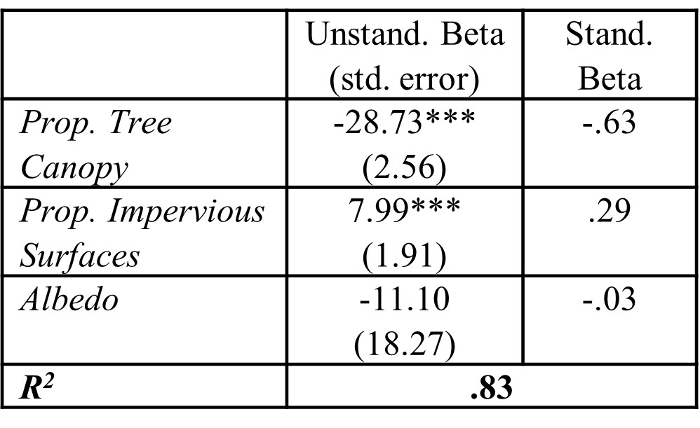
Figure 12.2: Example for organizing and reporting multivariate regression results, including unstandardized betas, standard errors, standardized betas, and significance for all independent variables and \(R^2\) for the full model fit. Significance is traditionally represented as: * - < .05, ** - < .01, *** - < .001).
12.4.5 Incorporating Categorical Independent Variables
Thus far, we have described regressions as a tool for using numerical independent variables to predict the variation in numerical dependent variables. Regressions can also incorporate categorical independent variables. The categorical variable simply needs to be converted into a series of dichotomous variables reflecting the separate categories, each of which will then have its own beta in the model. We create a dichotomous variable for all categories in the independent variable except for one because we need something to compare other categories to. We call this the reference category. Each of the betas is then the difference of that category’s mean from the reference category’s mean. Best of all, if we enter a categorical variable into lm(), it can automatically create these dichotomous variables for us.
Let us start by entering the HOLC grade variable (Grade) into a model predicting land surface temperature. In one sense, this is a bivariate regression because we have only entered one variable. But because Grade has four categories (A, B, C, and D), our regression has three variables, with communities graded A as our reference category.
reg_grade<-lm(LST_CT~Grade, data=tracts)
summary(reg_grade)
##
## Call:
## lm(formula = LST_CT ~ Grade, data = tracts)
##
## Residuals:
## Min 1Q Median 3Q Max
## -10.5562 -1.8257 0.0014 2.2248 8.7436
##
## Coefficients:
## Estimate Std. Error t value Pr(>|t|)
## (Intercept) 89.481 3.368 26.571 < 0.0000000000000002 ***
## GradeB 6.588 3.517 1.873 0.062741 .
## GradeC 8.534 3.386 2.521 0.012614 *
## GradeD 11.981 3.391 3.533 0.000526 ***
## ---
## Signif. codes: 0 '***' 0.001 '**' 0.01 '*' 0.05 '.' 0.1 ' ' 1
##
## Residual standard error: 3.368 on 173 degrees of freedom
## (1 observation deleted due to missingness)
## Multiple R-squared: 0.2632, Adjusted R-squared: 0.2504
## F-statistic: 20.6 on 3 and 173 DF, p-value: 0.0000000000184We see here that census tracts graded D or C were significantly hotter than Grade A neighborhoods by 11.98⁰F (p < .001) and 8.53⁰F (p < .05), respectively. Neighborhoods graded B were close behind at 6.59⁰F warmer than A neighborhoods, but not quite significant. If you look closely and compare to the results of our ANOVA in Chapter 11, the results are very familiar. The unstandardized betas are equal to the differences in means reported in the post-hoc tests. R2, the F-statistic, and the p-value for the full model are the same as those from the ANOVA as well. This is because the ANOVA and the categorical regression are arithmetically identical. The one difference is the significance of the regression parameters. This is because the post-hoc tests adjusted for multiple comparisons, but the regression does not. The adjustments were especially meaningful given how small the sample of grade A neighborhoods was.
As a last step, we might examine the extent to which canopy, pavement, and albedo account for the differences in temperature between neighborhoods with different HOLC grades. As we have already seen, a regression limited to the former three factors explained far more variance than the HOLC grades did (83% vs. 26%). This suggests that the environmental factors are probably more proximal predictors than the HOLC grades.
reg_grade2<-lm(LST_CT~Grade + CAN_CT + ISA_CT + ALB_CT,
               data=tracts)
summary(reg_grade2)
##
## Call:
## lm(formula = LST_CT ~ Grade + CAN_CT + ISA_CT + ALB_CT, data = tracts)
##
## Residuals:
## Min 1Q Median 3Q Max
## -5.5021 -0.8924 0.0524 0.9329 3.8710
##
## Coefficients:
## Estimate Std. Error t value Pr(>|t|)
## (Intercept) 98.29662 3.79896 25.875 < 0.0000000000000002
## GradeB -1.74841 1.66440 -1.050 0.295
## GradeC 0.01725 1.62067 0.011 0.992
## GradeD 0.06251 1.65999 0.038 0.970
## CAN_CT -26.98596 2.71056 -9.956 < 0.0000000000000002
## ISA_CT 7.89329 1.89695 4.161 0.0000502
## ALB_CT -22.51662 18.29857 -1.231 0.220
##
## (Intercept) ***
## GradeB
## GradeC
## GradeD
## CAN_CT ***
## ISA_CT ***
## ALB_CT
## ---
## Signif. codes: 0 '***' 0.001 '**' 0.01 '*' 0.05 '.' 0.1 ' ' 1
##
## Residual standard error: 1.55 on 170 degrees of freedom
## (1 observation deleted due to missingness)
## Multiple R-squared: 0.8466, Adjusted R-squared: 0.8411
## F-statistic: 156.3 on 6 and 170 DF, p-value: < 0.00000000000000022In this model we see that HOLC grades are no longer predictive of land surface temperature, but canopy and pavement have very similar betas as before and explain an overwhelming amount of the variation. As such, we are able to say with some confidence why redlined neighborhoods are warmer. It is because they have less canopy and more pavement (see Section 11.7 for a visual depiction of this latter relationship). In turn, we now have multiple mechanisms by which we might address the issue.
12.5 Some Extensions to Regression Analysis
12.5.1 Dealing with Non-Normal Dependent Variables
As noted in Chapter 10, not all variables are normally distributed. This can create issues for traditional statistical tests, linear regression included. In fact, a linear equation may not be an appropriate model for fitting a variable. If, for example, it has a Poisson distribution, we need to assume an entirely different arithmetic relationship between the independent and dependent variables. There are also times when we want to predict a dichotomous (i.e., 0/1) variable. Each of these special cases is possible using the glm() function, which stands for generalized linear model. Generalized linear models extend the logic of the linear model to estimate models that predict dependent variables with non-normal distributions. The specific model needed can be specified with the family = argument (e.g., family = ‘Poisson’). We will not go further into glm() in this book, but it is a tool you are welcome to explore if relevant to the variables you are looking to analyze.
12.5.2 Working with Residuals
The point of a regression is to fit a linear model that can explain variation in a variable of interest. Sometimes we might be as interested in the places where the model failed to explain values as we are in the model itself. Returning to our multivariate model above, which neighborhoods are warmer or cooler than expected taking into consideration their canopy and pavement coverage? These differences from expectation are known as residuals, and they can be extracted from an lm object using $residuals. They can be positive (above expectations) or negative (below expectations). We can also visualize them (say, with a map) or analyze them in conjunction with other variables by merging them back into the original data set with the following example code.
tracts<-merge(tracts,data.frame(reg_multi$residuals),
              by='row.names',all.x=TRUE)
12.5.3 Building a Good Model
Conducting a solid multivariate analysis requires thinking critically about how you have selected your independent variables. There are three suggestions I might make on this front, though there are certainly other considerations one might make:
- Be careful that the implied independent-dependent variable relationship is appropriate. Does it make sense for your selected independent variable to be predicting your dependent variable? Describe the relationship in words to check that it is logical and is the relationship you want to be testing.
- Try not to include multiple independent variables that are overly similar. For example, median income and poverty rate of a neighborhood are nearly the same measure. Statistically, this can create problems with running the model. Conceptually, it makes interpretation difficult, especially if the similarity of the variables causes one to be positive and the other to be negative, which would seem to be logically impossible.
- Consider confounding variables. Are there other features related to one or more of your independent variables that might help tell the story even better? Further, are there confounds that are muddying the interpretation? For example, many analyses of crime separate out predominantly residential from predominantly commercial neighborhoods because those two contexts have distinct social patterns. You can include such variables in the model as a control. However, it is sometimes necessary to consider subsetting your data and running the models by limiting each regression to a single group to confirm that such issues are not obscuring all results.
- Do not overload your model. Having access to lots of variables is a major advantage for telling a full story. However, too many variables in a model can become confusing, sometimes obscuring meaningful predictors or overstating the importance of others. A telltale sign of this situation is having no significant predictors but a significant R2. This means that some set of variables is explaining your dependent variable, but they are dividing their impact. A classic example is including median income and percentage of residents under the poverty line in a neighborhood in the same model. These two variables have nearly identical variations, creating issues for interpretation. It is important then to think critically about what should be in the model and which variables are complicating matters and therefore should be trimmed.
12.6 Visualizing Regressions
Visualizing regressions can be tricky. How does one visualize the effect of multiple independent variables on a single dependent variable? The answer is, short of a multi-dimensional plot, you cannot. Instead, we have to find ways to communicate our multivariate results with bivariate (and sometimes trivariate) visualizations.
In Chapter 7, we learned the most traditional way to show the relationship between two numeric variables: the dot plot. We are going to replicate that here and add a new wrinkle that captures the linear relationship between the variables more explicitly. To do so, we will return to ggplot2.
base<-ggplot(data=tracts, aes(x=CAN_CT, y=LST_CT)) +
    geom_point() + xlab("Prop. Canopy Coverage") +
    ylab("Land Surface Temperature")
base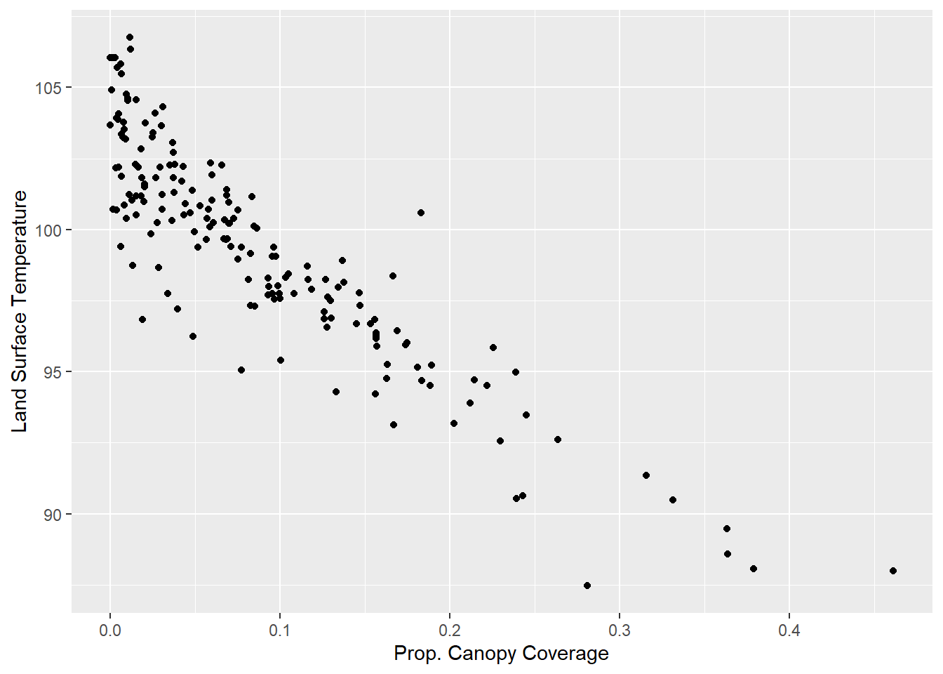
As we might have expected given the large, negative standardized beta, we see a sharp drop in land surface temperature in neighborhoods with more canopy coverage. If we want to visualize this relationship in the linear sense embodied by a regression, though, we can add the geom_smooth() command, with method=lm. geom_smooth() summarizes a bivariate relationship with a single line, and the lm method, as you may have guessed, uses the slope and intercept from a bivariate regression to do so.
base + geom_smooth(method=lm)## `geom_smooth()` using formula 'y ~ x'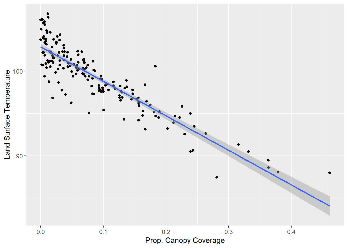
As we can see, the line summarizes the graph with a single line and confirms the strong negative relationship between the two variables. Also, returning to Section 12.5.2, we can observe residuals visually. Dots that fall above the line are those that are warmer than expected given their canopy cover, and dots that fall below the line are those that are cooler than expected given their canopy cover. Again, we might choose to extract these residuals from a regression and map them to see how they are distributed across the city or further analyze them to see what additional factors might be driving land surface temperature.
12.7 Summary
The goal of this chapter was twofold. Conceptually, we wanted to conduct an equity analysis that took a bivariate relationship between a single characteristic (i.e., redlining) and an outcome (e.g., temperature) and revealed the mechanisms that might be perpetuating that relationship. In a technical sense, this was a vehicle for conducting our first multivariate statistical analyses. We learned that the correlation between redlining and temperature could largely be explained by the design and infrastructure of the community, specifically the presence (or absence) of tree canopy and pavement and other impervious surfaces. In the process, we have learned to:
- Distinguish equity and equality;
- Identify independent and dependent variables when conducting a multivariate analysis;
- Propose and test mechanisms that might be responsible for perpetuating inequities;
- Conduct and interpret a regression using the
lm()command, including:- Design a model including the appropriate independent variables for explaining a given dependent variable;
- Generate, interpret, and report unstandardized and standardized betas;
- Generate, interpret, and report model fit statistics;
- Visualize a bivariate regression relationship.
As a final thought, it is worth noting that the correlation between race and temperature in Boston is not as concerning today as this analysis might suggest. Black communities have largely been displaced from their historical neighborhoods by gentrification, meaning that the hottest parts of the city are now occupied by relatively affluent, predominantly White populations that often have a disproportionate number of young professionals. This is not necessarily true across the United States, especially in cities in the southern United States where summer heat is quite dangerous and hot neighborhoods are unlikely to attract gentrification. Also, cities that have not seen the economic boom that Boston has over the last 30 years may not have seen the same demographic turnover. Further, even in Boston, the issue of the urban heat island effect and health goes beyond exposure to heat. It is also a matter of vulnerability to medical emergencies when exposed to heat, which tends to be higher in communities of color, and the ability to mitigate that exposure (e.g., escaping to air conditioning), which tends to be lower in communities of color. Thus, although communities of color are not systematically warmer in Boston, the relationship between redlining and infrastructure still plays a role in the impacts of the urban heat island effect and other racial inequities in the United States.
12.8 Exercises
12.8.1 Problem Set
- For each of the following pairs of terms, distinguish between them and describe when each is the most appropriate tool.
- Correlation vs. causation
- Correlation vs. regression
- Beta vs. R2
- Unstandardized beta vs. standardized beta
- ANOVA vs. regression
- Which of the following statements about r and \(\beta\) are true?
- r controls for other variables.
- r and \(\beta\) are on the same scales.
- \(\beta\) is generated by correlation tests.
- None of the above
- All of the above
- You read a report that how income predicts health, with the beta being -2.5. The article does not state if it is a standardized or unstandardized beta. Which is it? How do you know?
- For each of the following pairs of variables, if you were to conduct an analysis with one predicting the other, which do you think should be the independent variable and which should be the dependent variable? If you think it could go in both directions, say so. Justify your answer by proposing at least one mechanism that could run in that direction.
- Distance from city center and population density
- Race and locally-owned businesses in a neighborhood
- Crime on a subway line and the number of people who ride it
- Redlining and medical emergencies per 1,000 residents
- Academic achievement in high school and career success in adulthood
- Return to the beginning of this chapter when the
tractsdata frame was created. Recall that we have worked previously with multiple data sets with many more measures describing tracts, including demographic characteristics from the American Community Survey, metrics of physical disorder, engagement and custodianship from 311 records, and social disorder, violence, and medical emergencies from 911 dispatches. For the following you can merge any of these variables into the tracts data frame.- Select an outcome variable of interest. Explain why you are interested in this variable.
- Run correlations between this variable and demographic characteristics to see if there are any disparities that might qualify as inequities.
- Select a set of independent variables that might partially explain this correlation. Justify this selection and test it in a regression model. Be sure to describe the findings for the individual variables and for model fit.
- Visualize the relationship between your dependent variable and at least one of the independent variables, presumably focusing on relationships that were the most interesting.
- Summarize the results with any overarching takeaways.
- Extra: Extract the residuals from your regression model and map them across the tracts of Boston.
12.8.2 Exploratory Data Assignment
Complete the following with a data set of your choice. If you are working through this book linearly you may have developed a series of aggregate measures describing a single scale of analysis. If so, these are ideal for this assignment.
- Select an outcome variable of interest. Explain why you are interested in this variable.
- Run correlations between this variable and demographic characteristics to see if there are any disparities that might qualify as inequities.
- Select a set of independent variables that might partially explain this correlation. Justify this selection and test it in a regression model. Be sure to describe the findings for the individual variables and for model fit.
- Visualize the relationship between your dependent variable and at least one of the independent variables, presumably focusing on relationships that were the most interesting.
- Describe the overarching lessons and implications derived from these analyses.