11 Identifying Inequities across Groups: ANOVA and t-Test
The urban heat island effect is the way that the structure and organization of cities—especially the extensive replacement of foliage with pavement—tend to trap heat. It has become increasingly apparent in recent years that this effect is responsible for more than just differences between cities and the surrounding suburbs and rural areas. It creates substantial temperature differences between the neighborhoods within a city as well. Especially concerning, a series of recent studies have demonstrated that these differences are highly correlated with race and income: Black and Latinx residents and those with lower incomes tend to live in warmer neighborhoods. This disparity can be life-threatening as such communities are then more exposed to extreme heat during the summer (Rosenthal, Kinney, and Metzger 2014).
The correlations between race, income, and heat were not an accident. They were part of the historical segregation of cities. In the 1930s, the federal government’s Home Owners’ Loan Corporation (HOLC) classified the neighborhoods of 239 cities according to their perceived investment risk. This practice has since been referred to as “redlining,” as the neighborhoods classified as being the highest risk for investment were often colored red on the resultant maps. Majority Black neighborhoods were almost universally placed in this bottom category, meaning that residents were often unable to access mortgages and other loans related to real estate and development. Today, once-redlined neighborhoods tend to be hotter than the other parts of the city (Hoffman, Shandas, and Pendleton 2020). Figure 11.1 contains an example of a redlining map from Portland, Oregon, and a comparison of current average temperatures by HOLC grades across cities.
Redlining was outlawed in 1968 as part of the Fair Housing Act. And yet its impacts persist. By preventing investment, it has condemned these neighborhoods to a future of concentrated poverty and all that comes with it: lower life expectancy, poorer health outcomes, and limited opportunity for local residents to advance their own opportunities through homeownership, entrepreneurship, or otherwise. These challenges have been inherited by each subsequent generation. And certain conditions, like hotter neighborhoods, make it particularly hard for communities to break away.
The legacy of redlining and the resultant correlation between temperature and race is a stark illustration of an inequity: when an individual or community is beset by challenges that make it difficult or impossible to achieve the same outcomes as others who do not face the same challenges. An important opportunity for urban informatics is to identify and reveal inequities statistically, shining a light on the ways in which some groups start at a deficit. Only then are we able to design policies, practices, and services to support them and even the playing field. In this chapter we will learn the basic statistical tools for identifying differences between groups (or, really, any categories we might define) and will apply them to the legacy of redlining and urban heat.
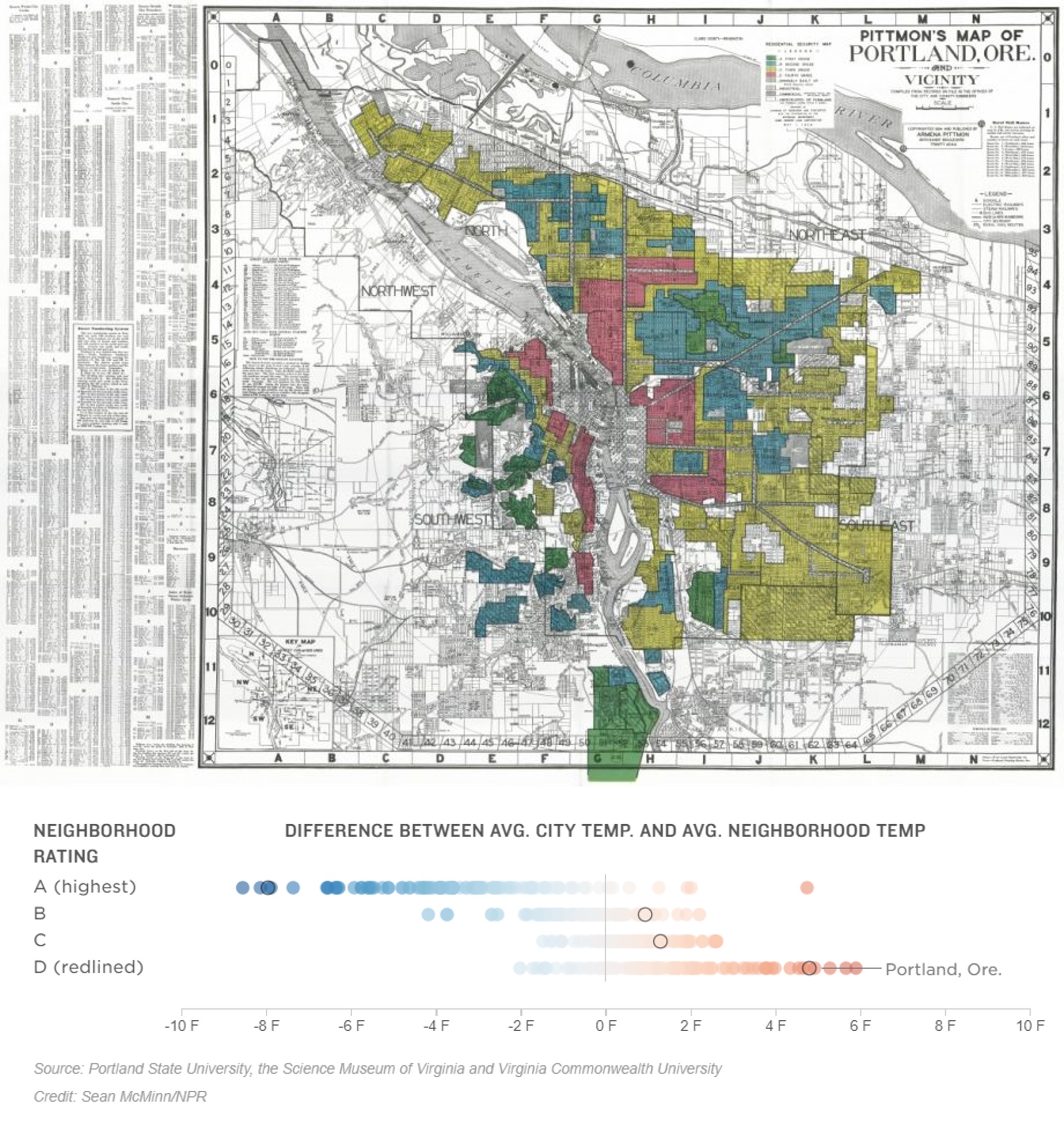
Figure 11.1: The federal government’s Home Owners’ Loan Corporation categorized the neighborhoods of 239 cities, including Portland, OR, (pictured, top) according to their investment quality (green being safest and red being riskiest) in the 1930s (top). “Redlined” neighborhoods tended to be those places occupied by communities of color, most notably Black Americans. Today, formerly redlined neighborhoods are still warmer than other neighborhoods in the same city, in Portland and elsewhere (bottom). (Credit: Source: Nelson, Winling, Marciano, Connolly, et al., Mapping Inequality; see image)
11.1 Worked Example and Learning Objectives
In this chapter we will reveal the relationship between redlining and urban heat in Boston . We will do so using a type of data we have not yet encountered in this book: remote sensing. Remote sensing data are gathered through imagery and other information on ground conditions that can be derived from a plane or satellite. These data are then processed to produce various measures, including the density of trees and pavement, estimates of population, and, of course, land surface temperature. In this chapter we will use the Urban Land Cover and Urban Heat Island Effect Database for greater Boston, curated by researchers at Boston University and available through the Boston Area Research Initiative’s Boston Data Portal. The database includes land surface temperature as well as a collection of related metrics that we will return to in Chapter 12. We will combine these data with an HOLC redlining map of Boston from 1938, provided by the Mapping Inequality project, a collaboration of faculty at the University of Richmond’s Digital Scholarship Lab, the University of Maryland’s Digital Curation Innovation Center, Virginia Tech, and Johns Hopkins University. The Mapping Inequality project has digitized and geo-referenced (the process of taking a historical map and matching its points to a modern projection) all 239 HOLC maps and made them publicly available. The Boston map has then been spatially joined to census tracts to determine how each was graded by the HOLC.
As we move forward, we will learn both conceptual and technical skills, including how to:
- Differentiate between inequalities and inequities;
- Conceptualize analyses that compare values across categories of people, places, and things, including identifying dependent and independent variables;
- Conduct t-tests that compare values on two groups;
- Conduct ANOVA tests that compare values across three or more groups;
- Visualize differences between groups in
ggplot2.
Links:
Urban Heat Island Database: https://dataverse.harvard.edu/dataset.xhtml?persistentId=doi:10.7910/DVN/GLOJVA
Redlining in Boston: https://dataverse.harvard.edu/dataset.xhtml?persistentId=doi:10.7910/DVN/WXZ1XK
Data frame name: tracts
require(tidyverse)uhi<-read.csv('Unit 3 - Discovery/Chapter 11 - Comparing Groups/Worked Example/UHI_Tract_Level_Variables.csv')
tracts_redline<-read.csv('Unit 3 - Discovery/Chapter 11 - Comparing Groups/Worked Example/Tracts w Redline.csv')
tracts<-merge(uhi,tracts_redline,by='CT_ID_10',all.x=TRUE)11.2 Identifying Inequities across Groups
Equity has been a buzzword of late, but what does it mean? And how is it different from equality? Turning to the dictionary, the literal definition of inequity is “lack of fairness or justice.” When we pursue equality we intend for fairness and justice, but there are situations in which equality can still be unfair. For instance, in the oft-used meme in Figure 11.2, we see three people trying to watch a sports game over a fence. On the left, each has a box of the same size, but this is not sufficient for the shortest person, who is still unable to see the game. On the right, we see a more equitable situation, in which the shorter person is provided with a taller platform that allows him to see over the fence. From this perspective, an inequity is a hurdle or challenge that an individual or community faces or has experienced that makes them less capable than others of achieving a desired goal.

Figure 11.2: Providing equal inputs or opportunities for all does not guarantee that all individuals will have the same success. When three people of different heights receive supports of the same height, the shortest is unable to see over the fence (left). An equity approach would be to provide the resources to each that enables them to succeed, as in giving the shortest person a taller support to see over the fence (right). (Credit: Interaction Institute for Social Change (interactioninstitute.org) | Artist: Angus Maguire (madewithangus.com))
Starting with the Civil Rights Era of the 1960s, the stated objective in policy and practice has been to achieve equality. This is often defined as ensuring that everyone has equal inputs and “equal opportunity.” This was an important transition from how society operated previously, as many populations, especially Black Americans, had been deliberately discriminated against and excluded from crucial resources, like education, transportation, and political representation. We have since discovered, however, that equality of inputs and opportunity without consideration of each individual or community’s starting point is insufficient for realizing equal outcomes. To illustrate, redlining by HOLC and the real estate companies that used the maps was a clear violation of the principle of equality. The practice is now illegal, but multiple decades of non-investment has left long-standing disparities in the financial capital, infrastructure, and conditions in those same places and the Black communities that occupied them. These manifest in a multitude of ways, including more intense heat, which in turn has inequitable consequences for health.
The recognition of the limitations associated with an “equality-first” approach has inspired a paradigm shift toward equity. Instead of pursuing equal access to government resources and other opportunities, the goal has become to design programs and services so that all populations have the same ability to avail themselves of these opportunities. In some cases, this means offering more support to those who need it to succeed, like the taller platform for the shorter person trying to see over the fence.
Data analysis plays a crucial role in the realization of equity. First, correlations, like those we conducted in Chapter 10, can reveal inequities: do certain populations systematically experience a different set of conditions and challenges that lower their ability to succeed? Often, we are most concerned when these factors correlate with race and socioeconomic status, which are numerical variables. Sometimes, however, we are faced instead with categorical variables—for example, was a neighborhood redlined?—whose relationships require a different set of statistical tools. In either case, the job of the analyst is to identify the distinct challenges that different groups inherit that can hinder their ability to thrive, thereby inspiring further examination and action.
11.2.1 Making Statistical Comparisons across Groups
11.2.1.1 Assessing Averages and Errors
Statistical comparisons across groups often lead to sweeping statements. “Men are taller than women.” “Low-income neighborhoods have more crime.” “Redlined communities are hotter.” These statements can be taken to imply that all men are taller than all women, that all low-income neighborhoods have higher crime than all high-income neighborhoods, that all redlined communities in a city are hotter than all non-redlined communities. Those statements are far too broad and demonstrably false. They also are inconsistent with what a statistical test is actually examining.
Let us take the example of comparing a particular measure in two groups, each of which we might treat as its own population. As we learned in Chapter 10, all populations have a range of values on any given numerical measure. This range often takes the form of a normal distribution, with values largely centered on the mean but spread out according to the standard deviation. Thus, each of our populations is its own normal distribution with its own characteristic mean and standard deviation, as we see here.
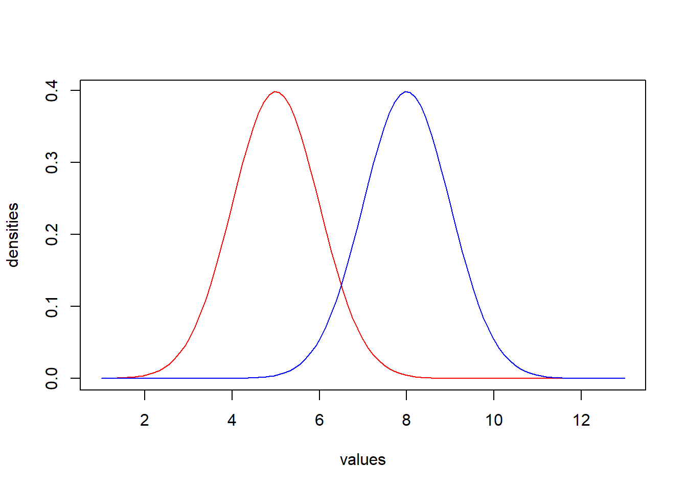
When we conduct a statistical comparison of values in two groups, the question we are actually asking is, “are the means of these two populations different?” Now, obviously, the means in the graph are different, but recall the distinction between samples and populations. When we are conducting statistical analyses, we assume that we are working with a sample of a population. As such, its mean is but an approximation of the population’s “true” mean, shifted up or down by chance error. Statistical tests then take into account the standard deviation to estimate how much error is likely to be present. We are then able to assess the likelihood that two populations have different means given the differences we observe in samples drawn from each. As in Chapter 10, this likelihood is quantified as p-values and evaluates whether a difference is significant or not.
This reasoning has three implications for comparing groups:
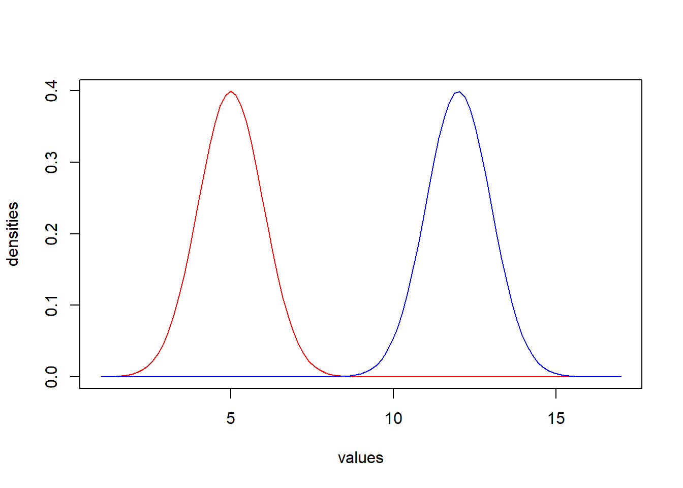
- Groups whose means are further apart are more likely to be significantly different. This becomes apparent visually as the distributions barely overlap, as in the following example.
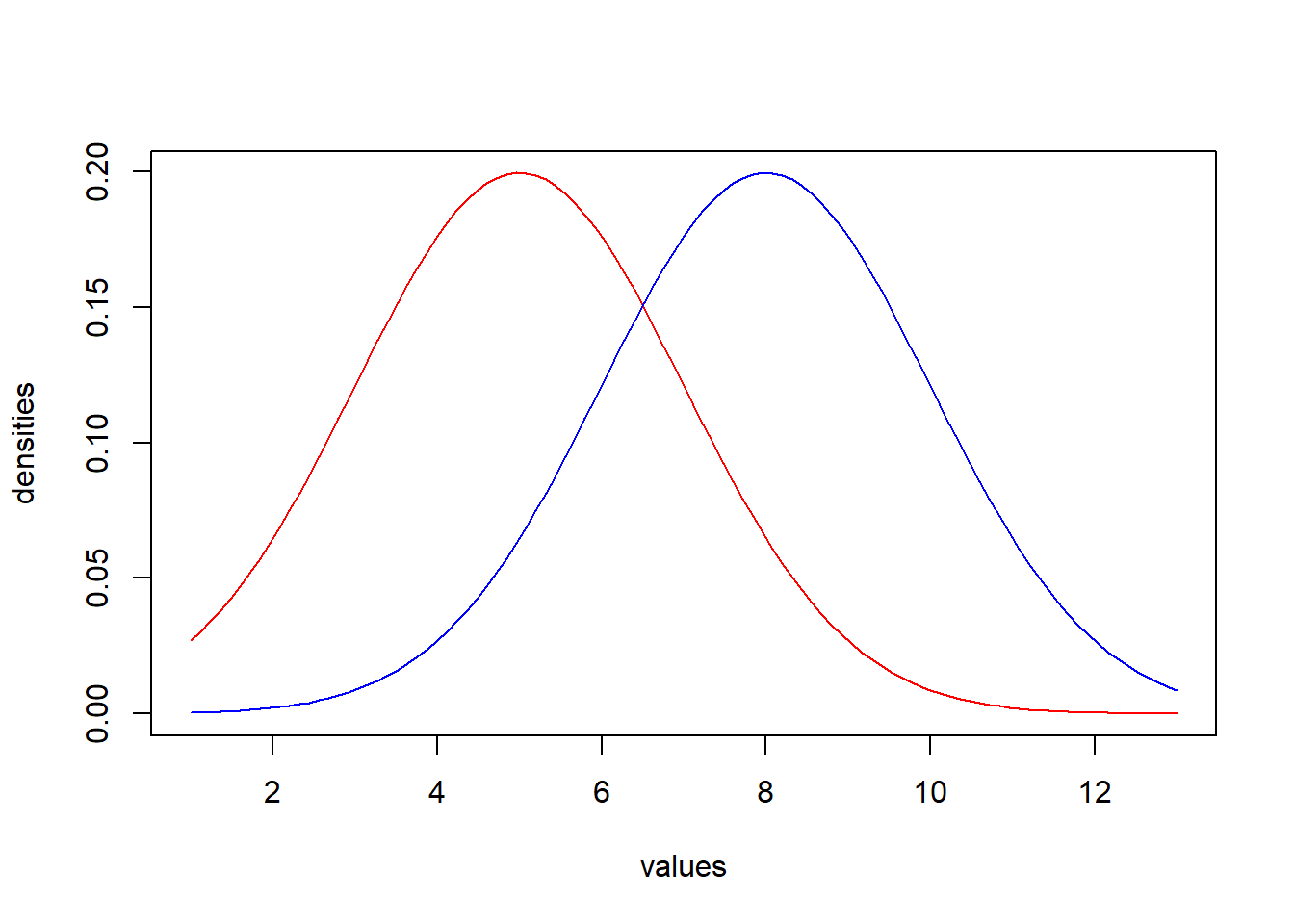
- Groups with more variability are less likely to be significantly different from each other. This is because (a) individuals from each population are more likely to have similar values to individuals from the other, and (b) because of this greater variability, error can have greater impacts on our means, in which case we are less confident that the mean of the sample is representative of the mean of the population. Though the first of these considerations is more apparent in the visual example below, the latter has considerable impact on the arithmetic underlying statistical calculations.
- Larger sample sizes produce less error in the estimation of the population means. Less error in the estimation of the means makes us more confident in the observed differences between the samples. Arithmetically, this is because we do not use the standard deviation alone to compare samples. We use a new statistic called the standard error of the mean, which quantifies how far we expect the mean of our sample could differ from the population mean. The standard error of the mean (or standard error, for short) is calculated as the standard deviation divided by the square root of the sample size (represented by n, as we learned in Chapter 10). Consequently, returning to our first example graph, suppose we conduct two studies, one in which each sample has 10 cases and another in which each sample has 100 cases. Even if they have the same means and standard deviations, the latter will have a smaller standard error for the estimate of the mean, because as the sample size goes up, the standard deviation is divided by a larger value. Consequently, a statistical test will be more likely to identify a significant difference.
This arithmetic assessment of means and standard errors (as a function of standard deviations and sample sizes) is the heart of comparing groups. It is actually the heart of all statistical tests, including the correlations we conducted in Chapter 10. You might note that correlations examine the relationship between two numerical variables, not between a categorical variable and an outcome, and you would be right. That said, the same premise applies. A correlation test is essentially testing how the mean in one variable changes with the mean in another variable and evaluates the significance of these changes in light of the overall variability. The arithmetic of how this works is beyond the scope of this book, but it is important to keep in mind that whenever we are conducting statistical tests we are analyzing means and standard errors to determine effect size and significance.
11.2.1.2 Multivariate Analysis: Defining Independent and Dependent Variables
Comparing groups also raises a new consideration: distinguishing between dependent variables and independent variables. A dependent variable is our outcome of interest, and we want to use independent variables to explain why those outcomes are sometimes higher or lower. A statistical analysis models variation in our dependent variable as a function of the variation in one or more independent variables. Another, equally accurate way of describing this is saying that we are using our independent variables to predict variation in our dependent variables; semantically, “prediction” in this case does not necessarily mean anticipating future events but instead using a statistical model to “predict” what each value in the dependent variable might be given the corresponding values on the independent variables. For instance, to what extent does a history of redlining account for differences in neighborhood temperature? In this case, redlining is the independent variable and neighborhood temperature is the dependent variable.
One way to think about the difference between dependent and independent variables is in terms of an experiment. In an experiment, the researcher alters one or more variables and then tests the effect on one or more outcome variables. For instance, a clinical trial gives some individuals a medicine and others a placebo and analyzes their subsequent health outcomes. The variable that the experimenter altered, in this case the administration of medicine or a placebo, is the independent variable; and the outcome variables, in this case the health outcomes, are the dependent variables. Occasionally, we have the opportunity to conduct experiments in community-based research, such as placing a community garden in some neighborhoods and not in others and then testing the impacts. But often we have to work with the natural variation that is already present. This can create some interpretative complications that go beyond the scope of this book, but for the moment this framing can be useful to determining which are your dependent and independent variables. For the worked example in this chapter, redlining was not quite an experiment, but it was a way that the HOLC altered the treatment of certain neighborhoods, resulting in a variety of later outcomes, including higher temperatures. It would be harder to reason in the other direction that temperature explains why differences in redlining exist. In addition, thinking in terms of experiments might help us consider what effective programs and services might look like.
11.3 t-Test: Comparing Two Groups
11.3.1 Why Use a t-Test?
The simplest tool for comparing the distributions of multiple groups is the t-test, or Student’s t-test, so called because it was published anonymously by Student in 1908. Student, whose real name was William Sealy Gosset, worked in quality control for the Guinness brewing company and had invented the t-test to rigorously compare batches of ingredients to each other. The company saw the work as its intellectual property and he was forced to publish it under the cover of a pseudonym.
The job of the t-test is to compare two values taking into consideration their variability, as measured by standard errors. It takes three primary forms:
Single-sample t-tests compare the mean of a sample against a pre-established value of interest. These tests only take into consideration the standard error of the estimate of the mean for the sample as the pre-established value has no error. It is the precise value to which the analyst wants to compare. This test is not especially common because it requires a meaningful benchmark to compare against.
Two-sample t-tests compare the means of two samples against each other, taking into consideration the standard errors for each. This is the most common form of t-test and what would be used in the examples of overlapping normal distributions featured in the previous section (Section 11.2.1).
Paired-sample t-tests compare means on two different outcomes for the same set of items. The measures on each outcome are “paired,” meaning we compare them only to their counterpart and then analyze the differences of all these pairings. This can be useful when two measures are highly correlated. For example, different types of air pollution tend to correlate from day to day, which makes it difficult to ask questions like “is there more carbon monoxide or sulfates in the air?” If they are going up and down together, their distributions may be hopelessly entangled But, if we ask if there is more of one or the other on each day, and then assess those within-day comparisons, we have a greater ability to observe differences. We will not illustrate a paired-sample t-test in this chapter, but it is a valuable tool worth knowing about.
For all t-tests, the null hypothesis is that there is no difference between the values evaluated, whether they be the mean of one group and a pre-established value or the means of two groups. The alternative hypothesis is that there is a difference between them. As we saw in Chapter 10 with correlations, the alternative hypothesis does not have a direction (i.e., if there is a difference, it does not stipulate which value is greater).
11.3.2 Effect Size: Magnitude of Difference in Means
The effect size for a t-test is highly intuitive. Most often, we want to tell our audience the “magnitude of difference in means.” This is just a fancy way of saying, how much larger or smaller is one mean than the other? If two neighborhoods differ in their temperatures by 3, 5, or 10 degrees, that is the most easily interpreted and actionable piece of information that an analyst can provide.
A t-test assesses the magnitude of difference in means using the standard errors for each. This process generates the t-statistic, which is then used to evaluate significance. As noted in Section 11.2.1, we are more confident that a difference is significant when the samples are larger. For this reason, t-statistics are evaluated according to the sample size from a t-statistic table, like the one pictured in Figure 11.3. In the era of modern statistical analysis, programs like R have these tables programmed in and they conduct the evaluation themselves and report the difference in the means, the t-statistic, and the significance level.
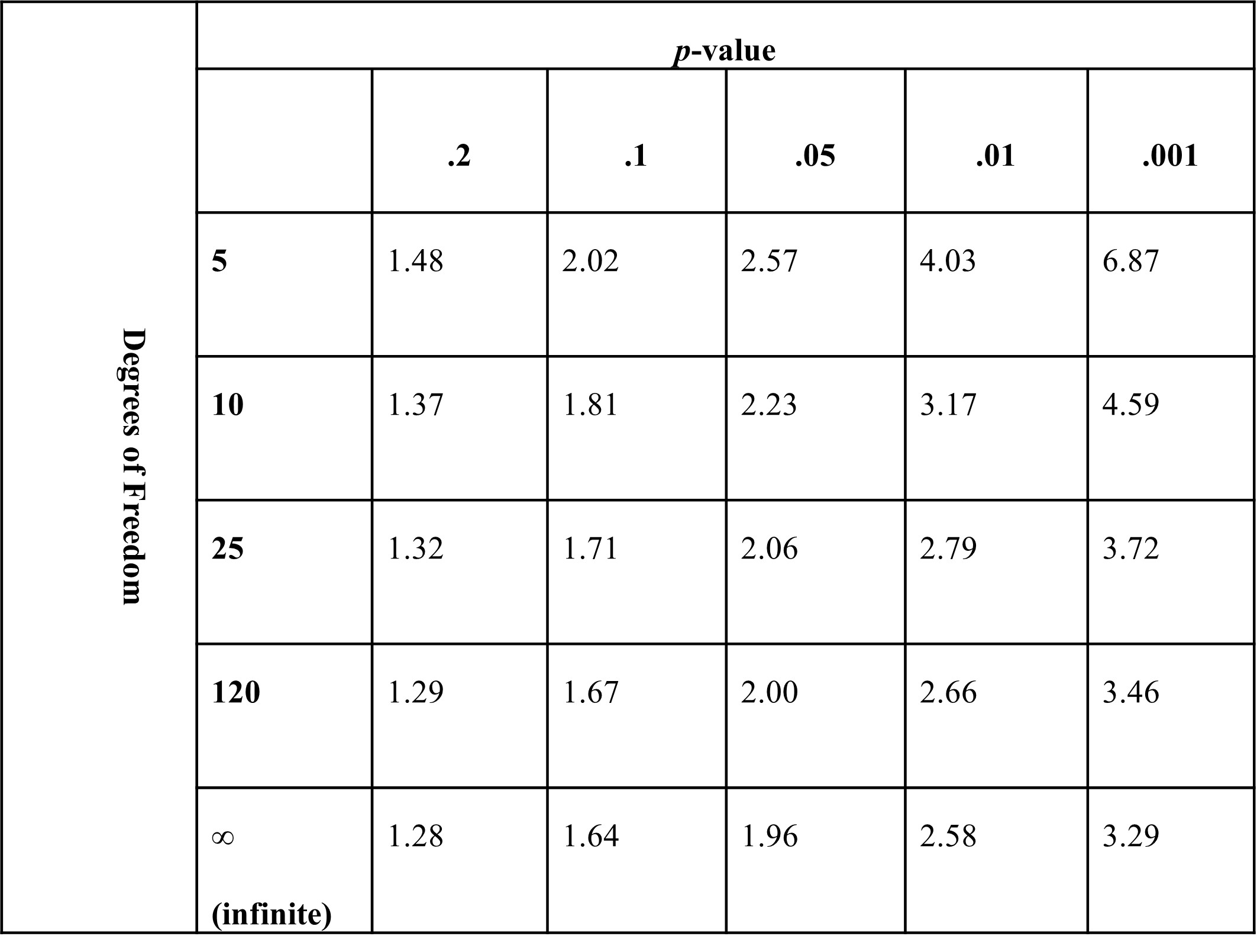
Figure 11.3: Example -value lookup table. Each cell contains the -value that corresponds to the threshold for a given -value for a given number of degrees of freedom. Any -value higher than that value would be less likely than that -value. For example, for 120 degrees of freedom, a -value of 2.00 or greater would have a -value of less than .05.
11.4 Conducting a t-Test in R
We will illustrate how to conduct single- and two-sample t-tests in R using the t.test() function to examine differences in land surface temperature between neighborhoods that were and were not redlined in Boston. (Note: Whereas t.test() works with a single outcome variable and a single categorical variable, a paired-sample t-test requires a different data structure with two outcome variables that are “paired” in that they each reference the same set of cases. For this reason, it also requires a different function, pairwise.t.test().)
11.4.1 Single-Sample t-Test
A single-sample t-test is useful if we want to compare the mean of a variable to a pre-established value. We have not to this point made a statement about whether we would like to test the mean land surface temperature across neighborhoods against a certain benchmark, but doing so gives us an excuse to get to know our variable a bit better. (It would have been good practice to look closely at the mean, standard deviation, minimum, maximum, and other characteristics of the distribution of this variable before diving into statistical analyses. You might want to take a moment and do that.)
Let us ask the simple question, “Is the land surface temperature in the average Boston census tract different from \(90^{\circ}F\) during the summer?” This would be executed with the following code, in which we indicate our variable of interest (tracts$LST_CT) and our benchmark (mu=, as mu, or \(\mu\), is the Greek letter used to symbolize the mean).
t.test(tracts$LST_CT, mu=90)##
## One Sample t-test
##
## data: tracts$LST_CT
## t = 31.751, df = 177, p-value < 0.00000000000000022
## alternative hypothesis: true mean is not equal to 90
## 95 percent confidence interval:
## 98.66290 99.81115
## sample estimates:
## mean of x
## 99.23702The result offers us a few pieces of information. Starting from the bottom, the mean of our variable is 99.24; in other words, the average census tract in Boston has a land surface temperature of \(99.24^{\circ}F\) in the summer. The 95% confidence interval above it ranges from 98.66 to \(99.81^{\circ}F\), which is approximately all values within 1.96 times the standard error of the mean (see Chapter 10 for a refresher on confidence intervals). This range does not include \(90^{\circ}F\), so unsurprisingly we see that the p-value is less than .001 (it is quite a bit smaller than that at \(< 2.2*10^{-16}\)), offering support for our alternative hypothesis that the true (or population) mean is not equal to \(90^{\circ}F\). This is based on the assessment of a rather large t-statistic of 31.75 (often values above 2 or 3 are significant, depending on sample size) and 177 degrees of freedom (which is calculated from the sample size).
One could take these results and write the following: “The average census tract in Boston, MA has a land surface temperature greater than \(90^{\circ}F\) during the summer (mean = \(99.24^{\circ}F\), t = 31.75, p < .001).” Alternatively, one might write: “The average census tract in Boston, MA has a land surface temperature of 99.24⁰F during the summer, which was significantly greater than \(90^{\circ}F\) (t = 31.75, p < .001).” You are probably saying to yourself, “That’s hot!” And it is. But it is important to keep in mind that land surface temperature is different from air temperature as we experience it because the ground absorbs a large amount of the heat generated by the sun. You should not interpret these numbers in the same way that you would a weather forecast.
11.4.2 Two-Sample t-Test
Now that we know the average land surface temperature across Boston’s census tracts in the summer, we are ready to evaluate whether this mean differs between those that were and were not redlined. This can also be done with t.test(). In this case, we indicate two variables, LST_CT and redline with ~ between them. In this and other functions, ~ indicates that the variable on the left side is being analyzed as a function of the variable (or variables) on the right side; that is, the left side is the dependent variable and the right side contains all independent variables. We then indicate the data frame containing the variables.
t.test(LST_CT~redline,data=tracts)## t = -7.698 df = 173.8 p-value = 9.999734e-13## 95 percent confidence interval:## -4.689 -2.775## mean in group FALSE mean in group TRUE
## 97.7299 101.4620Again, let us work through these results from the bottom up (note that the output has been reformatted to fit the margins of the book and will look slightly different on your screen). We see that our TRUE group—that is, those for which redline==1, or those that were redlined—have an average summer land surface temperature of \(101.46^{\circ}F\), and our FALSE group-—i.e., redline==0, or never redlined—have an average land surface temperature of \(97.73^{\circ}F\). This is a magnitude of difference of 3.73⁰F. Though t.test() does not actually calculate this for us, it does report the 95% confidence interval for the difference as ranging from -4.69 to \(-2.78^{\circ}F\). This range does not contain 0, implying that the difference is significant at p < .05. Indeed, the p-value is again very, very small at \(1*10^{-12}\). This is based on a t-statistic of -7.70 and 173.84 degrees of freedom. Note that everything in this result is negative because R subtracts the mean from the TRUE group from the mean of the FALSE group.
In simple terms, we see strong evidence for our alternative hypothesis that there is a temperature difference between neighborhoods that were and were not redlined. We might write this as: “Redlined neighborhoods have summer land surface temperatures \(3.73^{\circ}F\) warmer than neighborhoods that were not redlined (means = \(101.46^{\circ}F\) and \(97.73^{\circ}F\), t = 7.70, p < .001).” Note that it is optional to maintain R’s decision to communicate t-statistics as positive or negative. They can be treated as absolute measures of the effect and thus reported as positive.
11.5 ANOVA: Comparing Three or More Groups
11.5.1 Why Use an ANOVA?
An ANOVA, also known as an Analysis of Variance, picks up where t-tests leave off in the comparison of means across groups. Whereas t-tests are limited to comparing two groups to each other, ANOVAs can compare means across any number of groups. In practice, this includes two groups, though the t-test is often a more efficient way to examine such questions. This is because an ANOVA specifically analyzes the question, “Are there differences in the means between these groups?” It does not, in fact, evaluate any of the pairwise differences between those groups. This can be a little frustrating to the analyst because knowing that there is some overarching variation between 3, 5, 8, or 10 groups is only so informative, and certainly not very actionable. More often we want to know which of these groups differ from each other. This can be accomplished, as we will see, through post-hoc comparisons. For the special case of two groups, conducting a t-test is more straightforward and arithmetically identical.
It is worth noting that ANOVAs are quite versatile and take a variety of different forms. They can include multiple categorical variables, assess interactions between variables (i.e., does a second set of categories alter the differences between the original categories of interest?), and accommodate many different research designs. These are most commonly used in disciplines that do controlled experiments, especially psychology. In fact, graduate students in psychology programs often have to take one or more whole semesters dedicated exclusively to ANOVA! Here we will only conduct the most basic form of ANOVA, which is to examine differences in means across one set of categories, also known as the one-way ANOVA. In sum, the ANOVA as we will work with it in this chapter tests the null hypothesis that there are no differences in means between two or more groups. The alternative hypothesis is that there are differences between the means of these groups. If we find evidence for the alternative hypothesis and want to know which groups’ means are different from each other, we can use post-hoc tests. The post-hoc tests include a series of pairwise comparisons, each with the null hypothesis that there is no difference between that pair of means and the alternative hypothesis that they do differ in their means.
11.5.2 Effect size: F-Statistic
An ANOVA reports an F-statistic, which evaluates the extent to which the means of groups differ from each other more than would be expected based on the natural variability in the data. This is also referred to as a comparison between between-group variation and within-group variation. The latter is also known as error variance or residuals, because it is the variation leftover once we account for groups. Much like the t-statistic, the F-statistic is a technical calculation that is combined with degrees of freedom (again based on sample sizes) to evaluate the p-value. It does not hold actionable meaning.
When conducting an ANOVA, there are two pieces of information we might include in the results to give our audience a more practical sense of the effect size. The first is again the magnitude of difference in the means themselves. Post-hoc tests allow us to evaluate their significance. Second, we can report the R2, which is the proportion of variance explained by our groups. If groups have completely non-overlapping distributions—say, every value in Group A == 5, every value in Group B == 10, and every value in Group C == 15—then R2 is equal to 100% or 1.0. This is because literally all variation is accounted for by groups. If, however, groups have identical distributions, R2 is equal to 0, because there is no variation associated with groups. Most cases fall somewhere in between, and they are calculated with a set of values called sums of squares (SS). Sums of squares are calculations of variation, and the arithmetic of ANOVA relies on differentiating SS within and between groups. R2 is then equal to SS between groups divided by Total SS; that is, it is the mathematical representation of the proportion of all variation in the sample that is accounted for by differences between groups.
11.6 Conducting an ANOVA in R
To extend our analysis of heat and redlining, we might recall the map in Figure 11.1. It is not a map of “red areas” and “everything else.” It is a detailed grading system with four different levels of classification. The highest of these, or ‘A’ communities, were considered the most promising investments. The lowest, or ‘D’ communities, were considered high-risk investments. These were the communities we now refer to as “redlined” and that probably have suffered from the most intensive effects of this discrimination. But it is possible that these effects saw a gradient, with A communities at the top, D communities at the bottom, and B and C communities falling in between. We can test this with ANOVA.
11.6.1 ANOVA with aov()
The aov() function in R conducts ANOVAs. It actually creates objects of class “aov” “lm”. The first part of the class is probably self-explanatory. The second part is a reference to linear models, which will make more sense in Chapter 12. That aov() creates objects of a special class will come in useful when we want to conduct post-hoc comparisons of means.
The arguments for aov(), at least one running a test of a single set of categories, is identical to that for t.test(). The only difference is that we will store the results in an object called aov_heat and use summary() to see our results. If you were to submit an aov() command directly, you would see that the results are limited and do not include everything we would like to know.
aov_heat<-aov(LST_CT~Grade,data=tracts)
summary(aov_heat)
## Df Sum Sq Mean Sq F value Pr(>F)
## Grade 3 700.9 233.62 20.6 0.0000000000184 ***
## Residuals 173 1961.9 11.34
## ---
## Signif. codes: 0 '***' 0.001 '**' 0.01 '*' 0.05 '.' 0.1 ' ' 1
## 1 observation deleted due to missingnessThe results include an F-statistic of 20.6, which has a p-value of \(1.84*10^{-11}\), which is quite small. This is based on the knowledge that 3 degrees of freedom are associated with the categories and 173 are associated with the rest of the variation. This provides substantial evidence for the alternative hypothesis that there are differences in land surface temperature across the four different grading levels created by the HOLC in the early 20th century. We can also calculate R2 as 700.9/(700.9 + 1,961.9) = .26.
We might report all of this as follows. “Census tracts with different investment grades created by the HOLC had significant differences in their land surface temperature (F = 20.6, p < .001). The grades explained 26% of the variation across census tracts.” This is a nice start, but it does not articulate the meatier comparison of communities we would probably like, however. For that we need post-hoc tests.
11.6.2 Post-Hoc Tests with TukeyHSD()
ANOVA only evaluates whether there are differences between the means of multiple groups. Post-hoc tests allow us to dig into the actual cross-group differences underlying that evaluation, which are more likely to give us practical, actionable information. In a sense, post-hoc tests are just a series of t-tests comparing the means of pairs of categories. This, however, is an oversimplification because the significance is evaluated differently. Recall from Chapter 10 that if we use a p-value of .05 as our threshold for significance, we would actually expect a significant result 5% of the time (i.e., 1 of every 20 times) just by chance—meaning that we could erroneously identify a relationship that is not actually there. For this reason, we need to be careful about conducting too many comparisons at once. If, for example, we are comparing 5 groups, there are 10 pairwise comparisons. If we have 10 groups, there are 45 pairwise comparisons between groups! In the latter case we would expect at least two comparisons to be significant at p < .05 even if in reality there were no population differences.
Post-hoc tests have been designed to deal with the issue of multiple comparisons. There is no single way to address the issue, however, and statisticians have literally developed dozens of solutions that vary in their complexity, specificity, and their conservativeness (i.e., how worried they are about falsely identifying non-existent relationships). R and its packages have functions for running many of these. The most commonly used is the Tukey HSD (for Honestly Significant Difference) test, and it can be run by applying the TukeyHSD() function to our aov object.
TukeyHSD(aov_heat)## Tukey multiple comparisons of means
## 95% family-wise confidence level
##
## Fit: aov(formula = LST_CT ~ Grade, data = tracts)
##
## $Grade
## diff lwr upr p adj
## B-A 6.588242 -2.5362265 15.712710 0.2434591
## C-A 8.534387 -0.2484688 17.317242 0.0602325
## D-A 11.981306 3.1848355 20.777777 0.0029332
## C-B 1.946145 -0.8392843 4.731574 0.2709477
## D-B 5.393065 2.5649974 8.221132 0.0000105
## D-C 3.446920 2.0755722 4.818267 0.0000000Now we have a full table comparing the means across all four categories of HOLC investment grades, represented as differences. These each have a 95% confidence interval (represented as lwr and upr) and associated p-value. Note that this is labeled as an adjusted p-value, reflecting that it is not a pure t-test, but one that accounts for multiple comparisons. For instance, communities graded B had a land surface temperature \(6.59^{\circ}F\) greater than communities graded A, though this difference had a confidence interval ranging from -2.54 to \(15.71^{\circ}F\). Because the confidence interval contained 0⁰F, it is unsurprising to see that the p-value = .24, meaning the difference is non-significant and we accept the null hypothesis of no difference in temperature between these groups.
Digging deeper into the table, we see that the only significant differences were between communities graded as D and communities with all other grades. Communities graded C were nearly significantly warmer than communities graded A, but not quite. Though the magnitude of difference would seem large at 8.53⁰F, the p-value is .06. Interestingly, the difference is substantially greater than that between D and B neighborhoods at 5.39⁰F, which is highly significant at p = .00001. Why? Let us take a quick look at the number of census tracts in each of these categories.
table(tracts$Grade)##
## A B C D
## 1 11 93 72There is only one census tract graded as A! Historically speaking, this tells us just how unfavorably the HOLC saw investing anywhere within the City of Boston, probably preferring to invest in the surrounding suburbs. For our purposes here, though, it shows just how small the sample for A neighborhoods is. For this reason, even a substantial difference might be non-significant because we cannot be fully confident that it is not a result of random error.
11.6.3 Communicating ANOVA Results
Let us expand on our brief summary of the initial ANOVA test from above to incorporate our post-hoc tests and tell a full story. A reader typically does not want to read through a number-by-number reiteration of six pairwise comparisons, so we need to distill the results. Often, a table might accompany the write-up below so that readers can inspect the results themselves. Or we could provide a graph, which we will learn to do in Section 11.7.
“Census tracts with different investment grades created by the HOLC had significant differences in their land surface temperature (F = 20.6, p < .001). The grades explained 26% of the variation across census tracts. Post-hoc tests found that only communities graded D were significantly warmer than the others (differences in means = 3.45 – \(11.98^{\circ}F\), all p-values < .001). Communities graded A, B, and C did not have significantly different temperature (all p-values > .05). It is worth noting, though, that only one census tract in Boston was graded A, making it hard to make a meaningful comparison between this and the other grades.”
11.7 Visualizing Differences between Groups
Sometimes, in addition to a statistical test, the easiest way to communicate differences between groups is with a bar chart. This is especially true for ANOVAs, where the numerous pairwise comparisons of post-hoc tests can be hard to absorb from a table or text. We will do this in a series of steps, moving up to increasingly sophisticated ways of communicating our data.
11.7.1 Representing Means
Creating a bar chart of means in ggplot2 is a touch more complicated than you might expect. Because our data consist of the individual records that contribute to the means, we need to first aggregate the data ourselves, taking means for each group. We can then visualize those means.
means<-aggregate(LST_CT~Grade,data=tracts,mean)11.7.2 Adding Variability
As we have discussed, means are not the whole story. Variability is key to evaluating whether differences in those means are meaningful. To add this consideration to our bar chart, we want to use standard errors to represent our confidence intervals, which are approximately equal to the standard error * 1.96 in each direction of the mean. This is calculated through the first line below, and then added to the the graph with the geom_errorbar() command at the end of the block of code.
ses<-aggregate(LST_CT~Grade,data=tracts,
      function(x) sd(x, na.rm=TRUE)/sqrt(length(!is.na(x))))
names(ses)[2]<-'se_LST_CT'
means<-merge(means,ses,by='Grade')
means <- transform(means, lower=LST_CT-1.96*se_LST_CT,
                   upper=LST_CT+1.96*se_LST_CT)

bar<-ggplot(data=means, aes(x=Grade, y=LST_CT)) +
  geom_bar(stat="identity",position="dodge", fill="blue") +
  ylab('Land Surface Temp.')
bar + geom_errorbar(aes(ymax=upper, ymin=lower),
              position=position_dodge(.9))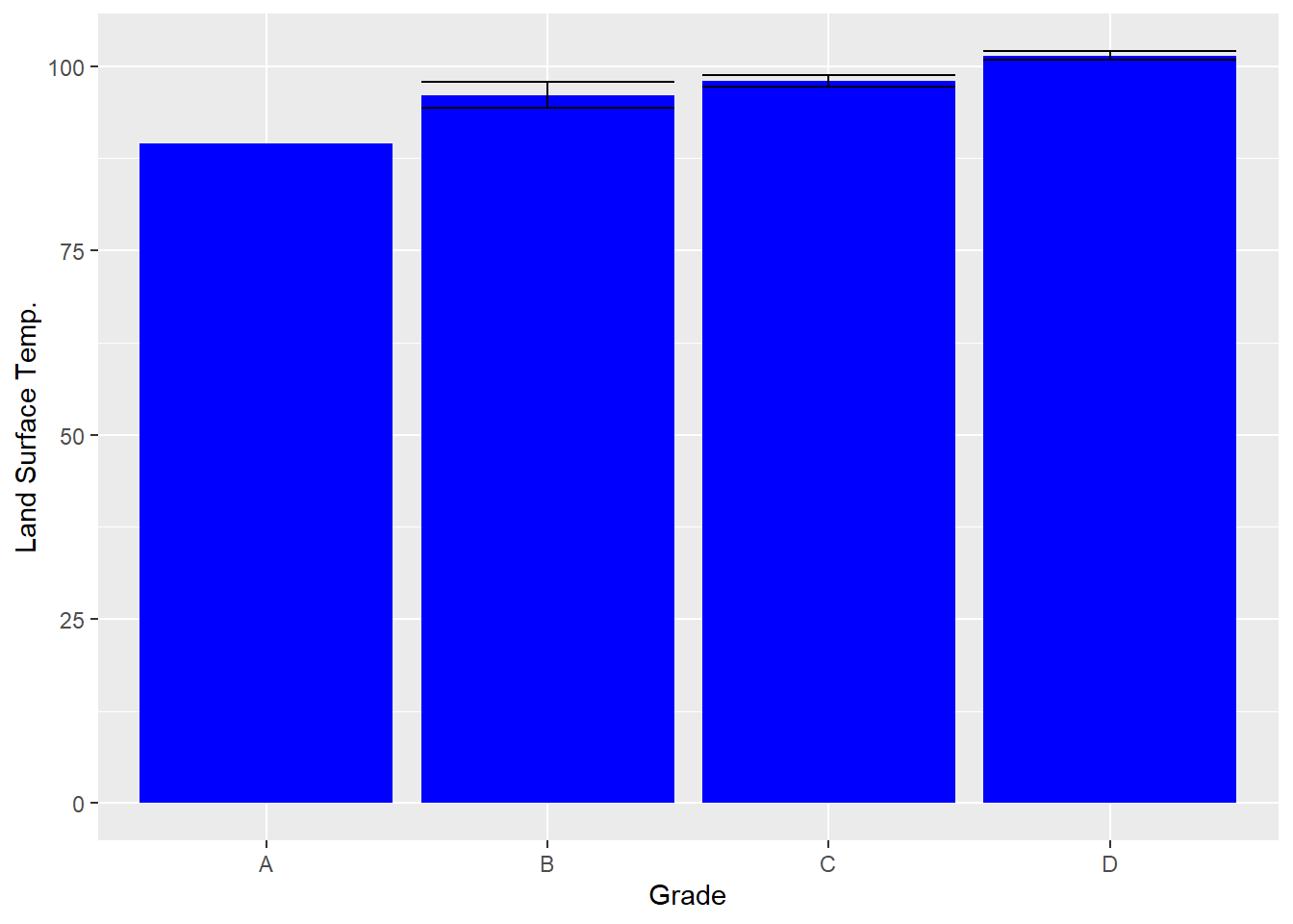
Here we can see that the variability would suggest that B and C are not all that difference from each other but that D is consistently warmer than the others. Meanwhile, A has no standard error because it cannot be calculated on only one case. Having a y-axis that ranges from 0 to 100 makes it challenging to interpret this graph, however, as all of the variation is constrained in the top part of the graph. We can fix this with coord_cartesian(). (You might be inclined to use ylim to do this, but in a bar graph, it considers the entire bar as part of the data point, so if you limit the y-axis above zero, it deletes the entire bar.)
bar + geom_errorbar(aes(ymax=upper, ymin=lower),
                    position=position_dodge(.9)) +
    coord_cartesian(ylim=c(80,105))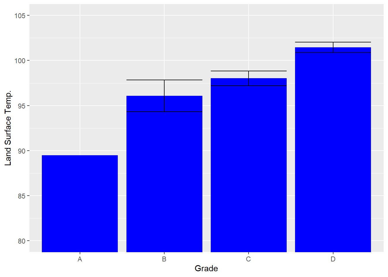
11.7.3 Comparing Multiple Variables across Groups
So far we have worked entirely with land surface temperature, but recall that the urban heat island database has a series of measures that are potentially related to temperature. Two of these, canopy cover and impervious surface coverage, are also measured on the same scale of 0–100. As a teaser to next chapter’s analysis of these variables and temperature, we might want to compare them simultaneously across neighborhoods. This is a bit more complicated as we need to create separate means for each variable across each neighborhood grade. We will need a new function, called melt() from the reshape2 package (Wickham 2020) to convert our data so that it treats each combination of measure and HOLC grade into its own row. We will then use aggregate() on this new data frame.
require(reshape2)
melted<-melt(tracts[c("Grade",'CAN_CT','ISA_CT')],
          id.vars=c("Grade"))
means2<-aggregate(value~Grade+variable,data=melted,mean)
names(means2)[3]<-"mean"
ses2<-aggregate(value~Grade+variable,data=melted,
        function(x) sd(x, na.rm=TRUE)/sqrt(length(!is.na(x))))
names(ses2)[3]<-'se'
means2<-merge(means2,ses2,by=c('Grade','variable'))
means2<-transform(means2, lower=mean-se, upper=mean+se)

ggplot(data=means2, aes(x=Grade, y=mean, fill=variable)) +
  geom_bar(stat="identity",position="dodge") +
  geom_errorbar(aes(ymax=upper, ymin=lower),
              position=position_dodge(.9)) +
  ylab("Land Surface Temp.")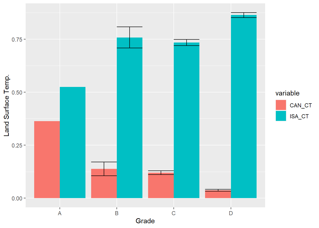
As you can see, differences in tree canopy and impervious surface correspond to differences in temperature. They also negatively correlate with each other. As there is more pavement, there is less tree canopy. And that tradeoff is most apparent in redlined neighborhoods, where there is very little canopy and lots of pavement. We will use additional statistical tests in the next chapter to evaluate the extent to which these structural differences explain temperature.
11.8 Summary
In this chapter we used the legacy of redlining and the consequent inequities as an excuse to learn the statistical tools that evaluate differences between groups. Specifically, we used t-tests and ANOVAs to assess how the grades that the HOLC gave neighborhoods in the first half of the 20th century continue to be associated with the urban heat island effect, with “redlined” neighborhoods having the hottest summers. In the process, we have learned to:
- Distinguish between equity and equality;
- Conceptualize the comparison of groups as an assessment of means and standard errors;
- Identify independent and dependent variables when conducting an analysis;
- Conduct a t-test to compare the means of two groups, or one group against a pre-established benchmark;
- Conduct an ANOVA to evaluate differences between three or more groups;
- Conduct post-hoc tests following an ANOVA to evaluate whether pairs of groups have different means;
- Visualize differences across groups with bar charts with standard errors, including comparing multiple variables simultaneously.
11.9 Exercises
11.9.1 Problem Set
- For each of the following pairs of terms, distinguish between them and their roles in analysis.
- Equity vs. equality
- Independent vs. dependent variables
- Standard deviation vs. standard error
- Mean vs. standard error
- t-test vs. ANOVA
- Single-sample t-test vs. two-sample t-test
- F-statistic vs. R2
- For each of the following scenarios, indicate whether the proposed analysis is correct or whether you would do something different and why.
- Conducting an ANOVA to compare the mean canopy between main streets and non-main streets.
- After running an ANOVA, running a series of t-tests to compare mean between pairs of groups.
- Using
t.test()to compare whether neighborhoods with above-average income have more supermarkets than neighborhoods with below-average income.
- Return to the beginning of this chapter when the tracts data frame was created. Recall that I have worked previously with multiple data sets with many more measures describing tracts, including demographic characteristics from the American Community Survey, metrics of physical disorder, engagement, and custodianship from 311 records, and social disorder, violence, and medical emergencies from 911 dispatches. For the following you can merge any of these variables into the
tractsdata frame.- Select an outcome variable of interest. Explain why you are interested in this variable.
- Select at least one categorical variable (or create one using thresholds or other logics). Explain why this variable is interesting and might be related to your outcome variable of interest.
- Run either a t-test or ANOVA for each of the categorical variables you selected or created to see if there are any differences across groups. Be certain to use the appropriate statistical tool and to conduct post-hoc tests if necessary.
- Visualize the relationship between your dependent variable and at least one of the independent variables, presumably focusing on relationships that were the most interesting.
- Summarize the results with any overarching takeaways, including whether the differences should be considered inequities.
11.9.2 Exploratory Data Assignment
Complete the following working with a data set of your choice. If you are working through this book linearly you may have developed a series of aggregate measures describing a single scale of analysis. If so, these are ideal for this assignment.
- Select at least one outcome variable of interest. Explain why you are interested in this variable.
- Select at least one categorical variable (or create one using thresholds or other logics). Explain why this variable is interesting and might be related to your outcome variable of interest.
- Run either a t-test or ANOVA for each of the categorical variables you selected or created to see if there are any differences across groups. Be certain to use the appropriate statistical tool and to conduct post-hoc tests if necessary. Try to find a way to conduct both a t-test and an ANOVA as part of this assignment, even if it takes creating a new variable.
- Visualize the relationship between your dependent variable and at least one of the independent variables, presumably focusing on relationships that were the most interesting.
- Summarize the results with any overarching takeaways, including whether the differences should be considered inequities.