8 Mapping Communities
In 1854, there was a cholera outbreak in London. At the time, most doctors believed that cholera (and other diseases) were spread through a “miasma,” or a noxious bad air. John Snow, an obstetrician and anesthesiologist, thought otherwise, reasoning that (a) there was no evidence for miasma, and (b) contaminated water made a much simpler explanation that was consistent with his anecdotal observations. The outbreak gave him an opportunity to make his case in a more systematic fashion.
Snow mapped the home address of each of the recorded deaths stemming from the cholera outbreak, as seen in Figure 8.1. In doing so he revealed a clear pattern. The deaths were spatially clustered around a single water pump on Broad Street. Further, when he drew a line (faintly visible in the map) around the households that were nearer to that water pump than any other—thereby making them most likely to access water from it—it contained almost all of the deaths. This was strong evidence that the water pump was the source of the cholera outbreak and, in turn, for Snow’s theory that cholera was transmitted by contaminated water.
The story of Snow’s map, the contaminated Broad St. water pump, and the transmission of cholera is one of the iconic illustrations of the power of spatial data. Sometimes, simply plotting points on a map can communicate intricate patterns and reveal important relationships and mechanisms. And we have come a long way since 1854, with sophisticated file formats, software, and analytic tools for examining and communicating spatial data. These Geographical Information Systems (GIS) can be applied to nearly any question. Researchers at Columbia University mapped incarcerations in New York City, identifying concentrations that were literally costing the state millions of dollars, or what they referred to as “million dollar blocks” (Kurgan et al. 2012). Mike Batty and his team at the University College London’s Centre for Advanced Spatial Analysis have digitized the road network of London going back to 1786, thereby modeling the ways in which roads grow outward and how side roads are constructed, comparing it to the growth of vein networks in leaves (Masucci, Stanilov, and Batty 2013). Recent advances in participatory GIS have enabled community organizations to crowdsource the ways that residents perceive their space, reconfiguring maps to reflect the experiences of those who live there. And NASA and others have used sensors on planes and satellites to map ground conditions, from estimated population to surface temperature to the density of trees.
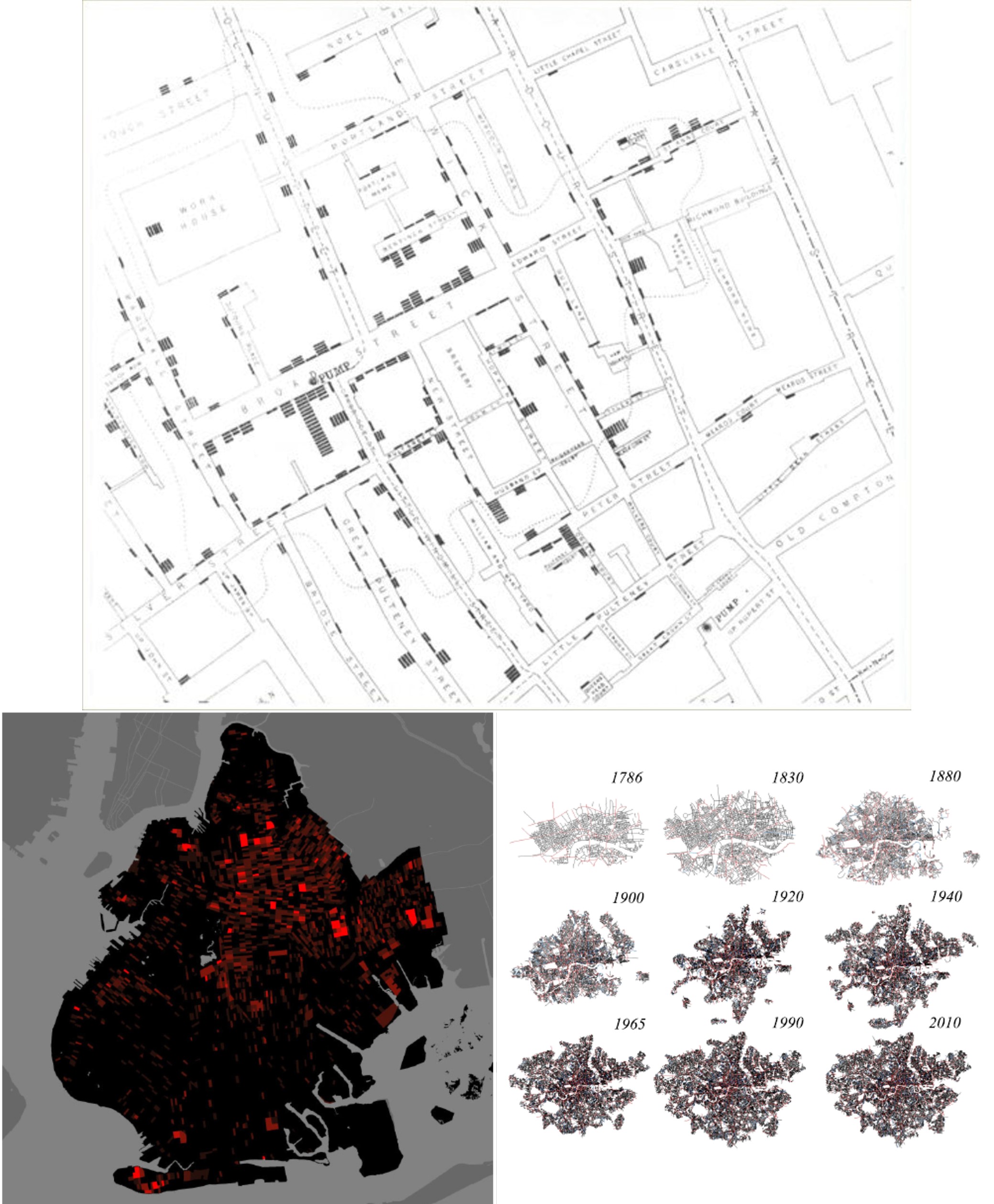
Figure 8.1: Mapping spatial data can illustrate a wide range of phenomena, from John Snow’s demonstration that a contaminated water pump was responsible for a cholera outbreak in London in 1854 (top), to more modern applications, like the identification of blocks in Brooklyn, New York where more than a million dollars were spent on the incarceration of residents (bottom left), to the examination of the evolution of London’s road network over the centuries (bottom right). (Credit: John Snow, Columbia University’s Center for Spatial Research’s, University College London’s Bartlett Centre for Advanced Spatial Analysis)
Working with GIS is a distinctive skill because the data have a different structure. Think about it. Instead of just a list of objects (i.e., rows) and their attributes (i.e., columns), we now need all of the information necessary to place those objects on a map. For reasons we will get into, that can be rather complicated to do, and thus GIS comprises a variety of specialized tools for solving these challenges. In this chapter, we will learn a bit more about the data structures used to organize spatial information, known as shapefiles, and how to work with them.
8.1 Worked Example and Learning Objectives
In this chapter, we will learn about shapefiles, the primary data structure for organizing spatial information, and the skills necessary to work with them in R. To do so, we will leap from last chapter’s example of historical census data to modern census data, mapping the demographics of Boston today. This will leverage the Boston Area Research Initiative’s Geographical Infrastructure for the City of Boston (see Chapter 6 for more on the schema), specifically the scale of census tracts (approximations of neighborhoods with ~2,500 residents). We will learn to:
- Describe a shapefile and why spatial data requires a unique structure;
- Identify the multiple types of spatial data;
- Import and manipulate a shapefile in R using the sf package;
- Make a map using ggmap, a companion package to ggplot2;
- Utilize point data, whether in a spatial form to start with or not;
- Connect to other tools for spatial analysis outside of R.
Links
Shapefile for tracts: https://dataverse.harvard.edu/dataset.xhtml?persistentId=doi:10.7910/DVN/SQ6BT4
Census indicators: https://dataverse.harvard.edu/file.xhtml?persistentId=doi:10.7910/DVN/XZXAUP/IDL8OA&version=3.0
You may also want to familiarize yourself with the data documentation posted alongside each of these datasets.
Data frame name: tracts_geo
8.2 Intro to Geographical Information Systems
Spatial data are unique for the very reason that they contain spatial information. This creates a variety of complications that Geographical Information Systems (GIS) software need to account for. In this section we will learn more about what these complications are and their implications; the types of spatial data that we typically encounter; and sf, the R package designed to work with them (Pebesma 2021).
8.2.1 Structure of Data
Compare, for a moment, the two images in Figure 8.2. On the left side, we have a spreadsheet with a list of the states in the United States, including their names and attributes like size, population, etc. Alongside it, we have a simple map of the 48 contiguous states. Visually, the image on the right is easier to digest. We see all of the states at once, their relative sizes are more or less apparent, and we could even recolor it to reflect differences in population, or any other attribute that our hearts desire. But a lot goes into making that map. How, for instance, does the software know all of the detailed curves that define the shape of each state? How does it know where to place them? And how is it still capable of knowing all of the attributes contained in the spreadsheet?
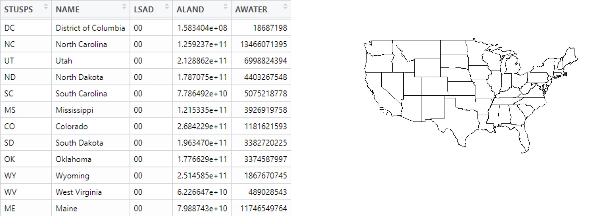
Figure 8.2: The information contained in a spreadsheet describing the states of the United States (left) can be more easily communicated through a simple map of them (right).
Describing spatial objects requires the coordination of two sets of information. First, it relies on the traditional spreadsheet with rows (cases) and columns (variables). The variables in this case are called the “attributes” of the spatial objects. Second, it requires information on the spatial placement and shape of those objects. As we will see, this information can be more or less complicated depending on the type of spatial information. For an example like the states, plotting their shapes entails the encoding of lots of irregular edges, which consists of lots of detail that would be difficult to put in a traditional spreadsheet. For instance, suppose the border of one state is defined by a line that connects 25 different points (or vertices) and another requires 40 different points (or vertices). Would the spreadsheet have 40 additional columns for spatial information, with some columns empty for certain rows? If so, how would we know when creating the file how many columns were necessary? Would all vertices be contained as a list in a single column? If so, how would we be able to access each point individually?
This complexity is solved by the shapefile, which has the suffix .shp. In fact, a shapefile is not a single file, but a composite of complementary files describing the same data, including:
- .shp catalogs all of the objects and their vertices.
- .dbf is a specialized form of the traditional spreadsheet or data frame, with all of the objects and their attributes.
- .shx is an index of all the objects, permitting coordination between the .shp and .dbf.
Each of the files must have the same name, differing only in the file type (e.g., Tracts.shp, Tracts.dbf, and Tracts.shx), otherwise the software will not be able to coordinate them. Often there are numerous other files in addition to these three required elements, many of which provide extra detail and enhance the processing of the data by GIS software and the precision with which they can be analyzed and mapped. One of these is the .prj, which encodes the coordinate projection, which we are about to learn more about.
8.2.2 Coordinate Projection Systems
The world is round. Maps, at least ones that we print on paper or create on our computer screens, are typically flat. How do we deal with that? This is the job of the coordinate projection system (CPS), which uses a fixed equation to translate the curvature of the Earth to a flattened approximation. This generally works pretty well, though it has its weaknesses. First, the further we zoom out, the more problematic the curvature becomes. To illustrate, we can generally see about 3 miles into the distance before things fall beneath the horizon—that is to say, things more than 3 miles away are not in our line of sight because the curve of the Earth’s surface hides them from our view. Thus, CPSes are always going to be an approximation.
Take, for instance, what happens when we try to generalize a CPS to the entire planet. This can be seen when we apply different CPSes to maps of the entire world, as in Figure 3. The Mercator Projection with which we are most familiar tends to exaggerate land near the poles and shrink land near the equator, making Antarctica look gigantic and Africa undersized relative to their actual land masses. Part of the issue here is that, as we zoom out, we are forced to make more and more of an approximation that violates the three-dimensional reality of how places are situated along the Earth’s curved surface.
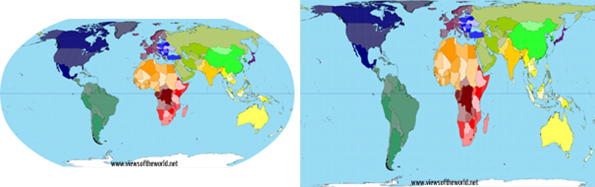
Figure 8.3: Most people are familiar with the Robinson projection for representing the world (left), which exaggerates the size of land near the poles and makes land near the equator look smaller. New techniques have been used to better represent the true land area of countries (right). (Credit: www.viewsoftheworld.net)
The existence of curvature alone is not the entirety of the problem. A further complication is that the curvature of the earth is not consistent across places but varies by where you are. The curve of the ground follows a gradient from horizontally flat at the poles and perfectly vertical at the equator. Consequently, a single CPS is never going to provide a perfect translation between the three-dimensional reality of space into a two-dimensional approximation for all places. We need different CPSes for each region. There are CPSes maintained by the United States Geological Survey that are reasonable approximations for mapping the entire United States. There are also distinct CPSes maintained for each state that are more precise for where they are located. Other countries maintain their own CPSes.
In nearly all cases, spatial data that you access will come with a standardized CPS. Rather than create one yourself you can lean on the hard work of others before you. What can be tricky, though, is that not all generators of spatial data use the same projection system. For instance, you might find one shapefile of data for Boston uses a Massachusetts-specific CPS and another uses a national CPS. This will often create minor discrepancies that seem trivial, but will make maps look ugly (e.g., streets being 20 feet out of line and covering images of buildings) and analyses imprecise. It can also create rather bemusing (or confounding) mismatches, like the time I accidentally mapped a bunch of 311 reports occurring in Boston to the middle of Angola. As we will see, though, because each CPS is simply a set of equations translating longitude and latitude to a two-dimensional plane, GIS software can translate between them seamlessly.
8.2.3 Types of Spatial Data
There are four main types of spatial data that you are likely to encounter: points, lines, polygons, and rasters. As summarized in Figure 8.4, these are categorized by the amount of information needed to define them and, consequently, how GIS software needs to organize that information. All are based on one or more coordinates, each one including a latitude and longitude or other way of placing an item on a two-dimensional, x-y plane. A given .shp can only contain objects of one of these types.
Points. Each object in a point .shp describes a discrete location with a single coordinate (x, y). Examples include events that are mapped to a single address (311, 911 calls). Also, many places that are shapes in real life can be abstracted as points if one is zoomed out far enough. For example, a building or address can often be represented as a point, and on national maps towns and cities are often represented as points, despite having more complex shapes. As we will see in Section 8.5, point data are the easiest to reconfigure as traditional data frames as their spatial information can be encoded in two variables—-the x and y components of the coordinate. This makes it possible to store and analyze point data in both forms.
Lines. Each object in a line .shp describes a line segment defined by a start point and end point {(x1,y1), (x2,y2)}. A common example of this is a street map. It is important to note that in GIS, a long street is not typically a single object. It is a series of line segments that run from intersection to intersection (or from intersection to dead end), defined by each of those end points. It is possible, though, to use attributes like a name column to identify every street segment that composes, say, Main Street.
Polygons. Each object in a polygon .shp describes a two-dimensional shape with both length and width. These are defined by a series of three or more vertices, placed in the order in which they are connected, much like a dot-to-dot activity. This can be represented as {(x1,y1), …, (x1,y1)}. An example of this is the states in Figure 8.2. We will also work primarily with this type of shapefile in the worked example of census tracts here.
Raster. Rasters are a special type of spatial data that organizes a landscape into grid cells, giving a value to each of one or more attributes. Rasters are popular for data collected by sensors on satellites or planes that try to describe conditions continuously across space. Interestingly, they do not actually need to be in the .shp format but can be represented in .jpg or .gif formats. This is because the grid is all the spatial information that needs to be described, and a graphic format is simply a grid. We will not work much with raster data in this book except in the form of “base maps,” which are pre-constructed maps that have been exported as rasters that we can then place our own information on top of. For example, if we use a base map provided by Google Maps to put context around the locations of Craigslist postings, the Google Map is a raster.
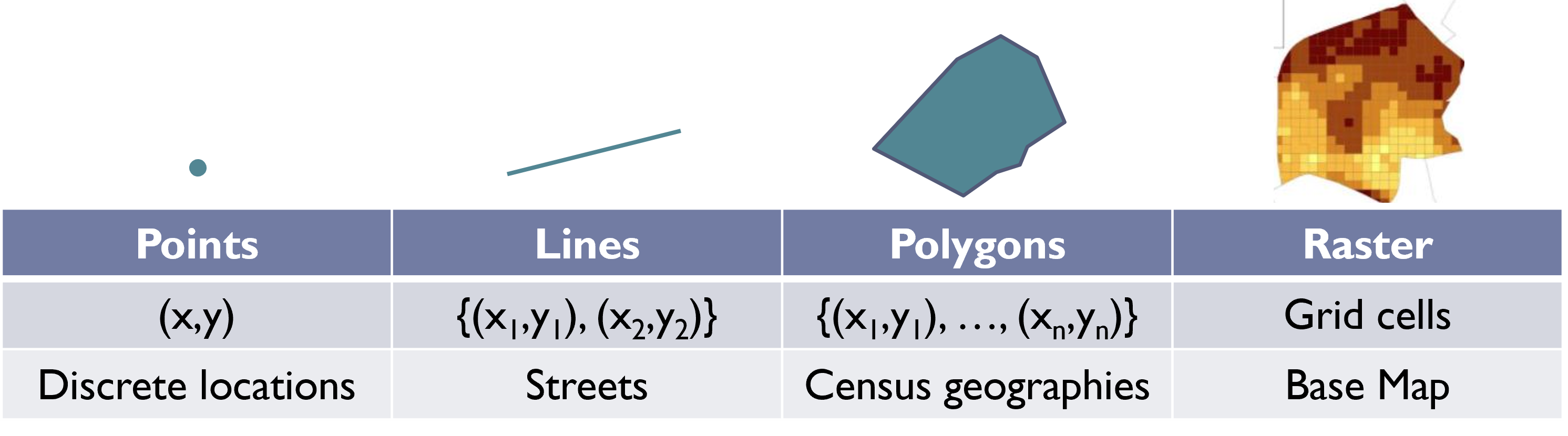
Figure 8.4: A brief summary of the four main types of spatial data, including the quantity of geographic points needed to draw them and illustrative examples.
8.2.4 Making a Map: Layering .shps
Each shapefile contains the spatial and attribute information for a clearly defined set of objects. For instance, returning to BARI’s Geographical Infrastructure for the City of Boston, there are .shps for addresses, streets, multiple census geographies, and multiple administrative boundaries. Most often, we want to create a map of the city that includes two or more of these. For instance, in a standard map of the United States, we want to see the states as polygons, but also capital cities as points, major highways, and large rivers and lakes as lines. Each of these elements is stored in its own .shp and can be visualized in a variety of ways, depending on its attribute data. How we choose to visualize each is called a layer, and a map consists of multiple layers. In the sections that follow, we will see how we import .shps into R and then layer them to create what we would recognize as a map.
8.3 Working with Spatial Data in R
8.3.1 The sf Package
GIS software entails a series of specialized functions for working with shapefiles, including coordinating the multiple files that compose them, representing them graphically, and analyzing their content. The most common software for doing so is ArcGIS, which is built by the company ESRI. ESRI is one of the pioneers in spatial data analysis and is responsible for designing the current .shp file format. Most municipalities, for instance, have a license for ESRI software. ESRI provides powerful tools for working with spatial data. In recent years, the opensource movement has given rise to Quantum GIS (or QGIS), a freeware alternative to ArcGIS that has many (but not quite all) of the same tools and functions—it is even designed to look nearly identical. Unless you have specific, advanced needs, like the creation of three-dimensional maps and animations, you could probably do your work successfully in QGIS.
R also has the capacity to work with spatial data thanks to multiple packages designed for that purpose. The most popular currently is sf, which stands for “simple features.” The sf package, as its name implies, has streamlined the way R handles spatial data, making the code for working with spatial data more straightforward and the computational tasks more efficient than previous packages. Both of these advances are good for analysis and that is why we are going to focus on sf in this chapter. To be certain, ArcGIS and QGIS have more tools and are better equipped to generate highly customized, attractive maps. sf can do the job effectively, however, and it allows you to keep your data analysis and spatial visualization in a single platform and syntax. You may find as you develop more skills, however, that you pick and choose between these softwares depending on the circumstance.
8.3.2 Importing Spatial Data into R
To get started with a spatial data set in R, we first need to import it, which requires a specialized function for reading in .shps. The st_read() function in sf is able to import .shp files into R, analogous to read.csv(). When we run:
require(sf)tracts_geo<-st_read("Unit 2 - Measurement/Chapter 08 - Mapping Communities/Example/Tracts_Boston_2010_BARI.shp")
we are notified that this is an ESRI shapefile with 178 features (observations) and 16 fields (though it is listed in the Environment as having 17 variables, the last of which is the spatial information), and its features are polygons. R also tells us what its “bounding box” is, or the coordinates that, if used to create a rectangle, would contain all of the objects, and that the CRS, or coordinate reference system (a synonym for CPS), is NAD83, which was designed for data in North America in 1983.
If we want to get to know the data further we can View() it or examine the head(). If you scroll over to the far right, you will find the last column, geometry, contains a list of coordinates for each row. These are the vertices describing the polygon. We can use the str() command, as we did in Chapter 3 when looking for initial information about a data set and its variables. We also can learn more about the projection with st_crs().
st_crs(tracts_geo)## Coordinate Reference System:
## User input: NAD83
## wkt:
## GEOGCRS["NAD83",
## DATUM["North American Datum 1983",
## ELLIPSOID["GRS 1980",6378137,298.257222101,
## LENGTHUNIT["metre",1]]],
## PRIMEM["Greenwich",0,
## ANGLEUNIT["degree",0.0174532925199433]],
## CS[ellipsoidal,2],
## AXIS["latitude",north,
## ORDER[1],
## ANGLEUNIT["degree",0.0174532925199433]],
## AXIS["longitude",east,
## ORDER[2],
## ANGLEUNIT["degree",0.0174532925199433]],
## ID["EPSG",4269]]Most of this is unintelligible to the average user, but it is good to know it is there. The key is that this shapefile is in the NAD83 projection and will align cleanly with others on the same projection. If two shapefiles have different projections we may need to convert the projection of one or the other, although often sf is able to solve that problem for us on the fly because it is aware of these differences and has built-in transformations.
8.3.3 Plotting a Shapefile
Let’s get to know our shapefile better in the way that it was meant to be viewed—as a map! This is done with the plot() function. plot() stops a step short of truly making a map with multiple layers and full customization, but it does give us a first view into a shapefile the way summary() or str() might for a data frame.
plot(tracts_geo)## Warning: plotting the first 9 out of 16 attributes; use max.plot
## = 16 to plot all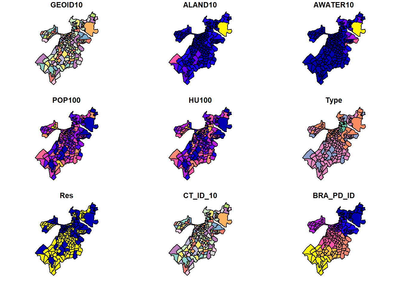
Note that we receive an error warning that it will only plot 10 of the attributes for us. You can read more about these variables in the data documentation, but many of the variables and their coloration probably make immediate sense. ALAND10 and AWATER10 are the land and water area contained in each tract, and they are largest at the edges of the city and on the coast, respectively (brighter colors). Population (POP100) and households (HU100) also vary across communities.
What if we want something simpler though, like just seeing the polygons themselves. We can do this with the st_geometry() command within the plot().
plot(st_geometry(tracts_geo))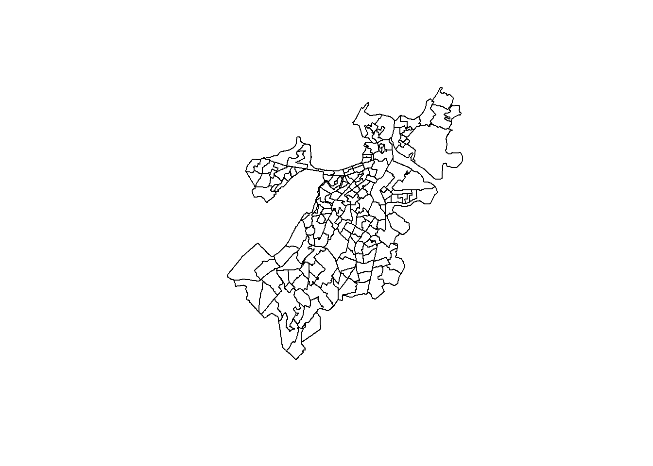
One fun feature of plot() is that it can layer plots on top of each other using the add=TRUE argument. So, if we want to add more information, like, say, whether a census tract is predominantly residential or not, we can do the following.
plot(st_geometry(tracts_geo))
plot(st_geometry(tracts_geo[tracts_geo$Res==1,]),
     add=TRUE, col='red')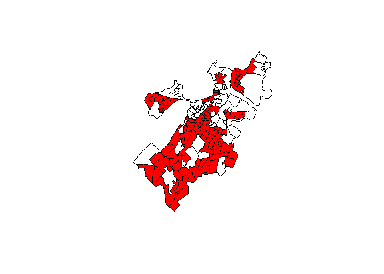
What if we want to visualize a continuous variable? Our instincts might suggest the following code:
plot(tracts_geo$POP100, main = 'Population in 2010',
     breaks = 'quantile')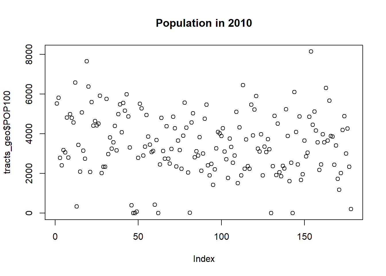
Unfortunately, this produces a dot plot that inexplicably has an index for the census tracts on the x-axis and the population on the y-axis.
This is because $ notation in this case creates a numeric vector that has been separated out from the shapefile. Instead, we need [] notation.
plot(tracts_geo['POP100'], main = 'Population in 2010',
     breaks = 'quantile')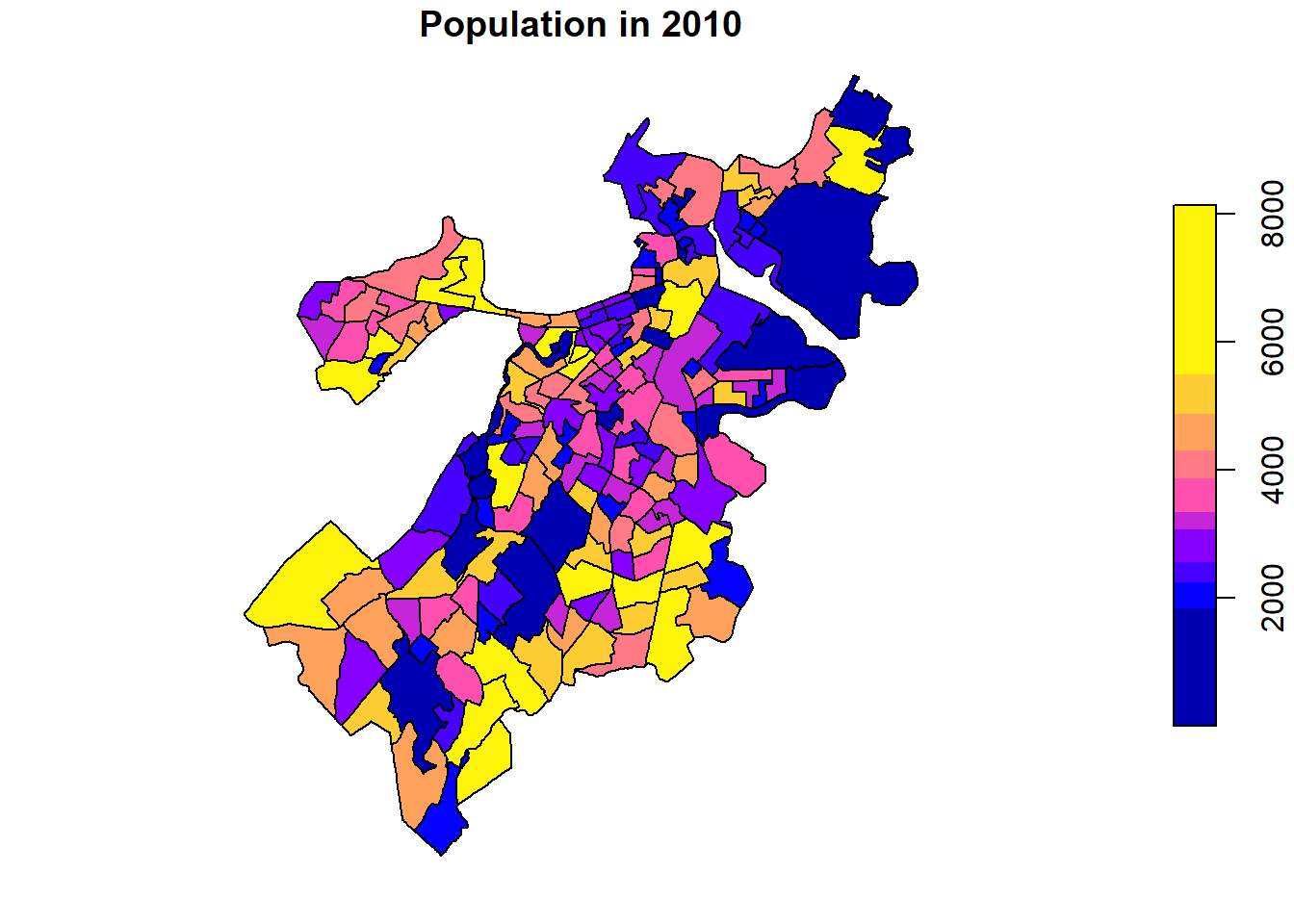
Now we have a plot of a single variable that clearly communicates the number of people living in each census tract. (Note that I have added breaks=’quantiles’ to the command to make it more readable as some tracts are outliers with much more population than others. This is not entirely necessary. Feel free to see what the map would look like without this additional argument, or other options for breaks=.)
8.4 Making a Map
Let’s make a map for real, one that capitalizes on additional information from our schema, has multiple layers, and that we can fully customize. This is going to consist of four steps: (1) importing and merging additional data; (2) creating a base map; (3) making a multi-layer map; and (4) customization.
8.4.1 Importing and Merging Additional Data
Our shapefile contains all census tracts for the City of Boston. Census tracts are good approximations of neighborhoods and many institutions release data describing them, all of which could easily be merged with our shapefile and incorporated into a map. Most notably, the U.S. Census Bureau releases a plethora of variables describing their population, households, and other characteristics. BARI curates a subset of these and publishes them with each update of the American Community Survey. We will incorporate these for the 2014-2018 estimates by importing them and merging them with our shapefile.
demographics<-read.csv("Unit 2 - Measurement/Chapter 08 - Mapping Communities/Example/ACS_1418_TRACT.csv")
tracts_geo<-merge(tracts_geo,demographics,by='CT_ID_10',all.x=TRUE)Note at this point a few details. First, the merge() command was able to work with tracts_geo as if it were a standard shapefile, merging the columns from demographics based on the shared CT_ID_10 variable. tracts_geo now has 74 variables instead of 17. Also, BARI’s census data are for all of Massachusetts and have 1,478 census tracts, so we use the all.x=TRUE command to account for the differences between the files and to safeguard the rows that we know we want to keep. Last, if you would like, take a look at names(). You will notice that geometry remains the last variable as that is required for sf to be able to continue working with it as a shapefile.
8.4.2 Creating a Base Map
Before we map our census tracts, we need a base map layer to place them on. Otherwise, as in the plots above, we will see the outline of Boston but without any geographic context. Incorporating a base map will require ggplot2 and its companion package ggmap. The latter provides us with the command get_map() for accessing publicly available base maps. The default is an opensource map from Stamen, which we will use here.
require(ggplot2)
require(ggmap)
Boston<-get_map(location=c(left = -71.193799,
                           bottom = 42.22,
                           right = -70.985746,
                           top = 42.43),
                source="stamen")
Bostonmap<-ggmap(Boston)
Bostonmap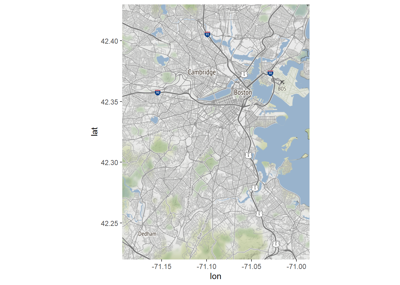
Let’s walk through what happened in those three lines of code and why we now have a map of Boston. First, we specified the bounding box for our map (which if you compare to above is quite similar to the bounding box for our census tracts). Another way to do this is to specify a single point and a zoom level; see the ggmap documentation for details. We stored the product in the object Boston. Note that the console generated a series of lines of the form:
Source : http://tile.stamen.com/terrain/12/1240/1517.png
These are the many tiles or grid cells that constitute the base map that we downloaded, which is actually a raster.
Now that we have a base map object, we need to convert it into a ggplot2 compatible object. The ggmap() command does this, acting as an equivalent to the ggplot() command, which creates the basis for a non-spatial graphic. And with that, we have a map of Boston.
8.4.3 Making a Multi-Layer Map
We are now ready to make a multi-layer map that combines our base map with a visualization of the census tract data. We can start simple, replicating our plot distinguishing between neighborhoods that are and are not predominantly residential.
Bostonmap + geom_sf(data=tracts_geo, aes(fill=as.factor(Res)),
                    inherit.aes = FALSE)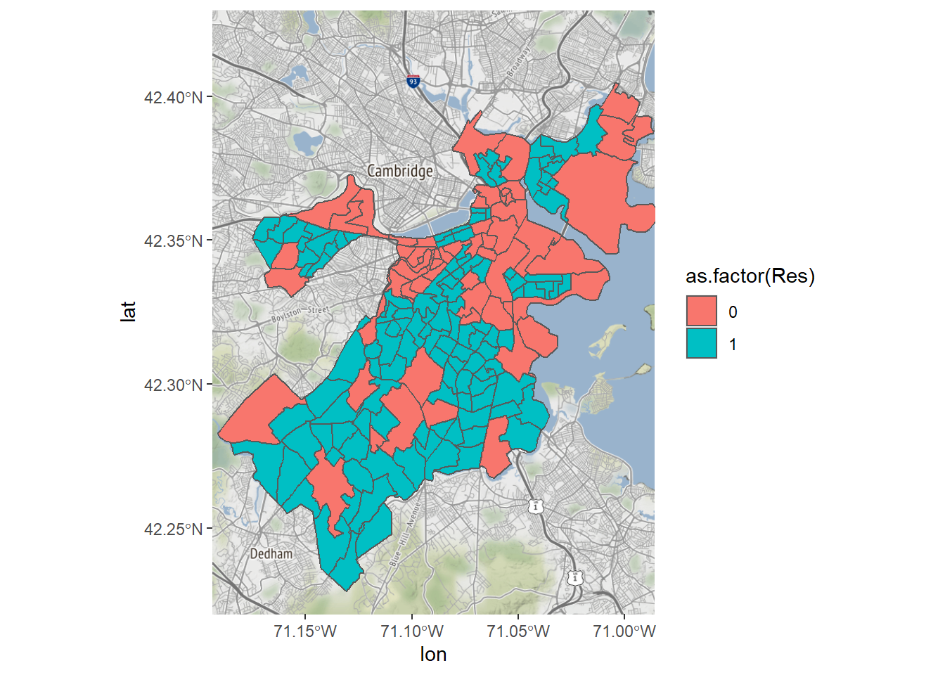
That’s it! One line of code, thanks to the elegance of ggplot2. Note that we already have the base map stored as Bostonmap, so this is equivalent to:
ggmap(Boston) + geom_sf(data=tracts_geo, aes(fill=as.factor(Res)),
                        inherit.aes = FALSE)
What we have done new is incorporate the geom_sf() function, which follows the standard structure of ggplot2 commands, specifying a geometry, in this case of the form sf. It includes, as is often the case, a data= argument, an aes() argument that can be used to specify the logic for fill= or the color of each object. We also need to specify inherit.aes=FALSE to avoid any disagreements between our ggmap() command and the new data. This proves useful because the two have different coordinate projections. As the console tells us, R detected this and converted all layers to match the NAD83 projection of our shapefile.
We could color the tracts according to the values of a continuous variable, like income, which will be the basis for the rest of this example. The technical term for this is a chloropleth, or the use of a color gradient to describe the distribution of a variable across spaces.
Bostonmap + geom_sf(data=tracts_geo, aes(fill=MedHouseIncome),
                    inherit.aes = FALSE)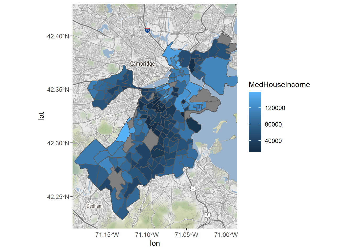
We can now see that the south-central part of the city has the lowest incomes in the city, and peripheral areas, which are more suburban, are more affluent. There are certainly ways that we can customize this map to be a bit easier to read, though.
8.4.4 Customization
Let’s finish by customizing our map of income in Boston. As we go through, we will iteratively add new elements and new arguments to existing elements in our ggplot2 command. First, it is hard to know how to interpret the median income of places with very few residents, so we will exclude tracts with a population lower than 500.
Bostonmap+ geom_sf(data=tracts_geo[tracts_geo$POP100>500,],
                   aes(fill=MedHouseIncome),inherit.aes = FALSE)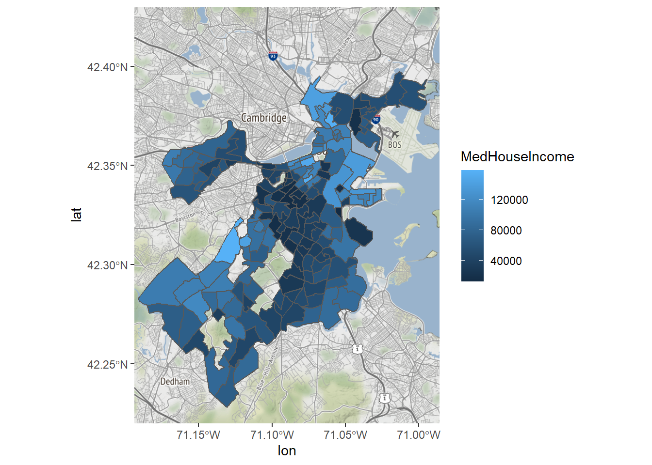
Maybe we also want to change the color gradient, say, running from red to green, changing color at the midpoint.
Bostonmap+ geom_sf(data=tracts_geo[tracts_geo$POP100>500,],
                   aes(fill=MedHouseIncome),inherit.aes = FALSE)+
  scale_fill_gradient(high = "green", low = "red")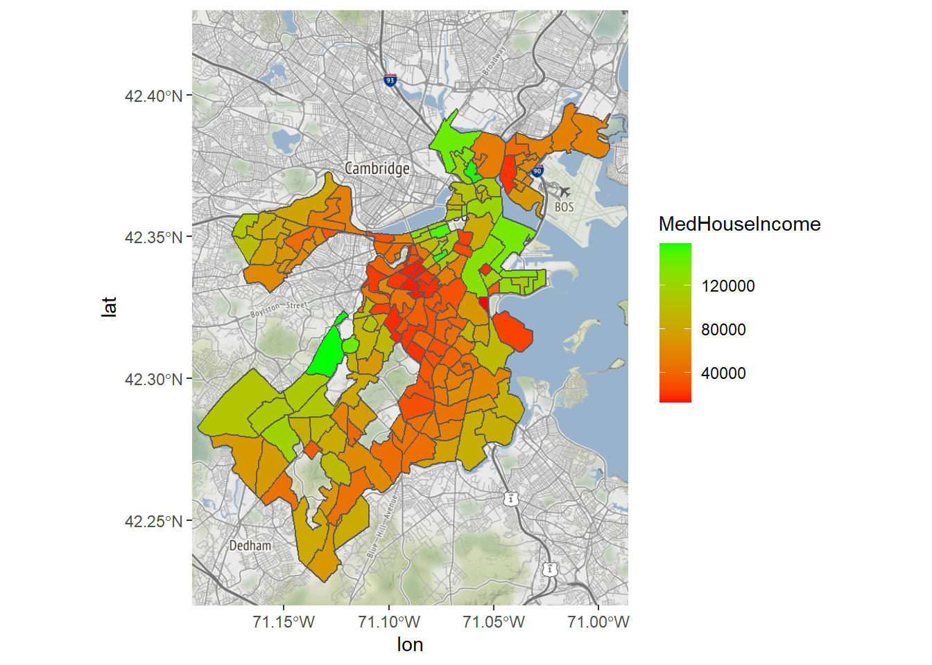
Last, a better legend label would be helpful.
Bostonmap+ geom_sf(data=tracts_geo[tracts_geo$POP100>500,],
                   aes(fill=MedHouseIncome),inherit.aes = FALSE)+
  scale_fill_gradient(high = "red", low = "green")+
  labs(fill='Median Household \nIncome')
8.4.5 Summary and Extensions
We have learned how to create a multi-layer map. This is a very generalizable skill. You can now create a chloropleth for any variable in the demographic indicators that we just merged with the shapefile. You could also do the same for any other data set at the census tract level—or any other shapefile you might encounter. Though the precise representation of points and lines will be slightly different, many of the same conventions apply. Also, this map only has two layers on it, but you could easily add more, including points or a road map. The world is your oyster.
8.5 Working with Points
A very common type of spatial data is points. Points are special for a couple of reasons. First, they are frequently the way that we represent the events and transactions that are captured by administrative and internet systems. Each record references the discrete location where said event occurred, and that is represented with a latitude and longitude. Second, latitude and longitude can easily be organized into two columns. Thus, there are a lot of data sets out there that are currently in a .csv or data frame format that can be coerced into a mappable form. We are going to illustrate this with an old friend from Chapter 3, the reports received by Boston’s 311 system. We will specifically analyze cases in 2020 referencing graffiti. Note that we will use tidyverse commands in the example that follows.
CRM<-read.csv("Unit 1 - Information/Chapter 3 - Telling a Data Story/Example/Boston 311 2020.csv")
require(tidyverse)
CRM<-CRM[str_detect(CRM$type,'Graffiti'),]
8.5.1 “Map” Records with lat-long
If we look at the names() in CRM, we will note that two of the columns are titled latitude and longitude, which, respectively, can be treated as y and x coordinates (oddly, latitude comes first but is north-south, meaning a y-coordinate, and longitude is east-west, meaning an x-coordinate). We can leverage these to treat them as point data.
Bostonmap + geom_point(data=CRM, aes(x=longitude, y=latitude))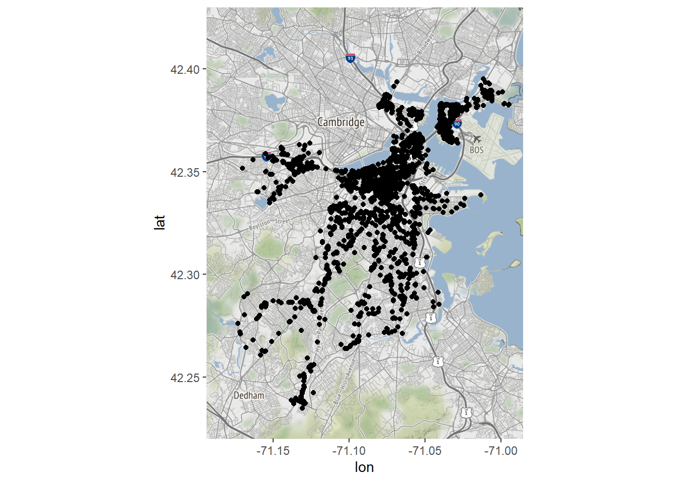
We now have a map of all the complaints about graffiti received by Boston’s 311 system in 2020. Note that the command for doing this was geom_point(), which we used to create dot plots in Chapter 7. It is not really a spatial command, but we were able to exploit the fact that a map is simply a two-dimensional plane with an x- and y-axis. Luckily, our points were drawn from a coordinate system that was consistent with that of our base map, making this possible. Otherwise, R would have no information to transform the two to match each other.
We can draw some simple inferences from this map, the most obvious being that most graffiti reports come from the downtown business district and few occur in the outlying neighborhoods. But the points are so numerous and dense that it is hard to say much more. We might get more out of a density plot, though, another skill we learned in Chapter 7.
Bostonmap + geom_density2d(aes(x=longitude, y=latitude),
                           bins=200, data = CRM)
Now we see something that looks akin to a topographical map for the density of graffiti complaints. We note that, as the points suggested, there are a lot more graffiti complaints in the downtown area near the harbor and along the river. As far as the plot is concerned, there might as well not be any reports in the outlying neighborhoods. The same thing is apparent if we use the aesthetically fancier stat_density2d().
Bostonmap + stat_density2d(aes(x=longitude, y=latitude,
                               fill = ..level.., alpha = .5),
                           size = .5, bins = 200,
                           data = CRM, geom = "polygon")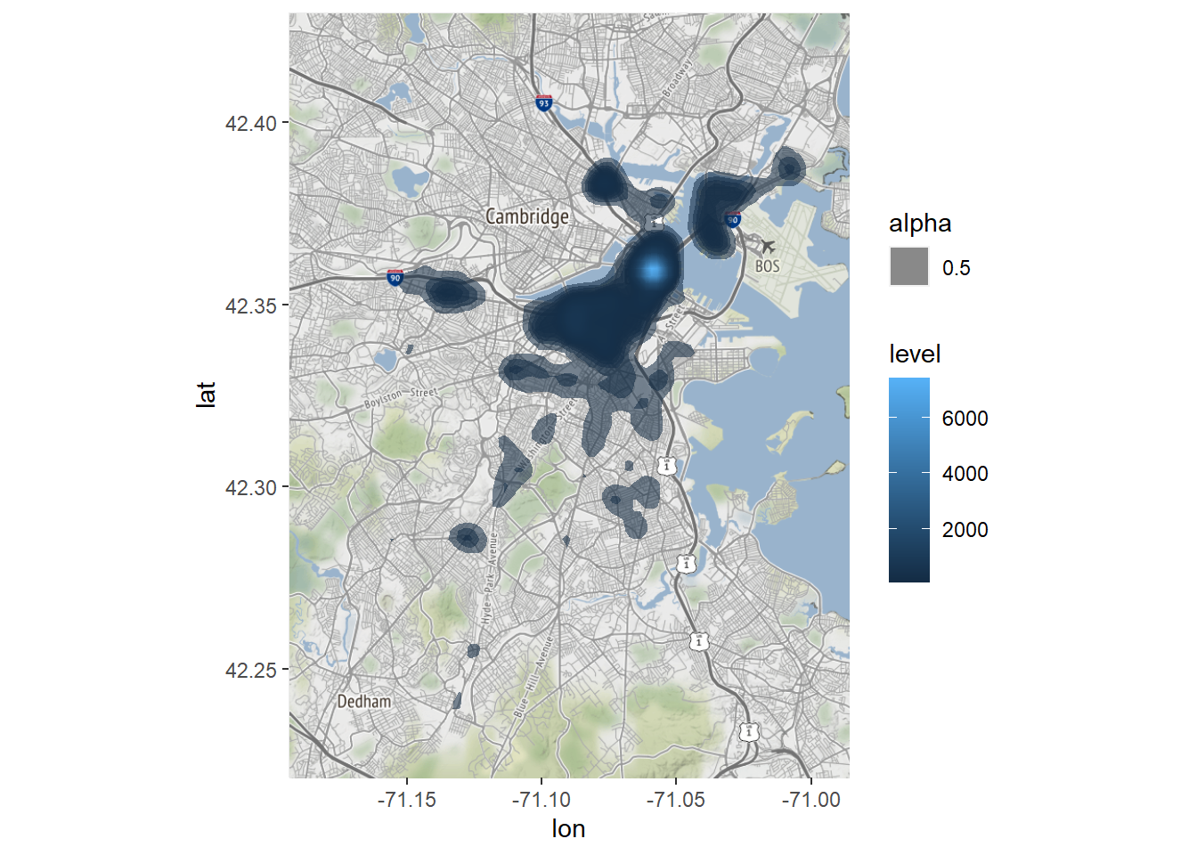
This tells the same story but with a bit more color. Clearly, the downtown area is where graffiti—or at least complaints about graffiti—concentrates.
8.5.2 Converting Records into sf Points
Thus far we have leveraged the latitude and longitude columns to visualize our 311 records as if they were spatial, but we have not actually converted them to spatial data as recognized by sf. This means we cannot leverage their spatial information for specialized tools or relate them to other spatial information, like our census tracts. Because the events occurred within census tracts we might want the two data sets to speak to each other.
We can convert records with latitude and longitude to sf points using the st_as_sf() command.
CRM_geo<-st_as_sf(CRM, coords=c('longitude','latitude'),
                  crs=4269)
This command required us to indicate our data frame, input coordinate variables, in the order of x and y (cords=c(‘longitude’,’latitude’)), and the CRS. Note that CRS 4269 is the numeric code for NAD83, which is how these points were generated.
Before we move on to use these points as spatial features, take a quick look at the new object.
class(CRM_geo)## [1] "sf" "data.frame"Its class is now “sf” “data.frame”.
Notably, it has one variable fewer than the original data frame. Why? (If you want to take a moment to solve this conundrum, please do.)
Answer: st_as_sf() took the two coordinates and combined them into a single geometry variable, which, as we have seen, contains the spatial information for all sf objects.
8.5.3 Spatial Joining Points with Polygons
Now that our graffiti complaints are an sf object, we can relate them to our census tracts. The easiest way to do this is with the plot() command.
plot(st_geometry(tracts_geo))
plot(st_geometry(CRM_geo),col='blue',add=TRUE)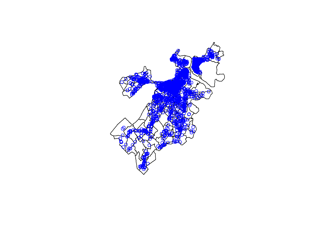
By using the add=TRUE argument, we were able to build a multi-layer plot of points on polygons. This illustrates that the two overlap as we might expect. What if we want to analyze their relationship? Say, for example, we want to know which census tract each point falls within. This is exactly the kind of thing that sf is designed to accomplish.
The st_join() function conducts what is referred to as a spatial join. Just as we learned in Chapter 7 about joins linking records from different data sets based on shared variables, a spatial join links them based on shared spatial information.
CRM_tract<-st_join(CRM_geo,tracts_geo,left=TRUE)We have now created a new version of our CRM_geo object that has 101 variables, which makes sense because we had 28 variables in the previous version of this object and there were 73 non-geometry variables in tracts_geo. If we look at the names, we now have attached to every record the CT_ID_10 of the tract containing it and all of its associated information.
8.5.4 Aggregating Spatially Joined Data
Last, now that our points are linked to our tract polygons, we can use the former to describe the latter. To do so we will return to the tools for aggregation that we learned in Chapter 7. Suppose we want to map how many graffiti complaints come from each census tract. We can do this by:
tracts_graf<-CRM_tract %>%
  group_by(CT_ID_10) %>%
  summarise(graffiti=n()) %>%
  st_drop_geometry()
tracts_geo<-merge(tracts_geo,tracts_graf,
                  by='CT_ID_10',all.x=TRUE)
Note that we had to use st_drop_geometry() before merging because sf assumes that any manipulation of an sf object will still be an sf object, and you cannot merge two sf objects because of the geometries.
Now we can create a map of graffiti complaints by census tract.
Bostonmap+ geom_sf(data=tracts_geo[tracts_geo$POP100>500,],
                   aes(fill=graffiti),inherit.aes = FALSE)+
  scale_fill_gradient(high = "red", low = "green")+
  labs(fill='Graffiti \nComplaints')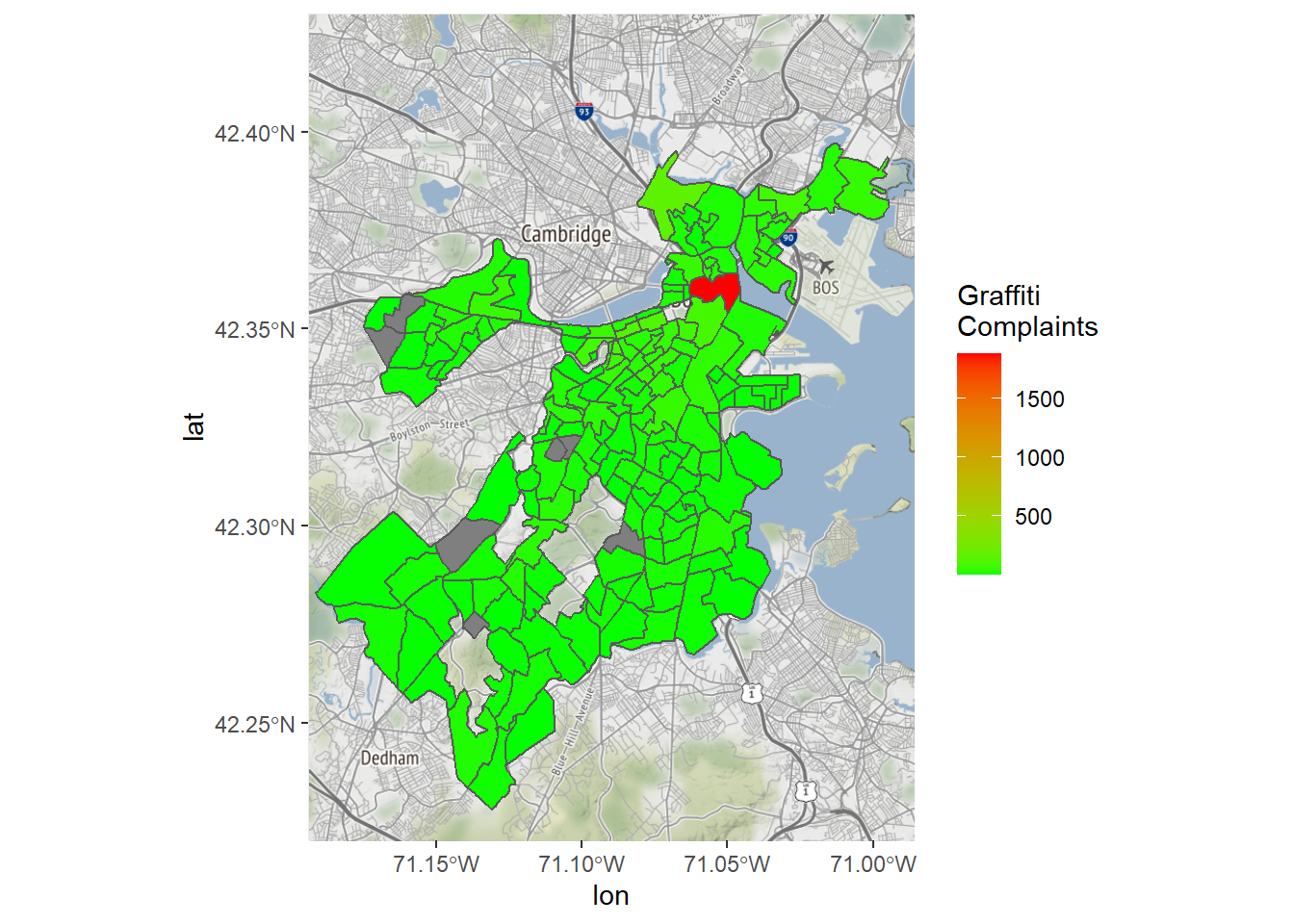
We do seem to have a problem, though, as there is a single outlier dominating the map. This also explains the extremities of the density maps we saw above. Why might this be? It turns out that that census tract contains City Hall, which is a default for mapping cases without location information. We should probably do it again without that tract.
Bostonmap+ geom_sf(data=tracts_geo[tracts_geo$POP100>500 &
                                     tracts_geo$graffiti<1000,],
                   aes(fill=graffiti),inherit.aes = FALSE)+
  scale_fill_gradient(high = "red", low = "green")+
  labs(fill='Graffiti \nComplaints')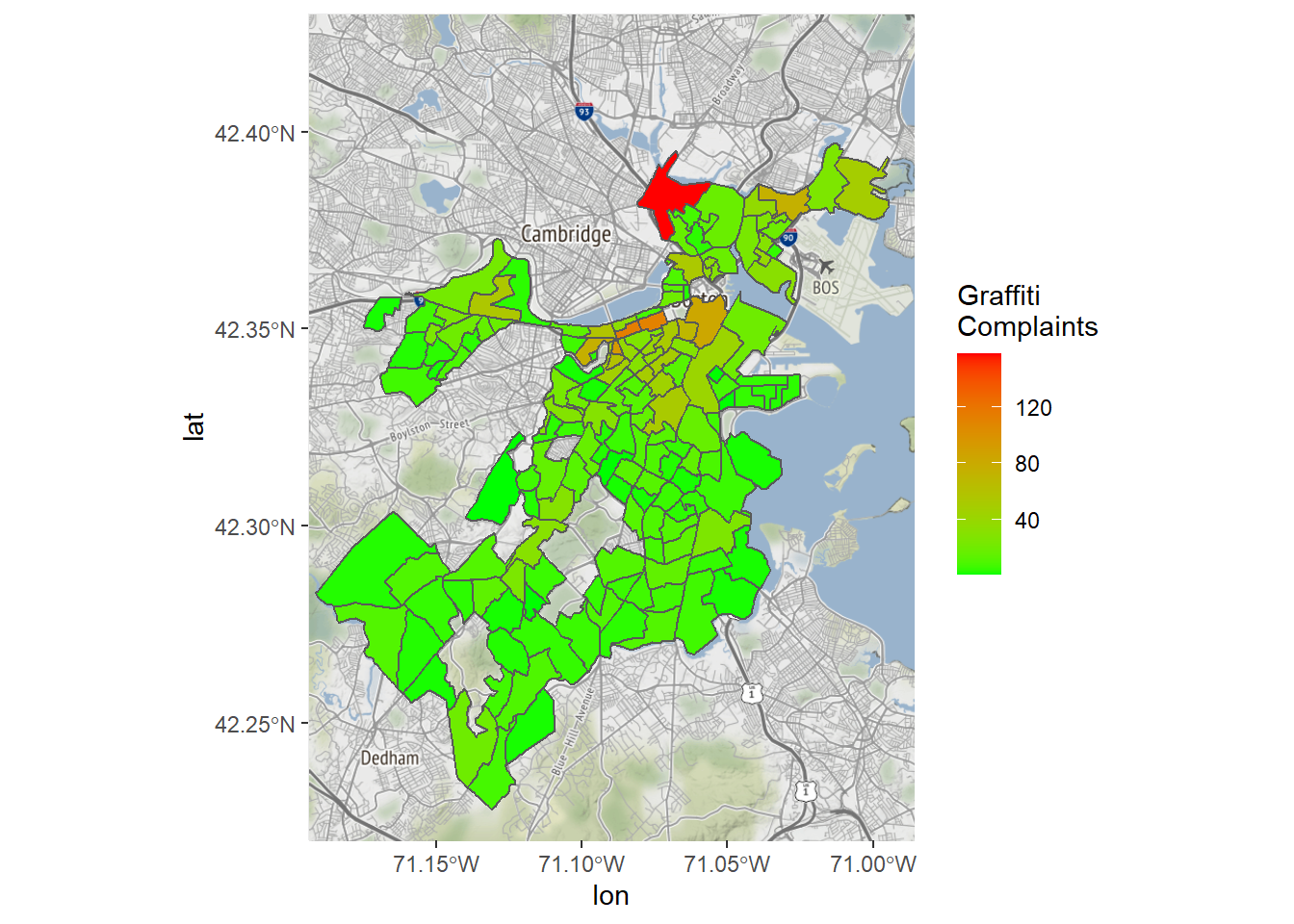
This is a bit more interpretable—still with a clear concentration of cases in the downtown area, but with at least some variation in other parts of the city.
8.5.5 Summary and Extensions
We have seen here the power of coercing records with latitude and longitude data into sf objects. In this case we have spatially joined them to census tracts and then created aggregate measures. This could be extended in multiple ways.
- We might create other aggregate measures based on any number of variables or any of the logics developed in Chapter 7.
- We can do other types of spatial joins. Here we did the default “intersect” or “over” join, where each point falls in a polygon. There are other logics, though, including nearest neighbor, which is popular for joining points to lines (e.g., events to the nearest street), or “majority contained within”, which can be used to join lines to polygons, especially when they cross over polygon borders.
- We could extend this to applying any spatial analytic tool we might like to the points. Learning more of these is beyond the scope of this book, but there are many resources out there for, including the
sfdocumentation, for learning more about the vast scope and capabilities of GIS.
8.6 Connecting R to Other GIS Software
R is just one software package capable of working with spatial data, and it is not even the most popular. We have learned it here because it is consistent with the curriculum of this book and because it is useful to be able to process and analyze data and maps in a single interface. Other options, though, include ArcGIS and QGIS, each of which is designed specifically to work with spatial data and are probably preferable if your goal is to make professional maps with detailed customization.
There are ways to integrate R into ArcGIS and QGIS as both have plug-ins that can accommodate R syntax. It is logical for the connection to go in this direction (as opposed to working in R and linking to ArcGIS or QGIS from there) because R is essentially a syntax that is then incorporated into a user interface (like RStudio). The power of ArcGIS and QGIS is to be able to do hands-on work with spatial data, so you would likely want to work in that context and leverage R syntax to serve up the content you need.
One exception, though, is Leaflet, which has become popular for creating interactive online maps. Leaflet is code-based itself with a structure similar to ggplot2, with commands stacked upon each other to specify the layers of a map and customize their visualization. As you might expect, there is a leaflet package that introduces this capacity for R (Cheng, Karambelkar, and Xie 2021). We will work through an example of creating a Leaflet map. This is possibly a bit tangential for some readers of this book. If you choose to skip this it will not affect your ability to engage with any of the material in subsequent chapters.
8.6.1 Making an Interactive Leaflet Map
Commands in the leaflet package are much like ggplot2, wherein we start with a leaflet() function that is often left empty, followed by a series of additional instructions. These are organized here through piping. We will proceed by gradually elaborating on a single map in eight steps.
8.6.1.1 Step 1: Creating a Base Map
First, as before, we need to establish a base map. The code for doing so is a bit different but should be interpretable. We have to indicate the source of our base map with addProviderTiles() (which we get in this case from CartoDB) and we set the extent of our base map with setView(), this time specifying a center point and a zoom level.
require(leaflet)
mymap <- leaflet() %>%
  addProviderTiles("CartoDB.Positron") %>%
  setView(-71.089792, 42.311866, zoom = 11)
mymap
8.6.1.2 Step 2: Adding a Layer
We now can add our own layer to the base map, in this case with the addPolygons() function (there is also the addPoints() command, etc.).
mymap <- leaflet() %>%
  addProviderTiles("CartoDB.Positron") %>%
  setView(-71.089792, 42.311866, zoom = 11) %>%
  addPolygons(data = tracts_geo)
mymap
8.6.1.3 Step 3: Making a Chloropleth
One thing that can be a little challenging about Leaflet is that it does not make any assumptions about what colors you would like a chloropleth to have. As such, it does not actually create a chloropleth unless you tell it how to. So, we need to first create a coloration with the colorNumeric() function and then pass that to the color= argument in the leaflet() command.
pal <- colorNumeric(palette='Blues',
      domain=tracts_geo$graffiti[tracts_geo$POP100>500 &
                                tracts_geo$graffiti<1000])

mymap <- leaflet() %>%
  addProviderTiles("CartoDB.Positron") %>%
  setView(-71.089792, 42.311866, zoom = 11) %>%
  addPolygons(data = tracts_geo[tracts_geo$POP100>500 &
                                  tracts_geo$graffiti<1000,],
              color = ~pal(tracts_geo$graffiti))
mymap
Here we have created a rule set for coloring our census tracts based on the color blue and the distribution of the graffiti variable. This then determines the coloration in the following map.
8.6.1.4 Step 4: Adjusting Opacity
In the previous map, the tracts were completely opaque. This may not be what we want if we want to maintain a sense of the spaces underneath them that they are describing. We can adjust the opacity with the fillOpacity= argument.
pal <- colorNumeric(palette='Blues',
      domain=tracts_geo$graffiti[tracts_geo$POP100>500 &
                                tracts_geo$graffiti<1000])

mymap <- leaflet() %>%
  addProviderTiles("CartoDB.Positron") %>%
  setView(-71.089792, 42.311866, zoom = 11) %>%
  addPolygons(data = tracts_geo, fillOpacity = .5,
              color = ~pal(tracts_geo$graffiti)
              )
mymap
8.6.1.5 Step 5: Introducing Interactivity with Highlights
One of the main attractions of Leaflet is that it creates interactive maps. We are now ready to introduce this capacity by creating “highlights.” Highlights are when objects on a map light up when the mouse cursor is placed over it. This is specific to a given layer on the map, so the highlight= argument goes within the addPolygons() command. We set the weight (thickness of the line) to 3, the color to red, and specify that it should bring the object to the front-—which would be relevant if there were multiple overlapping layers.
pal <- colorNumeric(palette='Blues',
      domain=tracts_geo$graffiti[tracts_geo$POP100>500 &
                                tracts_geo$graffiti<1000])

mymap <- leaflet() %>%
  addProviderTiles("CartoDB.Positron") %>%
  setView(-71.089792, 42.311866, zoom = 11) %>%
  addPolygons(data = tracts_geo, fillOpacity = .5,
              color = ~pal(tracts_geo$graffiti),
              highlight = highlightOptions(weight = 3,
                                           color = "red",
                                           bringToFront = TRUE)
  )
mymap
8.6.1.6 Step 6: More Interactivity with Pop-Ups
Another interactive feature available from Leaflet is “pop-ups,” in which a user can click on an object and have information about it appear. This is again specific to a given layer, so the popup= argument is within the addPolygons() command. We have used the paste() command to indicate that, when a tract is clicked on the map, it should print the BRA_PD, which is the name of the larger neighborhood containing that tract, and the number of graffiti complaints, with a colon in between.
pal <- colorNumeric(palette='Blues',
      domain=tracts_geo$graffiti[tracts_geo$POP100>500 &
                                tracts_geo$graffiti<1000])

mymap <- leaflet() %>%
  addProviderTiles("CartoDB.Positron") %>%
  setView(-71.089792, 42.311866, zoom = 11) %>%
  addPolygons(data = tracts_geo, fillOpacity = .5,
              color = ~pal(tracts_geo$graffiti),
              highlight = highlightOptions(weight = 3,
                                           color = "red",
                                           bringToFront = TRUE),
              popup = paste(tracts_geo$BRA_PD,
                            ":",tracts_geo$graffiti))
mymap
8.6.1.7 Step 7: Add a Legend
Of course, no map is complete with an interpretable legend. We can do this with the addLegend() command, whose arguments should be largely self-explanatory.
mymap <- leaflet() %>%
  addProviderTiles("CartoDB.Positron") %>%
  setView(-71.089792, 42.311866, zoom = 11) %>%
  addPolygons(data = tracts_geo, fillOpacity = .5,
              color = ~pal(tracts_geo$graffiti),
              highlight = highlightOptions(weight = 3,
                                           color = "red",
                                           bringToFront = TRUE),
              popup = paste(tracts_geo$BRA_PD,
                            ":",tracts_geo$graffiti))%>%
   addLegend(pal = pal,
            values = tracts_geo$graffiti[tracts_geo$POP100>500 &
                                        tracts_geo$graffiti<1000],
                        position = "bottomright",
                        title = "Graffiti \nComplaints",
                        opacity = 1
              )
mymap
8.6.1.8 Step 8: What Next?
At this point, our map feels arguably complete. But there is always the opportunity to add more. For example, you could put more points, maybe of the locations of parks or government buildings. You might want the interactive pop-ups to offer more information. There might be other customizations you would like to pursue. Whatever it is you are looking to do, you can likely accomplish it with the code we have learned or by looking through the documentation of the leaflet package.
8.7 Summary
In this chapter we have learned how to work with spatial data. This is no easy feat! As discussed at the outset, organizing and representing spatial information is complicated and can be quirky, idiosyncratic, and error-prone. That said, advances over the years have made the process increasingly streamlined and accessible. The skills you have learned here are the tip of the iceberg, but they are both extensible to any other spatial data you might encounter and can act as a gateway to a variety of more complex spatial transformations, analyses, and visualizations that await. As you go forth, you can already do the following:
- Describe what makes spatial data distinct and the challenges that these distinctions solve;
- Identify the different types of spatial data;
- Use the
sfpackage to:- Import shapefiles (.shps) into R,
- Plot shapefiles in R using
plot(), and - Merge additional data with shapefiles on shared key variables;
- Create a base map with
ggmap; - Make and customize a multi-layer map with
ggmapandggplot2; - Leverage latitude-longitude data in records to incorporate them into maps and spatial analyses;
- Spatial join one layer with another to merge their information together based on their intersections (including creating aggregate measures from those spatial joins);
- Make an interactive map with the
leafletpackage.
8.8 Exercises
8.8.1 Problem Set
- Define each of the following terms. How does it address one or more of the specific challenges or opportunities created by spatial data?
- Shapefile
- Coordinate Projection (or Reference) System
- Chloropleth
- Spatial join
- Visit the open data portal of your choice. See if you can find an example of each of the four types of spatial data. How are you confident that it is of that type?
- Using the merged data set of tracts and census indicators from the worked example, make three additional chloropleths (you may want to read the census indicators documentation to better understand all of the measures). Describe what you observe. Do you notice any interesting patterns or similarities between the spatial distributions of these variables?
- Visit the Boston Data Portal and download another component of the Geographical Infrastructure for the City of Boston.
- Make at least one map visualizing a variable already in the data frame associated with that shapefile.
- Find another data set on the Boston Data Portal that references the same geographic scale (Hint: use keywords associated with the scale of the shapefile, like “streets” or “census block groups”). Merge its variables into your first shapefile and make an additional visualization.
- Incorporate an additional data set of a different type (i.e., if you have polygons, incorporate lines or points; if you have lines, incorporate polygons or points, etc.), visualized in the way that makes the most sense for communicating a meaningful map.
8.8.2 Exploratory Data Assignment
Working with a data set of your choice. (Note: you will need access to at least one shapefile to complete this assignment. Many open data portals for cities have shapefiles. You can also download shapefiles from the U.S. Census or create shapefiles from records with latitude and longitude.)
- Create new measures based on aggregations of your data to a geographic scale. It is possible that you have already done this for the Exploratory Data Assignment in Chapter 7. Merge these measures to the shapefile for that geographic scale.
- Create a chloropleth for at least one of these variables.
- Describe the spatial distribution of the variable and how you believe this furthers our understanding of the landscape of the communities you are seeking to better understand.
- Feel free to incorporate other shapefiles, whether points, lines, polygons, or rasters, that you believe help illustrate the patterns you see in the spatial distribution of that variable. If you do so, please explain their contributions to the map.