10 Beyond Measurement: Inferential Statistics (and Correlations)
One of the oldest observations in the study of cities is that bad things—crime, medical emergencies, low academic and career achievement, poor upkeep of buildings—tend to cluster together in certain communities. Possibly the first person to systematically examine this clustering was Charles Booth, whose 1889 maps of London color-coded each street according to its level of “poverty” (Booth 1889). Notably, poverty was measured as a collection of issues, including low income, unpleasant jobs (including prostitution), crime, poor sanitation (or physical disorder, in modern parlance), public drinking and fighting, and so on. As shown in Figure 10.1, streets colored black were home to the “lowest class” and red and yellow reflected the “well-to-do” and “wealthy.”
Not long after Booth, two independent set of scholars also recognized that certain communities suffered from many issues, whereas other communities saw few to no such issues. Interestingly, they both proposed similar explanations for this outcome. W.E.B. DuBois, studying Black communities in Philadelphia, argued that certain social challenges, like weak community institutions (e.g., churches, community centers), lack of opportunity, and limited relationships between neighbors, were responsible for these ills (DuBois 1899). Likewise, members of the University of Chicago’s new Department of Sociology (affectionately referred to now as the Chicago School of Sociology) , led by Robert E. Park and Ernest W. Burgess, linked the clustering of maladies in certain communities to the social organization, or strength of relationships between neighbors and local institutions, which could be called upon to manage behavior and maintenance in public spaces and advocate for local priorities (Park, Burgess, and McKenzie 1925/1984). They believed that the social organization was undermined by demographic characteristics that limited the ability of a community to build such relationships, including poverty, residential turnover (i.e., households moving in and out), and immigrant concentration. This perspective has been one of the most influential theories in urban science, inspiring lines of research in sociology, criminology, public health, developmental psychology, and community development, among others. Both DuBois and the Chicago School noted that the strength of the social organization was weaker in communities populated by ethnic minorities, especially Black Americans. (Note: The long-term impact of the Chicago School’s version of the theory is not necessarily evidence that it was “better” than DuBois’. It is probably more indicative of the immediate influence that White scholars in the early 20th century were able to have with their peers in the academy relative to a preeminent Black scholar.)
Analytically speaking, the concept that bad things cluster together relies on correlations—that is, whether some variables tend to go up and down together across a set of objects. Does crime tend to be higher in neighborhoods with lower income? Are medical emergencies higher in communities with dilapidated housing? Are all of these issues higher in communities with more non-White residents and lower in communities with more White residents? This chapter begins the unit on Discovery, which focuses on inferential statistics and the use of various analytic techniques to evaluate relationships among variables. This includes, but is certainly not limited to, correlations. We will learn about the conceptual basis for inferential statistics and demonstrate them for the first time with correlation tests, setting the stage for additional statistical tools we will learn in the proceeding chapters.

Figure 10.1: Various urban scientists have sought to demonstrate that and explain why lots of unwanted outcomes, like crime, poor health, low academic and career achievement, and low income, cluster in certain communities. This includes Charles Booth, whose maps of London in 1889 quantified “poverty” street-by-street (top), W.E.B. DuBois, who studied Black communities in Philadelphia in the 1890s (bottom left), and the early Chicago School of Sociology, who studied the emerging immigrant neighborhoods of industrial Chicago (bottom right). (Credit: booth.lse.ac.uk; Wikimedia commons, Public Domain; ludilozezanje at deviantart.com)
10.1 Worked Example and Learning Objectives
In this chapter we will introduce the fundamental concepts underlying inferential statistics. We will then illustrate them using correlations, specifically evaluating whether “bad things cluster together” in the neighborhoods of modern Boston . We will also look at how these things correlate with the demographic factors that W.E.B. DuBois and the Chicago School of Sociology believed were relevant to a community’s social organization and, in turn, the various outcomes occurring there. Along the way, we will learn to:
- Differentiate between descriptive and inferential statistics, including the logic of studying samples;
- Describe the distributions of numeric variables and the assumptions that statistical tests make about them;
- Interpret and report the magnitude of a relationship between variables (i.e., effect size) and whether it is likely to be observed by chance (i.e., significance);
- Run and interpret correlations between pairs of variables using multiple commands;
- Visualize a series of correlations with the
GGallypackage.
For this chapter we will return to census indicators of Boston’s census tracts. To expand the story, however, we will leverage two other data sets that BARI publishes annually: indicators (or ecometrics, a term we learned in Chapter 6) of crime and medical emergencies from 911 dispatches. Before getting started we will download, import, and merge these and then subset to a series of variables that will be the focus of our analysis. We will also use tidyverse throughout.
Links:
Demographics: https://dataverse.harvard.edu/dataset.xhtml?persistentId=doi:10.7910/DVN/XZXAUP
911: https://dataverse.harvard.edu/dataset.xhtml?persistentId=doi:10.7910/DVN/XTEJRE
You may also want to familiarize yourself with the data documentation posted alongside each.
Data frame name: tracts
demographics<-read.csv('Unit 3 - Discovery/Chapter 10 - Inferential Statistics and Correlations/Example/ACS_1418_TRACT.csv')
eco_311<-read.csv('Unit 3 - Discovery/Chapter 10 - Inferential Statistics and Correlations/Example/311 Ecometrics Tracts Longitudinal.csv')
eco_911<-read.csv('Unit 3 - Discovery/Chapter 10 - Inferential Statistics and Correlations/Example/911 Ecometrics CT Longitudinal, Yearly.csv')
tracts<-merge(demographics,eco_311,by='CT_ID_10',all.y=TRUE)
tracts<-merge(tracts,eco_911,by='CT_ID_10',all.y=TRUE)

tracts<-tracts %>%
select('CT_ID_10','White','Black','Hispanic',
       'MedHouseIncome','Guns_2020','MajorMed_2014')
10.2 Foundations of Inferential Statistics
10.2.1 Inferential Statistics and Samples
The two main types of statistics are descriptive statistics and inferential statistics, and each entails the analysis of a given set of items (i.e., people, places, things) known as a sample. Descriptive statistics describe, summarize, and communicate the features of one or more variables for the sample, typically using a small set of indicators or representations. We have learned and practiced the tools of descriptive statistics numerous times in this book by calculating means, medians, minima, maxima, and modes, and by creating frequency tables, histograms, and other visualizations. Inferential statistics, on the other hand, uses the characteristics of the sample to attempt to generalize (or make inferences, as the name implies) about the full population from which the contents of the data set are drawn. In this way, both descriptive and inferential statistics are conducted on samples, but whereas descriptive statistics take the sample at face value, inferential statistics seek to leverage the sample to understand the world more broadly. The tools for doing so are new to us and will be the focus of this unit of the book. We will specifically focus on statistics for numeric variables, though there are techniques for working with categorical and character variables as well.
To illustrate the distinction between descriptive and inferential statistics, suppose we analyze the standardized test scores of a sample of students from a single school. Descriptive statistics communicate the average score, the highest and the lowest scores, and so on. Inferential statistics, however, would take these values and use them to come to conclusions about scores for the entire school.
There are two things that must always consider when conducting inferential statistics. The first is an estimate of uncertainty. For instance, when conducting descriptive statistics, we are confident of the average test score in our sample because we have those numbers. But how this information generalizes to the full school is imprecise. It is possible that this sample is a bit above or below average for the school as a whole. Thus, we need to quantify and account for this uncertainty when communicating our inferences. You have probably seen this when reading about a public poll for which the results have a “margin of error,” which seeks to communicate the range that the “true” or population mean most likely falls within. A critical element to uncertainty is the size of our sample, which is represented by the symbol n. As n gets bigger, we are increasingly confident in the characteristics that we are observing, because the amount of error created by the presence or absence of a single case gets smaller.
Second, we must take into consideration how representative our sample is of the full population. Samples will naturally deviate from the characteristics of the population, but we want to draw samples that are as insulated from bias as possible. For example, if we took the sample exclusively from a single classroom, or only from students who attended a special afterschool program for advanced math, or only from students in a single neighborhood, we may have an unrepresentative sample that is systematically biased. The easiest way to avoid this is taking a random sample from all students—that is, each student has an equal likelihood of being included. If this is not possible, we need to evaluate how our sample might have been biased and how this should inform our interpretation of the results. This is very similar to our discussion of the data-generation process and our efforts to interpret the contents of naturally occurring data. As we will return to below, it is important to keep sample size and bias separate. A very large sample might on the surface appear to have very little uncertainty, but it could still suffer from bias that could lead to erroneous conclusions if not handled properly.
10.2.2 Distributions of Numeric Variables
To make inferences about a given numeric variable for a population, we need to first understand its distribution, or the range of values present and their relative frequency. We have seen distributions repeatedly throughout this book, and they are often represented elegantly through histograms.
10.2.2.1 The Normal Distribution
Distributions come in many forms. The most common, and the one with which you are probably most familiar, is the normal distribution (or “bell curve”), as illustrated in Figure 10.2. Many, many variables naturally take on a normal distribution.
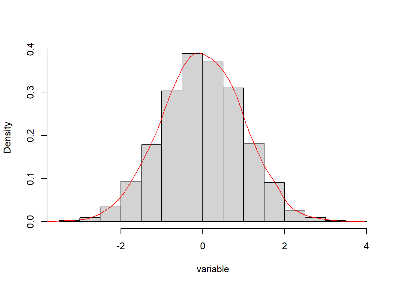
Figure 10.2: Histogram approximating the bell curve for mean = 1 and standard deviation = 0.
The normal distribution is an especially useful tool because its shape is defined by two statistics: it is centered at the mean; and its variation is defined by the standard deviation, such that 68% of cases sit within 1 standard deviation of the mean, 95% of cases sit within 2 standard deviations of the mean, and so on. This variation is symmetrical around the mean. In the example in Figure 10.2, the mean has been set to 0 and the standard deviation to 1.
10.2.2.2 Other Important Distributions
Not all variables are naturally normally distributed. The most common deviation from the normal distribution is referred to as skew, where the expected symmetry of the normal distribution is violated by outliers on the right side (i.e., high end) of the graph. This is demonstrated in Figure 10.3 and can be rather common. For example, income is well known to have positive skew, with certain individuals or communities having substantially higher incomes than would be expected in a normal distribution. There is also negative skew, in which the outliers are on the low end of the distribution.
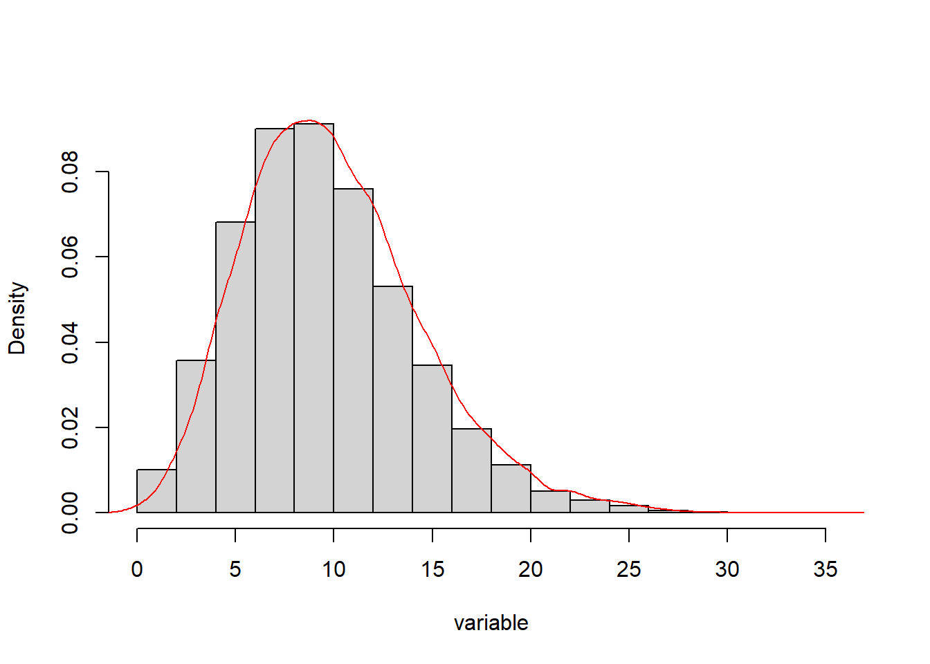
Figure 10.3: Histogram approximating a skewed distribution with outliers on the high side.
Last, we might consider a third distribution known as the Poisson distribution. The Poisson distribution is interesting because it is the natural distribution arising from a count variable. That is, if you have n events and x places where those events might occur and you distribute them at random, the result is not a normal distribution. Instead, it looks like what you see in Figure 10.4.
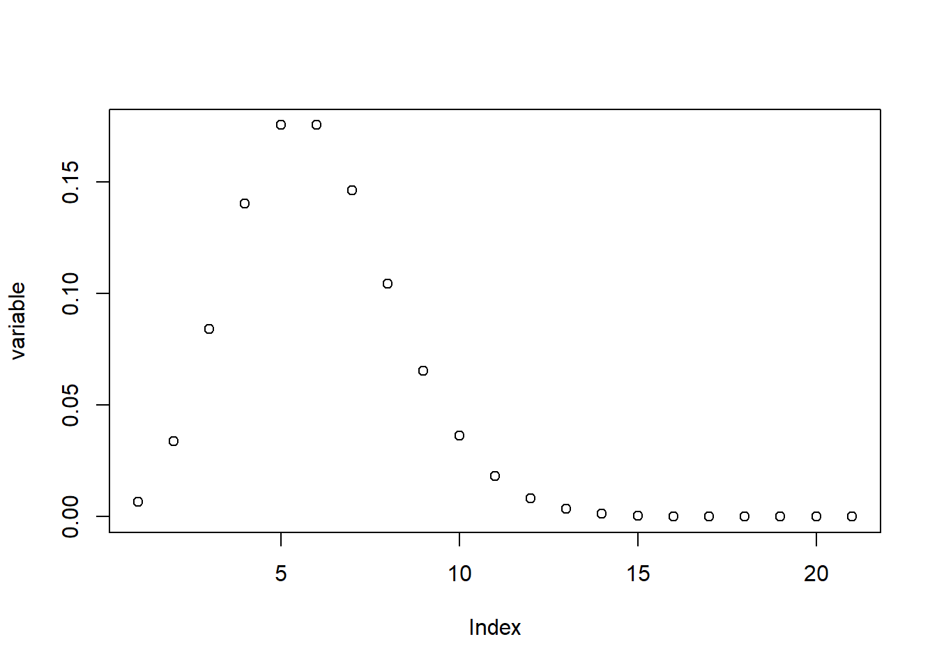
Figure 10.4: Plot of the values in a Poisson distribution with outliers on the high side.
As you can see, a Poisson distribution has a large proportion of low values with a long tail of higher values. This is actually what would happen if you randomly distributed events across a set number of places (or people or things). This is a more complicated distribution whose analysis requires special techniques, but it is worth noting because it can come up rather frequently for variables that are based on counts, like the distribution of crimes across addresses.
10.2.3 Hypothesis Testing
“Testing hypotheses” is a phrase we often hear in common discourse, but what does it mean? It would be helpful to break down the concept into its two parts. A hypothesis is sometimes described as an “educated guess.” This is accurate in spirit, though a bit simplistic. In inferential statistics, a hypothesis is a proposal that a certain characteristic of a single variable or relationship between two or more variables is true, with the proposal being based on some existing information or theory. The average standardized test score of this school is higher than 80% because of the large number of students with parents with high education levels. The crime level of a community is correlated with its median income, in part because of the social and economic challenges faced by lower income individuals that might lead to crime. Advertised rental prices might be higher during the winter because of lower supply. These are all hypotheses grounded in logical reasoning.
Once we have a hypothesis, we need to test it using inferential statistics. There are hundreds of different statistical tests for evaluating hypotheses and each is tailored to test a specific type of relationship. For example, in this chapter we are looking at correlations, which test whether two variables rise or fall together. Recall, however, that inferential statistics must always assess the uncertainty. It is not a matter of simply saying whether a hypothesis is “correct” or not. We must evaluate it relative to some benchmark. This benchmark is referred to as the null hypothesis. The null hypothesis, represented by \(H_0\), assumes that there is no relationship between variables or that a single variable does not differ from expectations. The alternative hypothesis, represented by \(H_A\), is then the proposal that such relationships or differences do exist. The alternative hypothesis does not typically predict a direction for the relationship, but simply assesses whether there is any relationship (e.g., positive or negative, above or below, etc.).
Returning to the three examples from the previous paragraph, \(H_0\) would be: the average standardized test score of the school is 80%; the crime level of the community does not share a correlation with its median income; rental prices are the same in winter and summer. Meanwhile, \(H_A\) would be: the average standardized test score of the school is higher than 80%; the crime level of the community increases as its median income decreases; rental prices are higher in winter than summer. As you can see, the alternative hypothesis is often similar to how we would state our research question in simple English.
10.2.4 Effect Sizes and Significance
When we conduct a statistical test, the first thing we want to know is its effect size, or the magnitude of the relationship between two variables or characteristic of a single variable. The school has an average test score of 85%, which is 5% higher than 80%, for instance. For every increase in $10,000 in median income, how much does the crime rate of a community go down? How much more or less are rents between the summer and winter? All statistical tests communicate effect sizes in one or more ways. They are crucial to communicating the practical implications of our statistical test.
But how do we know if that difference is “real”? Again, uncertainty plays a critical role. We need to determine whether the patterns and relationships observed in the data are significant; that is, that they are strong enough that we should take them seriously and are not merely a product of chance. For instance, is an average score of 85% evidence that the school’s performance is significantly different from 80%, or is it within the range of expected deviations? The significance of a statistical test depends on the effect size and the size of the sample. As the effect size becomes larger, significance is more likely because larger relationships are less likely to happen by chance. As the sample size becomes larger, significance is also more likely because we are less likely to have large deviations from expected outcomes. That is, if the average is 85% for 10 students, that is weaker evidence for difference from 80% than if the average were 85% for 100 students.
Significance is communicated with the p-value (for probability), which is the likelihood with which a certain outcome would occur if the null hypothesis were true. For example, p = .15 indicates that an effect of a given size or larger would occur 15% of the time by chance if the null hypothesis were true. The analyst needs to set a threshold for when the p-value is small enough for a result to merit classification as significant. We then tend to communicate significance relative to the established threshold (either being greater or less than the threshold) rather than in terms of their precise value. This is evaluated by calculating a confidence interval around the estimate of the effect size. The confidence interval is a range of possible relationships that might be likely given the effect size we saw.
The most common threshold for p-values is 5%, written as p < .05. The confidence interval in this case is called a 95% confidence interval (i.e., 1 - .05 = .95, or 95%). If the confidence interval contains that point of comparison for the null hypothesis, then p > .05. If it does not contain that point of comparison, then p < .05. If p < .05, then we know that a given effect size would only occur 5% of the time (or 1 out of every 20 times) if the null hypothesis were true. To illustrate, given an average test score of 85%, if the confidence interval is 79–91%, which contains 80%, then the likelihood that the population mean is different from 80% has a p-value > .05. In such a case, we say that we “accept the null hypothesis.” If the confidence interval were 83–87%, which does not contain 80%, the p-value would be < .05. We then “reject the null hypothesis” and say that “we have evidence for the alternative hypothesis.”
There are situations when other thresholds for significance are more appropriate, especially when conducting many tests. Suppose you are testing 100 correlations. You would expect 5 of those correlations be significant even if there were no “true” correlation between the variables (i.e., the null hypothesis were true). In such situations we might lower the threshold to .01 or even further. There are multiple formal techniques for specifying an ideal p-value, though these are beyond the scope of this book.
In summary, when we conduct a statistical test, we always want to communicate both the effect size and the p-value. The effect size tells us the magnitude of the relationship, thereby quantifying its practical implications. The p-value communicates significance, which is the likelihood that an effect of that size would occur by chance, thereby evaluating whether we have evidence in support of our hypothesis or not.
10.2.5 Inferential Statistics in Practice: Analyzing “Big” Data
We have learned a lot in this section about inferential statistics and we are just about ready to start applying these concepts to our first statistical test: correlations. Before we do so, it is probably useful to summarize some of the main details while also relating them to the types of data that we have worked with throughout the book.
10.2.5.1 Samples with “Big” Data
A sample is a subset of a population. Often with naturally occurring data, however, we theoretically have access to the population, not a sample. Test scores for all students in a city, records of all crimes, tweets, and Craigslist postings, and demographics for all neighborhoods in a metropolitan region are technically populations, not samples. We still want to treat them as samples, though, and treat their features as having uncertainty. Why? Two reasons stand out. The first is philosophical in that even a population is just a sample of what is possible, influenced in a variety of unspecified ways. Thus, instead of assuming that everything we observe in the population is inherently true, we want to analyze it with the same rigor as any other sample. This is the case especially when the “population” is not all that large (e.g., a metropolitan region would probably be divided into a few hundred neighborhoods), which means it is vulnerable to chance relationships.
A second consideration is bias. Recall that when analysts source a sample they need to be sensitive to how the sample might be systematically biased by the sampling process. As noted repeatedly in this book, naturally occurring data may suffer from various forms of bias owing to the data-generation process. In this way the data-generation process and sampling are analogous processes, each of which forces us to consider how our data might differ from the ideal population that we are trying to understand. We want to be very careful about this with large data sets, which can suffer from the big data paradox. When we have such a large data set, we often have very low levels of uncertainty because the addition or subtraction of any given piece of information will have very little impact on the full data set. But what if the data set has fundamental biases arising from the sampling or data-generation process? This might then lead us to be overly confident about conclusions that are incomplete or inaccurate. As we have discussed in previous chapters, this is not to say that biased data is completely useless. However, it does place responsibility on the analyst to understand the potential sources of bias and the ways in which they should be considered when interpreting any analyses.
10.2.5.2 Distributions
Distributions will largely operate in the same way for naturally occurring data as for other forms of data. The one difference is that as data sets get larger, distributions tend to be cleaner. This means that there are fewer chance deviations from a normal distribution, and that we are more confident that skew or Poisson distributions are meaningful. It is important to note that nearly all statistical tests (and all tests learned in this book) assume that the data being analyzed are normally distributed. Arithmetically, this means they rely on the mean and standard deviation to reach inferences. Thus, they are not well-suited to evaluating other distributions. There are, however, alternatives that are not formally covered here.
There are workarounds for incorporating non-normal variables into statistical tests that assume a normal distribution. One is to transform a variable to be closer to a normal distribution. This is most often done by taking the natural logarithm of the variable to pull outliers closer to the rest of the distribution (i.e., log(x) or log(x+1) if any values are less than 1, which would otherwise produce hard to analyze negative outliers; if x has negative values, you need to do log(x+1+min(x))). You can also create categorical variables from a Poisson distribution based on a meaningful threshold. A classic technique for this is the “elbow test,” in which the analyst identifies the point at which the curve flattens out into the tail, classifying everything beyond this point as scoring high on the variable.
10.2.5.3 Hypothesis Testing
Hypothesis testing itself works the same way regardless of the size or structure of the data set. There is one fundamental thing to always keep in mind, though: does the statistical test align with the question you are asking? Statistical tests are designed to evaluate very specific relationships. To communicate your results and their implications clearly, you need to be confident that you have selected the right statistical technique for testing your hypothesis appropriately.
10.2.5.4 Effect Size and Significance
Effect sizes are not typically sensitive to the size of a data set (though there are exceptions). As samples get larger, however, significance for the same effect size becomes smaller and smaller. This is because with more cases we can be increasingly confident that the effect sizes that we are observing are not by chance. Correspondingly, the confidence intervals are much smaller. For a very large data set with millions of cases, extremely small effect sizes are likely to have p-values of .001 or lower. This is not a problem in itself, but it further highlights the importance of communicating the effect size. If we only communicate significance when analyzing a large data set, then everything we observe is important. We have no way to determine which relationships have greater or lesser practical importance. Effect sizes allow us to make these determinations.
10.3 Correlations
We will now learn our first statistical test: the correlation. This and other statistical tests in this book will be presented in a consistent fashion. Each will start with conceptual information about the types of questions that the test can help answer and the effect size it reports. This will be followed by a worked example demonstrating how to conduct the test in R and interpret, report, and visualize the results. As described in Section 10.1, the worked example for this chapter will be to test correlations between various characteristics of the census tracts of Boston, including: demographic features associated with disadvantage and the social organization, such as median income and racial composition; and unwanted outcomes, such as gun violence and medical emergencies (as drawn from 911 dispatches). Each measure is drawn from the last time they were updated by BARI at the time of this writing (the 2014-2018 ACS estimates for demographics, 2020 for gun violence, and 2014 for medical emergencies). Despite slightly different time periods, all measures are largely stable over time so the inferences drawn from this illustration are generalizable to simultaneous measures.
10.3.1 Why Use a Correlation?
“Correlation” is a word we often see and hear in daily conversation and popular media. In statistics, a correlation is used to evaluate the relationship between two numerical variables, specifically whether they rise and fall together or whether one falls as the other rises and vice versa. The former is referred to as a positive correlation, the latter is a negative correlation. In the formal language of hypothesis testing, the null hypothesis is that two variables have no correlation. That is, the level of one variable is in no way predictive of the level of the other variable. The alternative hypothesis is that the two variables have either a positive or negative correlation. Note that the alternative hypothesis associated with a statistical test does not typically select a direction of a relationship, even if our own inspiration for the statistical test might be articulated this way.
You have probably heard the phrase, “correlation does not equal causation.” It is a very true statement and should be taken seriously. A strong positive correlation tells us that two variables rise and fall together, but it does not tell us why that is true. We cannot definitively say that one variable causes the other, simply that they tend to coincide. We always need to be careful about this when interpreting correlations. We will attend to this more in Chapter 12.
10.3.2 Effect Size: The Correlation Coefficient (r)
The effect size measured by a correlation test is called, fittingly, a correlation coefficient, and it is represented by the symbol r. r is a representation of the strength of the relationship between two numeric variables and has a range of -1 to 1. When r is positive, the two variables rise and fall together. When r is negative, as one variable rises, the other falls, and vice versa. When r is further from 0, the correlation is stronger. When r is near 0, there is no meaningful correlation, which means that changes in one variable are not associated with changes in the other variable. It is also important to recognize that r and slope are not the same thing. Slope is a calculation of how much one variable increases (or decreases) on average every time the other variable increases by 1. r calculates how consistent this relationship is, but not the relationship itself.
To illustrate, let us take a moment and consider the well-known correlation between Celsius and Fahrenheit. This relationship follows the equation \(F=C*9/5+32\). Here the slope is 9/5 or 1.8. In other words, for every degree increase in Celsius, Fahrenheit increases by 1.8 degrees. The positive correlation between Celsius and Fahrenheit is perfect because they are defined by an equation. For this reason, the r between them is equal to 1.
To summarize, correlation tests communicate the consistency with which differences in one variable correspond to shifts in another variable. They have no way, however, of evaluating slope, and thus we cannot use them to communicate how much one variable is likely to differ based on changes in the other variable. We will return to slopes, though, when we learn about regressions in Chapter 12. We will now see how this works in practice with our worked example.
10.3.3 Running Correlations in R
There are a variety of ways to run correlations in R. We will learn three of them. cor() is the most basic way of running a correlation matrix, reporting the correlation coefficients between all pairs of variables in a set of two or more variables. It has its limitations, however. To address these, we also use cor.test(), which evaluates the size and significance of the correlation between a single pair of variables, and rcorr() from the Hmisc package (Harrell 2021), which generates a correlation matrix for all pairs of variables in a set of two or more variables and reports their significance.
10.3.3.1 cor()
cor() is the simplest way to run a correlation in R. Let us start by running one on our tracts data frame.
cor(tracts)## CT_ID_10 White Black Hispanic
## CT_ID_10 1.000000000 -0.2643588 0.3190802 0.1600927
## White -0.264358837 1.0000000 -0.8507669 -0.6239106
## Black 0.319080196 -0.8507669 1.0000000 0.2545213
## Hispanic 0.160092734 -0.6239106 0.2545213 1.0000000
## MedHouseIncome -0.081310908 0.7626905 -0.5246184 -0.5141626
## Guns_2020 0.087688848 -0.6789560 0.7041435 0.2926918
## MajorMed_2014 0.003631076 -0.3210942 0.2839987 0.1006539
## MedHouseIncome Guns_2020 MajorMed_2014
## CT_ID_10 -0.08131091 0.08768885 0.003631076
## White 0.76269050 -0.67895596 -0.321094181
## Black -0.52461841 0.70414355 0.283998689
## Hispanic -0.51416260 0.29269185 0.100653893
## MedHouseIncome 1.00000000 -0.48100736 -0.253731258
## Guns_2020 -0.48100736 1.00000000 0.506307764
## MajorMed_2014 -0.25373126 0.50630776 1.000000000This produces a matrix of correlation coefficients between all 7 variables in the data frame. This means 49 relationships (7*7), though note that it is a symmetrical matrix, with all values above the diagonal equal to their mirror image below the diagonal. This is because a correlation between two variables is the same regardless of whether one variable is the row or the column. Additionally, note that all correlations between a variable and itself are equal to 1 because it is the same variable. That means there are only 21 distinct, meaningful pieces of information in the matrix (7*6/2 = 21 unique pairs of variables).
There is an issue, though. CT_ID_10 is included in the matrix even though it is a unique identifier. Because CT_ID_10 is a numerical variable, cor() has treated it as such, even though this has no practical meaning. We can address this with a small tweak.
tracts %>%
  select(-'CT_ID_10') %>%
  cor()
## White Black Hispanic MedHouseIncome
## White 1.0000000 -0.8507669 -0.6239106 0.7626905
## Black -0.8507669 1.0000000 0.2545213 -0.5246184
## Hispanic -0.6239106 0.2545213 1.0000000 -0.5141626
## MedHouseIncome 0.7626905 -0.5246184 -0.5141626 1.0000000
## Guns_2020 -0.6789560 0.7041435 0.2926918 -0.4810074
## MajorMed_2014 -0.3210942 0.2839987 0.1006539 -0.2537313
## Guns_2020 MajorMed_2014
## White -0.6789560 -0.3210942
## Black 0.7041435 0.2839987
## Hispanic 0.2926918 0.1006539
## MedHouseIncome -0.4810074 -0.2537313
## Guns_2020 1.0000000 0.5063078
## MajorMed_2014 0.5063078 1.0000000We have now removed CT_ID_10 and can take a closer look at our correlation matrix. First, we see a strong positive correlation between the percentage of White residents in a neighborhood and the median income (r = .76) and a strong negative correlation between both the percentage of Black residents and Latinx residents and median income (r = -.52 and -.51, respectively).
Additionally, we see that gun violence and medical emergencies are more strongly concentrated in poorer neighborhoods, with correlations with median income of -.48 and -.25, respectively. Though smaller than some of the previous correlation coefficients, these are still substantial. Places with more Black and Latinx residents also experienced more of these challenges, with the former featuring correlations of .28 and .70, and the latter seeing correlations of .10 to .30. Last, hearkening to the clustering of “bad things” observed by Booth, DuBois, and the Chicago School, we see that gun violence and medical emergencies are correlated with each other, sharing a correlation of .51.
10.3.3.2 cor.test()
cor() is an effective tool for describing the relationships between our variables, but it has some deficiencies. The biggest is that it does not evaluate the significance of the correlation coefficients. In this sense, it might be characterized as a tool for descriptive statistics not inferential statistics. cor.test() is more thorough in conducting the hypothesis test associated with a correlation, but it can only do it for one pair of variables at a time.
Let’s use cor.test() to further probe whether gun violence and medical emergencies are positively correlated with each other.
cor.test(tracts$MajorMed_2014, tracts$Guns_2020)##
## Pearson's product-moment correlation
##
## data: tracts$MajorMed_2014 and tracts$Guns_2020
## t = 7.5646, df = 166, p-value = 0.000000000002531
## alternative hypothesis: true correlation is not equal to 0
## 95 percent confidence interval:
## 0.3843632 0.6108870
## sample estimates:
## cor
## 0.5063078Looking closely at the output, we see that the correlation at the bottom (labeled cor) is the same as in the cor() test we conducted above, indicating that the two functions are testing the same thing. Above that is a 95% confidence interval with a range of .38–.61. This is the range of values that the population correlation might take with 95% likelihood given the correlation of .51. Note that this range does not include 0, which would suggest that the correlation is significant beyond a 5% chance. In other words, p < .05, and we have evidence that gun violence and medical emergencies are indeed correlated across census tracts. Going up to the top of the output, p indeed is less than .05—it is equal to \(2.531*10^{-12}\), which is a really small number! In a formal report, we would communicate this result as: “Gun violence and medical emergencies shared a positive correlation across neighborhoods (r = .51, p < .001).” We could also say, “Neighborhoods with higher levels of gun violence also had higher rates of medical emergencies (r = .51, p < .001).”
10.3.3.3 rcorr()
cor() can report correlation coefficients between three or more variables in a matrix but does not evaluate them for significance. cor.test() can test the significance of the correlation coefficient, but only between a single pair of variables. rcorr(), a function in the package Hmisc, combines each of these capabilities, reporting a matrix of correlation coefficients and evaluating their significance.
rcorr() does have a few quirks we should anticipate. First, it can only process data as a matrix, meaning we will need to transform the format of our data before conducting the analysis. Second, on the positive side, it automatically does pairwise deletion, so we do not need to specify that (though we can specify other logics for deletion; see the function documentation of the function for more details). Third, it generates three separate matrices: one with the correlation coefficients, one with the pairwise n (sample) used to calculate each, and one with the p-value for each coefficient. If we run it directly, the output is all three matrices. For the sake of brevity, we will skip this (though you are welcome to try it on your own). We will instead save the result as an object. We can then call up any of the three matrices using bracket notation.
The matrices are stored in the order noted above (i.e., [1] contains the r values, [2] contains the pairwise sample (or n), and [3] contains the p-values). For instance, to see the correlation coefficients.
require(Hmisc)rcorr_matrix<-tracts %>%
select(-'CT_ID_10') %>%
as.matrix() %>%
rcorr()
rcorr_matrix[1]## $r
##                     White      Black   Hispanic MedHouseIncome
## White           1.0000000 -0.8507669 -0.6239106      0.7626905
## Black          -0.8507669  1.0000000  0.2545213     -0.5246184
## Hispanic       -0.6239106  0.2545213  1.0000000     -0.5141626
## MedHouseIncome  0.7626905 -0.5246184 -0.5141626      1.0000000
## Guns_2020      -0.6789560  0.7041435  0.2926918     -0.4810074
## MajorMed_2014  -0.3210942  0.2839987  0.1006539     -0.2537313
##                 Guns_2020 MajorMed_2014
## White          -0.6789560    -0.3210942
## Black           0.7041435     0.2839987
## Hispanic        0.2926918     0.1006539
## MedHouseIncome -0.4810074    -0.2537313
## Guns_2020       1.0000000     0.5063078
## MajorMed_2014 0.5063078 1.0000000Starting with the matrix of correlation coefficients, we see that the numbers are the same as in the previous analyses, so there is not much to discuss here. Moving on to the second matrix of n for each pairwise calculation:
rcorr_matrix[2]## $n
## White Black Hispanic MedHouseIncome Guns_2020
## White 168 168 168 168 168
## Black 168 168 168 168 168
## Hispanic 168 168 168 168 168
## MedHouseIncome 168 168 168 168 168
## Guns_2020 168 168 168 168 168
## MajorMed_2014 168 168 168 168 168
## MajorMed_2014
## White 168
## Black 168
## Hispanic 168
## MedHouseIncome 168
## Guns_2020 168
## MajorMed_2014 168all values are equal to 168, which is the number of census tracts analyzed.
In the third matrix:
rcorr_matrix[3]## $P
## White Black
## White NA 0.0000000000000000000
## Black 0.0000000000 NA
## Hispanic 0.0000000000 0.0008705021270802860
## MedHouseIncome 0.0000000000 0.0000000000002895462
## Guns_2020 0.0000000000 0.0000000000000000000
## MajorMed_2014 0.0000219857 0.0001909679275746701
## Hispanic MedHouseIncome
## White 0.000000000000000000 0.0000000000000000000
## Black 0.000870502127080286 0.0000000000002895462
## Hispanic NA 0.0000000000010145218
## MedHouseIncome 0.000000000001014522 NA
## Guns_2020 0.000118090922862635 0.0000000000412576640
## MajorMed_2014 0.194224604286196367 0.0009045086104191302
## Guns_2020 MajorMed_2014
## White 0.000000000000000000 0.000021985702605587
## Black 0.000000000000000000 0.000190967927574670
## Hispanic 0.000118090922862635 0.194224604286196367
## MedHouseIncome 0.000000000041257664 0.000904508610419130
## Guns_2020 NA 0.000000000002531308
## MajorMed_2014 0.000000000002531308 NAmost of the p-values are quite small, often less than .001. There are some, however, that are non-significant. The proportion of Latinx residents in a community and medical emergencies, for instance, are not significantly correlated, with p = .19.
10.3.4 Visualizing Correlation Matrices
There are multiple ways to visualize correlations, some of which we have already seen. In Chapter 7 we learned how to create dot plots and density plots in ggplot2, which is the most traditional way to represent the correlation between two variables. In Chapter 9 we learned how to create correlograms, which are a visual version of a correlation matrix, using the ggcorrplot package. Correlograms are also useful in that they reorganize variables to be grouped by their strongest correlations. Here we will learn an additional tool for visualizing correlation matrices called gally plots, made possible by the ggpairs() function in the package GGally (Schloerke et al. 2021). Gally plots are similar to correlograms in that they communicate the full correlation matrix, but they do even more. They report r values with their significance in the upper half of the matrix and the dot plot relationships in the lower half. They also provide descriptive statistics for each of the individual variables along the diagonal (replacing the trivial reports of r = 1). As such, they communicate a lot of information in a single graphic—and from a single line of code.
require(ggplot2)
require(GGally)
ggpairs(data=tracts, columns=2:7)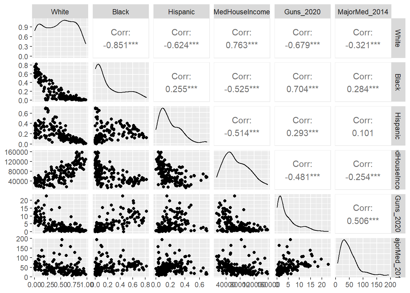
If you look closely at the output preceding the graphic (which I have suppressed here), you will note that it generates a series of geom_point() and stat_density() figures that it then combines. Turning to the graphic itself, it has all of the values we would expect above the diagonal. One star means p < .05, two stars means p < .01, and three stars means p < .001, as is traditional in software packages and reports. We then see the distribution curve for each of our variables (many of which are non-normal, it turns out) along the diagonal. Below that are dot plots for all the pairs of variables. If you look closely, the shapes of these dot plots reflect the corresponding correlation coefficients, with strong correlations corresponding to more linear shapes on dot plots that point upward or downward, and weak correlations corresponding to noisier relationships that appear to be flat.
10.4 Summary
We have now learned the core concepts underlying inferential statistics and the practice of testing for relationships between variables. We have also applied them for the first time by evaluating the clustering of undesirable outcomes in those Boston neighborhoods that are populated by lower income residents and by historically marginalized populations that often suffer from higher rates of poverty, greater residential turnover, and more family disruption. In the process, we have learned to:
- Consider the relationship between samples and populations, including how the former do (and do not) help us reach conclusions about the latter;
- Recognize a normal distribution and deviations from it;
- Interpret and communicate both the effect size and significance of a statistical test;
- Run and interpret correlations between pairs of variables using
cor(),cor.test(), andrcorr(); - Visualize a correlation matrix with the
GGallypackage.
10.5 Exercises
10.5.1 Problem Set
- For each of the following pairs of terms, distinguish between them and describe how they complement each other during statistical analysis.
- Descriptive statistics vs. inferential statistics
- Sample vs. population
- Normal distribution vs. Poisson distribution
- Null hypothesis vs. alternative hypothesis
- Effect size vs. significance
- r vs. slope
- You read a report that there is a correlation of r = .5 between income and health. The article uses this as evidence for saying that income has a causal effect on health. How do you interpret this statement? What critiques do you have?
- Return to the data frame
tractsanalyzed in the worked example in this chapter. Select two correlations between variable pairs that you find interesting. For each:- Report and interpret the r and p-value.
- Make a dot plot of the relationship.
- Extra: Relate the two correlations to each other, describing how together they tell a fuller story.
- Return to the beginning of this chapter when the
tractsdata frame was created. Recall that the variables analyzed in the worked example were selected from a much larger collection of demographics and annual metrics of social disorder, violence, and medical emergencies through 911 dispatches.- Create a new subset of variables that you think is interesting. Justify your selection.
- Run correlations between these variables. Interpret the results. Be sure to reference both effect size and significance. Note that if you have chosen a large number of variables, you will want to summarize the results without listing each individual correlation coefficient.
- Create a gally plot.
- Summarize the results with any overarching takeaways.
10.5.2 Exploratory Data Assignment
Complete the following working with a data set of your choice. If you are working through this book linearly, you may have developed a series of aggregate measures describing a single scale of analysis. If so, these are ideal for this assignment.
- Choose a set of variables for a given scale of analysis. Justify why these variables are interesting together. It could be that there is good reason to analyze them collectively or that you have one variable of primary interest (e.g., that you developed for a previous exploratory data assignment) whose correlations with other variables you want to evaluate.
- Run correlations among these variables and report and interpret the results. Be sure to reference both effect size and significance. Note that if you have chosen a large number of variables you will want to summarize the results without listing each individual correlation coefficient.
- Create a gally plot of the relationships and at least one dot plot of the correlation between a particular pair of variables.
- Describe the overarching lessons and implications derived from these analyses.