4 The Pulse of the City: Observing Variable Patterns
You have probably heard much about how cell phone records contain detailed information about people’s movements, their social ties, and habits. MIT’s Senseable City Lab was one of the first research centers to reveal the rich potential for these novel data. In one paper, they used cell phone records from three different metropolises—London, New York City, and Hong Kong—to illustrate the daily rhythms of communication in different parts of the city (Grauwin et al. 2014). They found that calls, texts, and downloads were more common in downtown and business districts during weekdays and that they spiked during the evening in residential areas. They also found that certain specialized areas, like airports, had rather distinct patterns. In this way, the cell phone data had revealed the pulse of the city —that is, the predictable patterns that characterize the activities of an urban area and its communities.
I would guess that you are of one of two minds about this work. You might be deeply impressed by the predictability of human behavior, saying something like, “Wow, cities have pulses just like humans!” Or you could be more skeptical, grumbling that “We didn’t need cell phone data to know that people play on their phones at workplaces during the day and at home at night.” Both perspectives are correct. These are obvious findings. But the methodology itself, the ability to observe the pulse of the city, is a critical advance. Let’s take the metaphor of the “pulse” seriously. Because we can easily measure our own body’s pulse (and other bodily functions), we can quantify and explain variation between individuals, identify aberrations and their relationship to health, and invent tools for responding to emergencies.
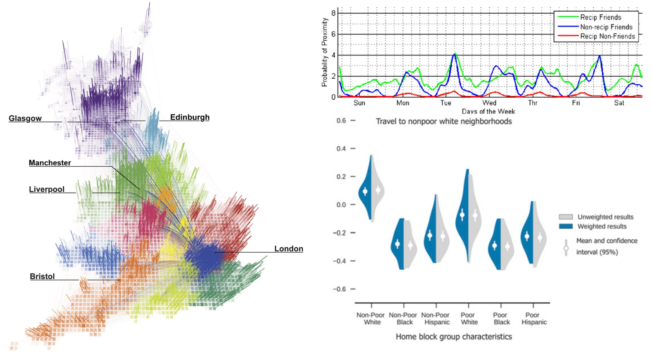
Figure 4.1: Cell phone records and related data have been used to reveal the patterns of society in many ways, including to map the “true” districts of the United Kingdom based on calling patterns (left), the “signature” of friendship based on frequency of proximity (upper right) and how racial segregation extends to the kinds of places people go (lower right). (Credit: The MIT Senseable City Lab, The MIT Media Lab, Wang et al. (2018))
Observing the pulse of the city through cell phone data was just the first step. As illustratd in Figure 4.1, analysts have since used the data for all nature of insight. They have redrawn the districts of nations based on communication and movement connections (Ratti et al. 2010). They have identified the “signature of friendship” based on the frequency with which people are near each other and contact each other by call or text (Eagle, Pentland, and Lazer 2009). They have shown that communities whose residents have more connections to other communities tend to also have higher incomes; and that people of different racial backgrounds not only tend to live in separate communities, they also tend to move through completely different spaces (Wang et al. 2018). And during the COVID-19 pandemic, there were regular reports showing how stay-at-home orders effectively “shut down” the pulse of the city, at least in terms of people leaving home (Abouk and Heydari 2021). All of these discoveries (and more!) were possible thanks to the initial work demonstrating the reliability of cell phone data to capture the daily rhythms of communities.
4.1 Worked Example and Learning Objectives
Cell phone data are fascinating but quite difficult to work with (see Chapter 13 for an inkling). But, as noted, many other data sets capture their own characteristic “pulse.” In this chapter, we will explore the pulse of the housing market as captured by Craigslist postings from Massachusetts in 2020-2021. A fun aspect of this time period is that we will not only be able to observe the pulse of the housing market but also how the pandemic altered it. These data were gathered and curated by the Boston Area Research Initiative as part of our COVID in Boston Database, an effort to track conditions and events across the city’s communities before, during, and after the onset of the pandemic.
Through this worked example, we will learn the following skills for revealing the pulse of any data set:
- Identify and describe the multiple classes of variable we might encounter;
- Summarize the contents of a variable;
- Graph the distribution of a single variable (using the package
ggplot2); - Replicate summaries and graphs for a variable under multiple conditions (say, comparing years);
- Inferring aspects of the data-generation process and interpreting the data appropriately.
Because we have learned how to download and import data in Chapter 3, starting with this worked example I will provide the link for the data set of interest here at the beginning of the chapter and indicate the name I gave it when I imported it into RStudio (using read.csv()). The link also contains variable-by-variable documentation.
Link: https://dataverse.harvard.edu/dataset.xhtml?persistentId=doi:10.7910/DVN/52WSPT
Data frame name: clist
clist<-read.csv("Unit 1 - Information/Chapter 4 - Pulse of the City/Example/Craigslist_listing.final.csv")
4.2 Summarizing Variables: How and Why?
When working with a new data set, one of the first things you want to do is summarize your variables. This includes generating summary statistics, tables of counts of values, and simple graphs. These tools all illustrate the content and distribution of the variable. This might seem a bit pedestrian or perfunctory, but it is a crucial step in conducting an analysis. Just as the skills in Chapter 3 allowed us to become familiar with the content and interpretation of individual records, summarizing variables allows us to become familiar with the content and interpretation of the data set as a whole.
There are three specific things we might gain from summarizing variables:
- We can reveal basic patterns, or what we have called the pulse of the city . This tells us what a “typical” value is and how much variability there is around it, or how the data are distributed across multiple categories. It also gives us direct access to the variation that we will eventually want to study further with more sophisticated techniques.
- We can identify and understand outliers that stand apart from the other values in the data. Are these special cases that are to be expected, like a very tall person or a property that generates an inordinate amount of crime? Or are they errors in the data arising from typos, glitches, or other processes?
- From these observations we can learn about the data-generation process and how we should interpret the data. If some of these values are potentially errors, how do we treat them? What does that tell us about the kinds of biases that might exist in the data? Is there information that we do not expect to be there or that is incorrect in some way? Or information that should be that might be missing? These conclusions will be important for couching how we communicate our results.
4.3 Classes of Variable
As we have learned in previous chapters, R is an object-oriented programming language, and every object is of a specific “class”—meaning it has certain defining characteristics that govern the information therein, how that information is structured, and the way that functions operate upon it. Data frames are a specific class of object composed of observations (rows) that each have values for a series of variables (columns). Each variable contains a specific type of data that can be categorized as one of a variety of classes. (Yes, this can be a little confusing. Whole objects have classes at the object level. The subcomponents of an object—like the variables of a data frame—have their own set of classes by which they are categorized.)
4.3.1 The Five Main Classes of Variable
There are five main classes of variable that we will work with in this book:
- Numerical variables contain numbers. A subtype of numerical variables is integer variables. These are constrained to values that are whole numbers, whereas other numerical variables can accommodate any number of digits after the decimal point.
- Logical variables can only take the values of
TRUEorFALSE. They also can operate as pseudo-numerical variables as R will interpretTRUE == 1andFALSE == 0if a logical variable is placed in an equation. Logical variables are crucial intermediaries when conducting analyses. In fact, every time you create a subset, you are actually asking R to evaluate a logical statement (e.g., in Chapter 3, we asked “was this 311 case closed?”). These are analogous to a special type of integer variable called dichotomous variables that only take the values of 0 or 1. - Character variables contain text in an unconstrained format, meaning they can contain any variety of values of any length.
- Factor is a special type of character variable in which each value is treated as a meaningful category or “level.” This organization can be helpful as functions can treat the categories as such, whereas other character variables are treated as having freeform content.
- Date/time variables comprise many different classes of variable. This is because of the many different ways that one might organize this sort of information—date, date followed by time, time followed by date, month and year only, and time only are just a handful of examples. And then there are questions like whether the time has seconds or not, whether it includes time zone, whether the date is month-day-year or day-month-year, etc. For these reasons date and time can be tricky to work with and we will return to them more in Chapter 5.
4.3.2 Example Variables from Craigslist
Let’s get started with our data frame of Craigslist postings by looking at the classes of variable it contains. We should probably begin by learning what variables are there:
names(clist)## [1] "X" "LISTING_ID" "LISTING_YEAR"
## [4] "LISTING_MONTH" "LISTING_DAY" "LISTING_TIME"
## [7] "RETRIEVED_ON" "BODY" "PRICE"
## [10] "AREA_SQFT" "ALLOWS_CATS" "ALLOWS_DOGS"
## [13] "ADDRESS" "LOCATION" "CT_ID_10"You can read more about each of these variables in the documentation (see link above), though many of the names are self-explanatory. Let’s see what classes some of them are.
class(clist$LISTING_DAY)## [1] "integer"class(clist$LISTING_MONTH)## [1] "character"class(clist$BODY)## [1] "character"class(clist$PRICE)## [1] "integer"class(clist$ALLOWS_DOGS)## [1] "integer"Unsurprisingly, LISTING_DAY is an integer, as days of the month are always whole numbers. LISTING_MONTH, however, is a character, suggesting that it might be the name of the month rather than a number associated with it.
Meanwhile, the variables BODY and PRICE will tell us more about the posting itself. The former is a character, which makes sense if it is the body of the post, including all the text that the landlord or property manager might have included. PRICE is an integer, which also makes sense as a price should be a whole number.
Last, I have thrown in ALLOWS_DOGS just for fun and we find that it is an integer. Why do you think that is the case (we will find out in Section 4.4)?
4.3.3 Converting Variable Classes: as. Functions
Sometimes we want to coerce a variable into a format that it wasn’t originally in. This can happen when we intend a variable to have a certain structure, but this is lost when importing a .csv. For instance, if LISTING_MONTH is indeed a list of months by name, it may be more useful as a factor—that is, treated as a set of categories. We can do this with the as.factor() function:
clist$LISTING_MONTH2<-as.factor(clist$LISTING_MONTH)Note that we have created a new variable, LISTING_MONTH2, which is a factor version of LISTING_MONTH. We will learn more about creating new variables in the next chapter, but for current purposes just know that this variable is now a part of the clist data frame (use names() to check if you like).
There are as. functions for all classes of variable (e.g., as.numeric, as.character, etc.), but they are to be used with caution. Data stored as a certain class are often stored that way because it reflects their content. Trying to squeeze it into another format can generate unexpected results. For instance, if we try to coerce the month variable, which is a character variable, into a numeric, we get an error:
clist$LISTING_MONTH3<-as.numeric(clist$LISTING_MONTH)## Warning: NAs introduced by coercionAny value that was not numerical was replaced by an NA! We will see soon the implications of that. One particularly tricky situation is if your numeric or integer variable was read by R as a factor. See the next subsection for more on why and how to handle it.
4.3.3.1 Extra: From Factor to Numeric
Suppose you have a numeric variable stored as a factor.
The Intuitive Process: Use as.numeric() to convert it.
But R does not think those values are numbers! They are categories that have been organized into alphanumeric ordering that you cannot see. As a result, if the smallest value in the variable is 50 and the second smallest is 100, these are actually considered by R to be categories 1 and 2. If you run as.numeric(), it will convert them to these values, rather than keeping the values you actually want.
The Solution:
Make your factor variable a character variable first, and then convert to a numerical variable: as.numeric(as.character(df$factor)).
4.4 Summarizing Variables
There are a lot of classes of variable, and the tools needed to summarize each can differ. Numerical variables call for summary statistics. Factor variables call for counts of categories. The rest of this chapter walks through these skills and their nuances.
4.4.1 Making Tables
One simple step is to create a table of all values in a variable. For example
table(clist$LISTING_MONTH)##
## April August December February January July
## 22604 17830 14025 9209 9141 21715
## June March May November October September
## 24910 14262 24271 13078 14028 20372tells us how many postings occurred in each month. You might notice some simple variations here already. For instance, January and February are a bit lower, which can be explained by the fact that BARI started scraping postings in March 2020. But why might December be lower? Does that possibly tell us something about the cycle of postings—or the pulse of the housing market? Also, March has fewer postings than April or May. Could that be an effect of the pandemic?
One way to answer that last question is to create a cross-tab, which is a table that looks at the intersections of two variables. This is done by adding an argument to the table command:
table(clist$LISTING_MONTH,clist$LISTING_YEAR)##
## 2020 2021
## April 13981 8623
## August 15973 1857
## December 7886 6139
## February 392 8817
## January 0 9141
## July 19478 2237
## June 16467 8443
## March 4298 9964
## May 16122 8149
## November 9348 3730
## October 12608 1420
## September 13401 6971Look at the difference between March 2020 and March 2021! The latter had two times as many postings as the former. Interestingly, April 2020 had many more postings than April 2021, suggesting that many postings that were held back in March were posted then. Still, the monthly numbers for December seem low relative to other parts of the year.
We can also see indications of the data-generation process. There are no cases in January 2020. Why? Because BARI was not scraping data then. We do have a small number of cases from February 2020, though. It appears that when BARI started scraping data, some postings from February were still up on the site. There are also lower numbers in August, October, and November 2021, when the BARI scraper stopped collecting data for a time.
We can use table() to look at numerical variables as well, though this is typically only useful for integer variables that take on a small number of values; otherwise the table would be hard to interpret. Thus, we would not want to use it for the PRICE variable, but maybe for LISTING_DAY.
table(clist$LISTING_DAY)##
## 1 2 3 4 5 6 7 8 9 10 11 12 13
## 6075 6941 7313 7196 6830 6369 7622 7700 7364 6722 6742 6275 6401
## 14 15 16 17 18 19 20 21 22 23 24 25 26
## 6694 7287 7528 7049 6745 6580 6695 6753 6006 6750 6556 5671 5788
## 27 28 29 30 31
## 6979 7146 6734 5665 3269Here we see how cases are distributed across the days of the month. Not too much of a story, however, except for the low count for the 31st, which only occurs in seven months.
Last, let’s learn a little more about the ALLOWS_DOGS variable.
table(clist$ALLOWS_DOGS)##
## 0 1
## 131022 71845Here we see that it is indeed a 0/1, or dichotomous variable (the numerical version of a logical), and that way fewer postings are for housing that allows dogs.
This also gives us an excuse to learn another command that can be applied to tables, called prop.table(), which calculates the proportion of cases in each cell:
prop.table(table(clist$ALLOWS_DOGS))##
## 0 1
## 0.6458517 0.3541483R has precisely confirmed our observation: only 35% of postings allow dogs. Note that prop.table() can do a lot more with tables that examine the intersections of multiple variables, like the one above between month and year. Use ?prop.table to learn more.
4.4.2 The summary() Function
Conveniently, one of the most versatile functions in R for summarizing data is called summary(). This function can be applied to any object. All classes of object and variable have embedded in them instructions for how summary will expose its content to the analyst. For example, when we run regressions in Chapter 12, it will provide clean, organized results from a regression model. For this reason, it will pop up throughout the book. Here we will see what summary() returns for variables.
Let’s start with the numerical variable PRICE
summary(clist$PRICE)## Min. 1st Qu. Median Mean 3rd Qu. Max. NA's
## 10 1425 1895 2026 2500 7000 5It appears to have given us the minimum, maximum, mean (arithmetic average), median (i.e., middle value), and the 1st quartile and 3rd quartile (i.e., the points at which 25% of the values are lower or higher, respectively). Some of this information makes a lot of sense: the mean is $2,026, which would seem reasonable for the Boston area, which can be quite expensive. The maximum is even more daunting at $7,000.
There is something a little strange, though. How is the minimum $10? Who is renting out an apartment for that little money? It is possible this is an error or typo when entering the price. It could also be a deliberate manipulation of the system. Think like a clever landlord for a moment. Some people will sort by price to get a sense of what kind of deal they can get. If they do that and you put a falsely low number in the price box, your listing comes up first. Either of these is possible, and each may be true for different cases. It does not seem like either is a predominant strategy, though, as the 25th percentile is $1,425, which is reasonable for a low-rent listing. We will spend more time later in the chapter trying to determine how frequent these erroneous cases are and what we should do with them.
Let’s look at another numerical variable, AREA_SQFT, which is the size of the apartment or home for rent.
summary(clist$AREA_SQFT)## Min. 1st Qu. Median Mean 3rd Qu. Max. NA's
## 0 718 925 1304 1184 7001500 120361Again, we see a few strange things. The maximum is 7,001,500 sq. ft., which seems, well, impossible. This is another possible error or manipulation.
Also, this summary generated a new piece of information: a count of NAs. Note that 120,361 cases (or 59%) had no information for sq. ft. This is because posters do not need to indicate the square footage of the apartment, though they do have to enter a price. This raises questions as to whether landlords of certain types of apartments are more likely to post the size—maybe listings for larger apartments include their size more often, or landlords of higher-rent apartments assume their clientele wants to know this information, or something else.
We can also return to the ALLOWS_DOGS variable:
summary(clist$ALLOWS_DOGS)## Min. 1st Qu. Median Mean 3rd Qu. Max. NA's
## 0.0000 0.0000 0.0000 0.3541 1.0000 1.0000 2583Note that the mean is 0.35, which perfectly reflects the 35% of postings permitting a dog. This is because the mean of a dichotomous variable is the proportion of 1’s. Also note that the NAs here are far fewer than the square footage.
The summary function is less useful for character variables, however.
summary(clist$LISTING_MONTH)## Length Class Mode
## 205450 character characterThis is because character variables are assumed to be freeform and thus are difficult to summarize in any systematic way. But, if we return to our factor version of the LISTING_MONTH variable, we get more information.
summary(clist$LISTING_MONTH2)## April August December February January July
## 22604 17830 14025 9209 9141 21715
## June March May November October September
## 24910 14262 24271 13078 14028 20372
## NA's
## 5In fact, we have generated the same table from above! This is just further validation that table() is the most fundamental way to look at a factor variable.
4.4.3 Summary Statistics
The summary() function is very powerful and often all that we need to get to know a numerical variable better. But what if we want to know information that summary() does not offer? Or what if, for whatever reason, we want to specifically access (and maybe store as an object) one of the statistics that summary() generates, like the mean or the maximum? There are a host of summary statistics that R can calculate, only a few of which are included in the default summary() output. Some of these are included in Table 4.1. Here we want to illustrate how they work.
Let us return to two of our numerical variables, PRICE and AREA_SQFT.
mean(clist$PRICE)## [1] NAWait! Why did that happen? It turns out that summary functions do not know how to handle NAs. In a sense, they say “If there are any missing cases, it is impossible to accurately calculate a summary statistic.” It can also act as a warning that your data contain NAs, if you had not already noticed that.
There is a workaround, however.
mean(clist$PRICE, na.rm=TRUE)## [1] 2026.146By adding the argument na.rm=TRUE we have told R to remove (rm) NAs from the analysis. And with that, we have our mean properly calculated. And, unsurprisingly (and comfortingly), this is the same value that the summary() function generated above—an average price of $2,026—though with a bit more precision after the decimal point.
| Function | What It Calculates |
|---|---|
| max(x) | Maximum value |
| median(x) | Median value |
| min(x) | Minimum value |
| range(x) | Range of values (max – min) |
| sd(x) | Standard deviation across values |
| sum(x) | Sum of all values |
4.5 Doing More with Summaries
Now that we have a set of tools for summarizing variables, there are a variety of ways we can extend them to do more sophisticated, thorough, and precise analyses.
4.5.1 Summarizing Multiple Variables with apply()
What if we wanted to calculate statistics for two variables with a single line of code? Let’s see what happens if we try to do this on another statistic, the maximum:
max(clist[c('PRICE','AREA_SQFT')], na.rm=TRUE)## [1] 7001500Why did we only get one value? Summary functions are based on all of the data entered, so what it reported was the maximum value across the two variables. As we already know, this is the maximum size of an apartment, which is a much larger value than any of the prices.
To solve this problem, the apply() function executes (or “applies”) another function across multiple elements.
apply(clist[c('PRICE','AREA_SQFT')],2,max, na.rm=TRUE)## PRICE AREA_SQFT
## 7000 7001500It worked! The structure of the function’s arguments is: apply(df, dimension, FUN), where FUN stands for function. Importantly, dimension refers to whether apply should execute the function for variables or cases. If dimension is set equal to 2, it executes the function separately for each variable. If set equal to 1, it executes it separately for each case. (Remember that the dimensions of a data set are represented [rows, columns].) Try entering 1 and see what happens.
Note that apply() is part of a large family of commands that can do the repetition of analyses on the subcomponents of various data structures. We will not touch on them much in this book but more complex situations sometimes call for them.
4.5.2 Summarizing across Categories in One Variable: by()
We might be interested in how a variable’s characteristics vary based on another condition. For example, are prices for apartments stable across the year? This can be accomplished with the by() command, which has three arguments: the numerical variable whose statistics you want to calculate, the categorical variable by which you want to split the analysis, and the function you want.
by(clist$PRICE,clist$LISTING_MONTH,mean)## clist$LISTING_MONTH: April
## [1] 2039.955
## ------------------------------------------------
## clist$LISTING_MONTH: August
## [1] 2042.148
## ------------------------------------------------
## clist$LISTING_MONTH: December
## [1] 1871.895
## ------------------------------------------------
## clist$LISTING_MONTH: February
## [1] 1872.817
## ------------------------------------------------
## clist$LISTING_MONTH: January
## [1] 1805.201
## ------------------------------------------------
## clist$LISTING_MONTH: July
## [1] 2165.895
## ------------------------------------------------
## clist$LISTING_MONTH: June
## [1] 2168.869
## ------------------------------------------------
## clist$LISTING_MONTH: March
## [1] 2054.44
## ------------------------------------------------
## clist$LISTING_MONTH: May
## [1] 2147.718
## ------------------------------------------------
## clist$LISTING_MONTH: November
## [1] 1871.635
## ------------------------------------------------
## clist$LISTING_MONTH: October
## [1] 1858.777
## ------------------------------------------------
## clist$LISTING_MONTH: September
## [1] 1997.779As you can see, the mean shows some shifts across the year, with average rents for postings from April to August topping $2,000 and even nearing $2,200 in the middle of summer, and average rents closer to $1,800 through the fall and winter. There are multiple possible interpretations here. It could be that the competition for housing is greater over the summer as many leases being in August or September, especially in a city like Boston which has many colleges and universities. It might also be that the summer postings tend to cater to the specific population of students and their contemporaries, which command higher prices. Also, how much are the waves of the pandemic affecting this dynamic? From the current analysis we do not yet know.
4.6 Summarizing Subsets: The Return of Piping
Thus far our analyses have found some potentially interesting things, but they are also surfacing concerns about whether some of the information is erroneous or complicating, in which case we might want to set that content aside. What do we do with apartments that claim a price of $10? How do we isolate our analysis to the pandemic year to be confident in the interpretation? This requires us to subset before conducting our analysis.
There are three ways to subset before analysis. One is to create a new data frame.
clist_2020<-clist[clist$LISTING_YEAR==2020,]This can fill the Environment with intermediate datasets, however, making things messy and taking up lots of memory.
We can also subset inside a function.
mean(clist$PRICE[clist$LISTING_YEAR==2020], na.rm=TRUE)## [1] 2024.37Note that the subset is of the variable we are analyzing, removing the need for a comma. This can be an effective approach but can make for a complicated line of code if there are lots of criteria.
The third technique is to use piping, which is what we will concentrate on here (reminder, you will need to enter require(tidyverse) if you are following along with the code). We will need to introduce the group_by() and summarise() commands in tidyverse for these purposes.
4.6.1 Summary statistics with summarise()
First, let’s suppose we want to remove postings with non-sensical prices from the data set. This sounds easy enough, but where should we draw the line? This requires some further scrutiny and a bit of a judgment call. For instance:
mean(clist$PRICE<100, na.rm=TRUE)## [1] 0.0001557594What I have done here is take the mean of the logical statement that the price of a posting is less than $100. R determines whether that statement is true or false for every case, with TRUE==1, and then takes the mean (which is also the percentage for a logical or dichotomous variable). Thus, 0.02% of cases have a price under $100. That is very few cases. We are probably safe calling these outliers.
But $100 is also a ridiculously low price for an apartment. What if we raise the threshold?
mean(clist$PRICE<500, na.rm=TRUE)## [1] 0.005509991mean(clist$PRICE<1000, na.rm=TRUE)## [1] 0.100387So, 0.6% are under $500, which is still a good indicator of outliers. But 10% are under $1,000. It would seem then that there are plenty of legitimate postings in between $500 and $1,000, possibly for sublets or private rooms within an apartment or house.
Moving forward, then, we will exclude cases with price less than $500 (and the NAs for good measure). How does this change things? Remember that to answer this question we will need the filter() function from tidyverse. Also, we will need to use summarise(), another tidyverse function that sidesteps limitations of certain traditional functions.
clist %>%
  filter(PRICE>500, !is.na(PRICE)) %>%
  summarise(mean_price = mean(PRICE))
## mean_price
## 1 2036.989The average has gone up slightly, from $2,024 to $2,037. Even though those outliers were so small, it seems that 0.6% of the data do not have that large of an effect on totals. Nonetheless, we can be more confident now in our results.
4.6.2 Summary Statistics by Categories with group_by()
Let us replicate the analysis by month with our subset. This will require the group_by() function, which instructs R to organize the data set by the categories in a particular variable for all proceeding steps of the pipe.
clist %>%
  filter(PRICE>500) %>%
  group_by(LISTING_MONTH) %>%
  summarise(mean_price = mean(PRICE))
## # A tibble: 12 × 2
## LISTING_MONTH mean_price
## <chr> <dbl>
## 1 April 2055.
## 2 August 2053.
## 3 December 1883.
## 4 February 1881.
## 5 January 1814.
## 6 July 2175.
## 7 June 2175.
## 8 March 2066.
## 9 May 2163.
## 10 November 1883.
## 11 October 1869.
## 12 September 2008.The results largely look the same as before (though they are cleaner when reported by tidyverse). The theme of higher prices in the summer and lower prices in the fall and winter remains, though some of the numbers have inched upwards with the removal of the outliers.
If you want to go further, you might limit the data to either 2020 or 2021 by adding an additional criterion to the filter() command.
4.7 Tables as Objects
You might look at a table and say, “I see counts across categories, I have what I want.” Or you might say, “I’d love to analyze those numbers.” As I have said numerous times, R is an object-oriented software, meaning that it applies functions to objects, each being of a class with defining characteristics. I have also alluded that many functions generate new objects that we can then analyze further. This is our first opportunity to do this.
The table() command does not itself generate an object, but it does generate something that looks a lot like a data frame if we examine its product with View().
View(table(clist$LISTING_MONTH))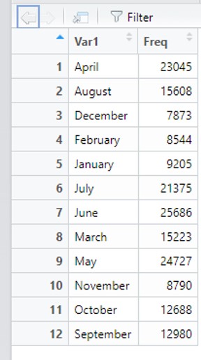
Could we turn it into one?
Months<-data.frame(table(clist$LISTING_MONTH))We now have a data frame of 12 observations and 2 variables in the Environment. You can use View() and names() to check that it is the same as before.
Before we analyze this table as a data frame, though, remember that representation across the years is a little funny because the scraping started in February of 2020. We could use piping to create a desired subset, though, and then analyze the final product.
table(clist$LISTING_MONTH[clist$LISTING_YEAR==2020 &
                            clist$LISTING_MONTH!='February']) %>%
  data.frame() %>%
  summary()
## Var1 Freq
## April :1 Min. : 4298
## August :1 1st Qu.:10163
## December:1 Median :13691
## July :1 Mean :12956
## June :1 3rd Qu.:16085
## March :1 Max. :19478
## (Other) :4Now we have a much stronger insight as to what listings per month looked like in 2020. The lowest month had 4,298 and the maximum had 19,478, whereas the mean month had 12,956.
4.8 Intro to Visualization: ggplot2
We have accomplished quite a bit using summary statistics, but some visuals would probably be helpful when communicating the patterns we are seeing. To do this, we are going to use ggplot2 (Wickham et al. 2021), which is a package designed to enable analysts to generate a vast array of visualizations. Base R does include some tools for basic visualizations, but the breadth of ggplot2’s capabilities has made it the go-to package for making graphics. Further, ggplot2 makes it straightforward to customize all aspects of a visualization, from naming the axes to labeling values to designing the legend to setting the color scheme and so on. It is premised on The Grammar of Graphics, which is a framework for layering additional details atop each other as you design a graphic (Wilkinson 2005). What this means practically is that ggplot2 commands consist of multiple pieces that you “add” to each other. This will make more sense as we go along.
There is a lot to ggplot2. We will learn additional skills in it in nearly every chapter of the book. I will not be able to share all of the different graphics that ggplot2 supports nor all the tools for customization. As you move along, you may want to consult either the ggplot2 cheat sheet from https://www.rstudio.com/resources/cheatsheets/ or the package documentation so that you can create the precise visuals you want. Also, ggplot2 is part of the tidyverse, so you may not need to install it to get started here.
4.8.1 Histograms: The Most Popular Univariate Visualizations
We are going to get started with ggplot2 in the simplest way we can: generating a series of graphics that describe the distribution of a single variable. These are also known as univariate graphics. This adds a visual dimension to everything we have done thus far.
Two features of ggplot2 will shape how we write code for it. First, it generates plots as objects, which means we can save them. Second, it builds those objects through sequential commands. A graphic always starts with the ggplot() function that specifies the data frame we want to visualize and an aes() argument that specifies the variables for each axis. If we enter this on its own, however, it just generates a blank graph:
ggplot(clist, aes(x=PRICE))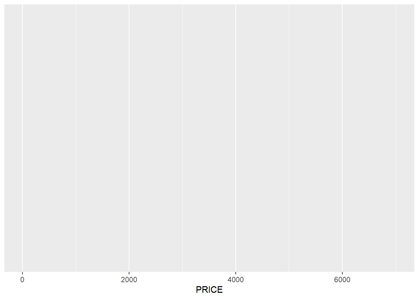
Essentially, we have told ggplot2 what we want to visualize but not how we want to visualize it. If we store this in an object, though, we can layer any number of visualizations on top of it.
For example, if we want a basic histogram, which organizes cases into “bins,” or ranges, and then counts the number of cases in each bin, we can do the following.
base<-ggplot(clist, aes(x=PRICE))
base+geom_histogram()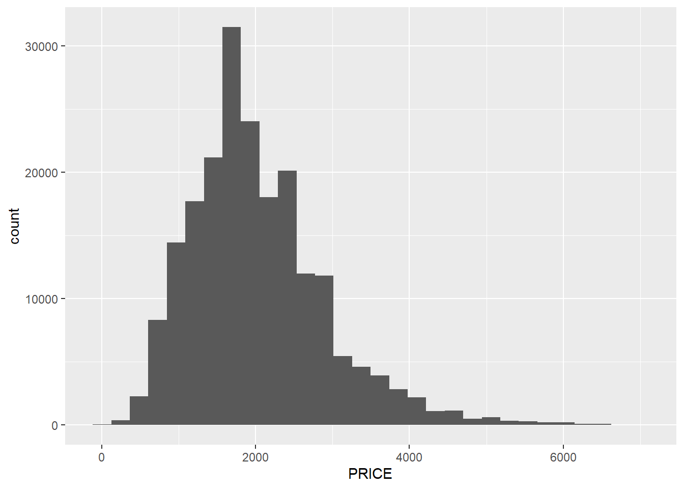
This is a visual version of the summaries we have already conducted, but it gives us a richer set of insights than a simple mean, or even minimum and maximum. The left tail does indeed get very close to $0, reflecting our minimum of $10, but it ramps up quickly—which verifies the interpretation that anything with PRICE>$500 might very well be legitimate. On the other end of the spectrum, though, it is noteworthy that the distribution has a quick drop-off after $3,000, but then a long tail stretching out to $7,000.
There are two things to note about the code. First, geom_histogram() has no additional arguments. There are ways to customize the command, but if it is empty, it simply borrows information from the ggplot() command regarding the data frame and variable of interest. Second, we added geom_histogram() to the object base, which contains the original ggplot() command. That means we have not altered this original object and can easily layer other visual elements on top of it.
4.8.2 Additional Univariate Visualizations
Let us try layering other visuals on top of our base ggplot() command. For example, a density graph gives us a smoother representation that tries to avoid the blockiness of bins. It also reports proportions rather than counts.
base+geom_density()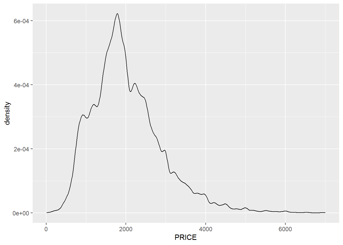 A frequency polygon is a merger of these two approaches, representing counts with a curve rather than boxes.
base+geom_freqpoly()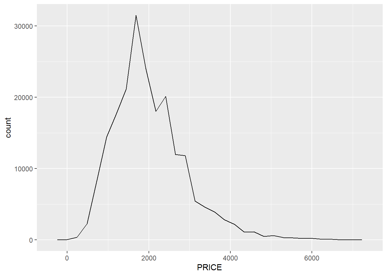
We might also visualize categorical variables in a similar way; though this requires a distinct function for a bar chart, geom_bar(), because a histogram assumes a numeric variable.
base_month<-ggplot(clist, aes(x=LISTING_MONTH))
base_month + geom_bar()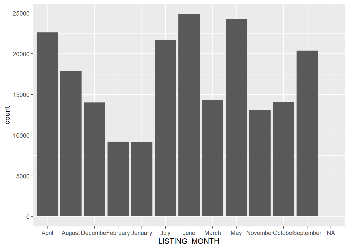
This is a visual version of the table we previously created, but it is possible that we would get more out of reordering these by the calendar rather than their alphabetical names. This requires an extra trick that we will use to re-create our LISTING_MONTH2 variable.
clist$LISTING_MONTH2<-factor(clist$LISTING_MONTH,
                             levels = month.name)
This told R that the factor levels have an order that corresponds to the months of the year. Now we can try again.
base_month<-ggplot(clist, aes(x=LISTING_MONTH2))
base_month + geom_bar()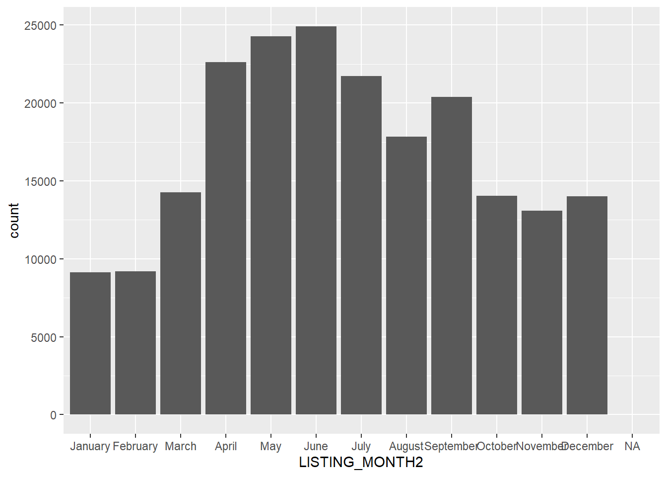
There we have it! Now I have not added additional code to clean up the graph, including replacing the variable name with a more interpretable axis name and moving the axis labels so that they do not overlap. We will learn more about customizing in the next chapter, but for now we will content ourselves with some nice graphics whose details are a little rough around the edges.
4.8.3 Incorporating Pipes into ggplot2
To close out this initial visual analysis, let us return to our subsetting criteria above and use pipes to generate a more easily interpreted graphic.
base_month_pipe<-clist %>%
  filter(clist$LISTING_YEAR==2020,
         clist$LISTING_MONTH!='February') %>%
  ggplot(aes(x=LISTING_MONTH2))
base_month_pipe + geom_bar() 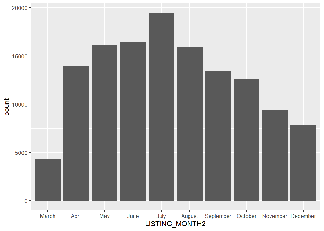
Here we see more clearly the dramatic impact of the pandemic on listings in March 2020 and the seemingly quick rebound in April. Also, see how we stored the full pipe through the ggplot() command in the object base_month_pipe and were able to layer the bar graph on top of it.
4.8.4 Stacked Graphs: One Variable across Categories
As a last step, let us compare the trends across the two years, which will enable us to evaluate more closely the impact of the pandemic. This can be done with a stacked bar graph, wherein the counts are split across a categorical variable, as indicated by the fill= argument. We want to return to the full 2020-2021 data set (note that we have to tell ggplot to treat LISTING_YEAR as a factor).
base_month+geom_bar(aes(fill=as.factor(LISTING_YEAR)))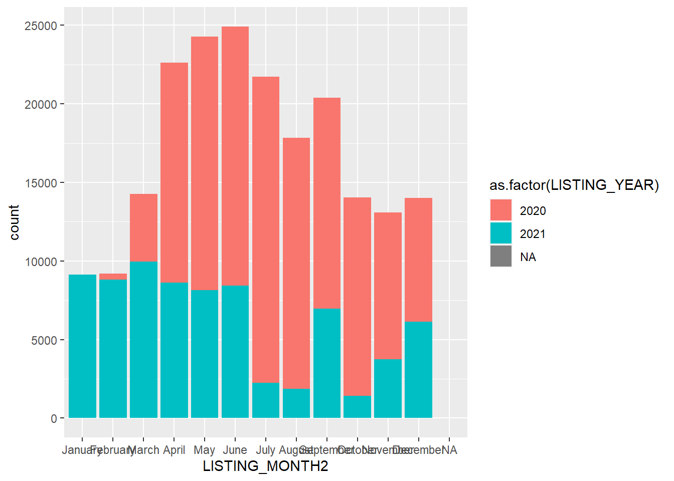
This is a striking graph for a couple of reasons. First, we see that March 2020 really was an aberration, at least relative to March 2021. But it is interesting to note how much taller the April-June bars are for 2020 than 2021. This suggests that a lot of postings that did not occur in March then flooded onto the market. It is also possible that there was more turnover because of the pandemic, leading to additional listings as well. Last, as we have discussed, BARI did not start scraping data until March 2020, so the small number of listings in February of that year are an artifact of the data-generation process. And scraping paused in July-August and October-November in 2021, creating some gaps.
We can do the same with histograms for numeric variables.
base+geom_histogram(aes(fill=as.factor(LISTING_YEAR)))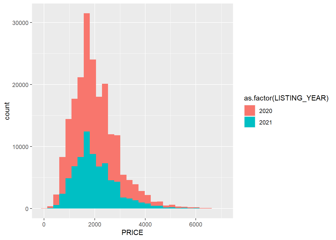
Here we see that, unlike listings by month, the distribution of prices was largely the same between the two years.
4.9 Summary
In this chapter we have learned how to reveal the pulse captured by a given data set, including both the features of the pulse itself and the ways in which the data-generation process needs to be taken into consideration when interpreting a naturally occurring data set. We saw how, in general, the housing market in Massachusetts appears to be more active in the summer, with more listings and somewhat higher prices than the rest of the year. We also saw how the pandemic dramatically diminished listings in March, but that this rebounded rather quickly with listings possibly even above average in the following months.
In terms of interpretation, however, we observed a few details that required us to take pause, or at least exclude cases whose meaning was unclear (or downright incorrect). We saw that any system that requires user input can have mistakes, like fake prices and missing or false square footage for apartments or houses. We came up with a strategy for setting a threshold for the former, though. We also saw that the timing of the data-generation process—the scraping of Craigslist, in this case—influenced how listings looked in certain months. In sum, we learned a lot about the pulse of the housing market in Massachusetts during the pandemic as well as the strengths and limitations of scraped Craigslist data to tell us about it.
We also practiced a variety of skills that can easily be applied to other data sets. We:
- Identified classes of variables so that we would know how to work with them;
- Made tables of counts of values across categories;
- Generated summary statistics for numeric variables using
summary()and other commands; - Summarized multiple variables using
apply(); - Organized summaries by categories provided by another variable using
by(); - Summarized subsets of data using piping, including the new commands
group_by()andsummarise(); - Analyzed tables as data frames;
- Visualized data with the package
ggplot2, including - Making histograms, bar graphs, and related visuals of the distribution of a single variable and
- Making stacked histograms that split the distribution according to categories from another variable;
- Critiqued the interpretation of a data set based on potential errors and biases arising from its origins.
4.10 Exercises
4.10.1 Problem Set
- Each of the following commands will generate an error or give you something other than what you want. Identify the error, explain why it did not work as expected, and suggest a fix.
by(clist$LISTING_YEAR,clist$PRICE,mean)mean(clist$ALLOWS_DOGS)summary(clist$BODY)
- Classify each of the following statements as true or false. Explain your reasoning
- All factors are character variables, but not all character variables are factors.
- All numeric variables are integer variables, but not all integer variables are numeric.
- An integer variable with only the values 0 and 1 is effectively equivalent to a logical variable.
- There is only one class of date-time variable.
- Describe in about a sentence what information R will return for the following commands.
median(clist$PRICE)clist %>%filter(LISTING_MONTH==’July’) %>%summarise(mean = mean(ALLOWS_CATS)by(clist$AREA_SQFT,clist$LISTING_MONTH,mean,na.rm=TRUE)ggplot(clist, aes(x=LISTING_YEAR)) + geom_freqpoly
- Which function would you use for each of the following tasks?
- Calculate the mean for multiple variables.
- See a set of basic statistics for one or more variables.
- Calculate the means on a single variable across multiple groups.
- Which function in
ggplot2would you use for each of the following?- Create a smoothed curve of a variable’s distribution.
- Visualize a variable’s distribution organized into rectangular bins.
- Visualize a variable’s distribution with a curve fit to bins.
- Visualize the distribution of observations across categories.
4.10.2 Exploratory Data Assignment
Working with a data set of your choice:
- Generate at least three interesting pieces of information or patterns from your data set and describe the insights they provide regarding the dynamics of the city.
- Find at least two things in your data set that are strange or do not make sense. What might they tell you about the data-generation process and any errors or biases it might generate?
- Redo your first analysis excluding cases that do not make sense, if necessary.
- Your findings can be communicated as numbers, graphs, or both and should convey what you see as the overarching information contained in the data set. You must include at least one graph.