9 Advanced Visual Techniques
The Kantar Information is Beautiful awards recognize the most impressive data visualizations of each year. The submissions cover a broad range of subjects, from arts and entertainment to maps and places, from news and current affairs to science and technology, from climate and environment to sports statistics. There is even a category called “Unusual.” The true versatility of data visualization is especially apparent, however, when one looks at specific submissions and awardees, including those pictured in Figure 9.1: a map of where houses in Houston damaged by Hurricane Henry have been scooped up by investors—-from mom-and-pop landlords to billion-dollar Wall Street funds; the history of U.S. immigration by continent conceived of as rings in a tree trunk (also known as “dendrochronology”; (Cruz et al. 2019)); a multimedia visualization of how American municipalities bus homeless individuals to other places, often big cities; and even quirky visualizations like a swarm plot of the vocabulary size of rappers, as measured by the number of unique words in their first 35,000 lyrics.
The Kantar Information is Beautiful awards illustrate just how powerful, prominent, and sophisticated the world of data visualization has become. In fact, if you browse through the submitters, you will notice that many are from major media outlets, like The New York Times, The Guardian, and The Washington Post, while others are from advocates, scientists, and independent analysts (a few, like MIT’s Senseable City Lab, have been mentioned previously in this book). And, if we are being honest, these visualizations really are beautiful! There are dozens of creative ways to visualize data, but to be certain this is not an “automatic” exercise. As with everything we have learned and will learn, the creation of data visualizations requires careful thought and design to ensure that the final product communicates the story clearly without distorting the meaning.
In this chapter, we are going to learn a handful of advanced data visualization techniques that, if used properly, are sure to help communicate your discoveries and impress your audience. In many cases, they are not all that difficult to execute, they just require forethought about how they are best designed to reveal the most important information. You could skip this chapter and have no difficulty completing the material that follows, but if you want to expand your toolbox for visualization beyond ggplot2, you are ready!
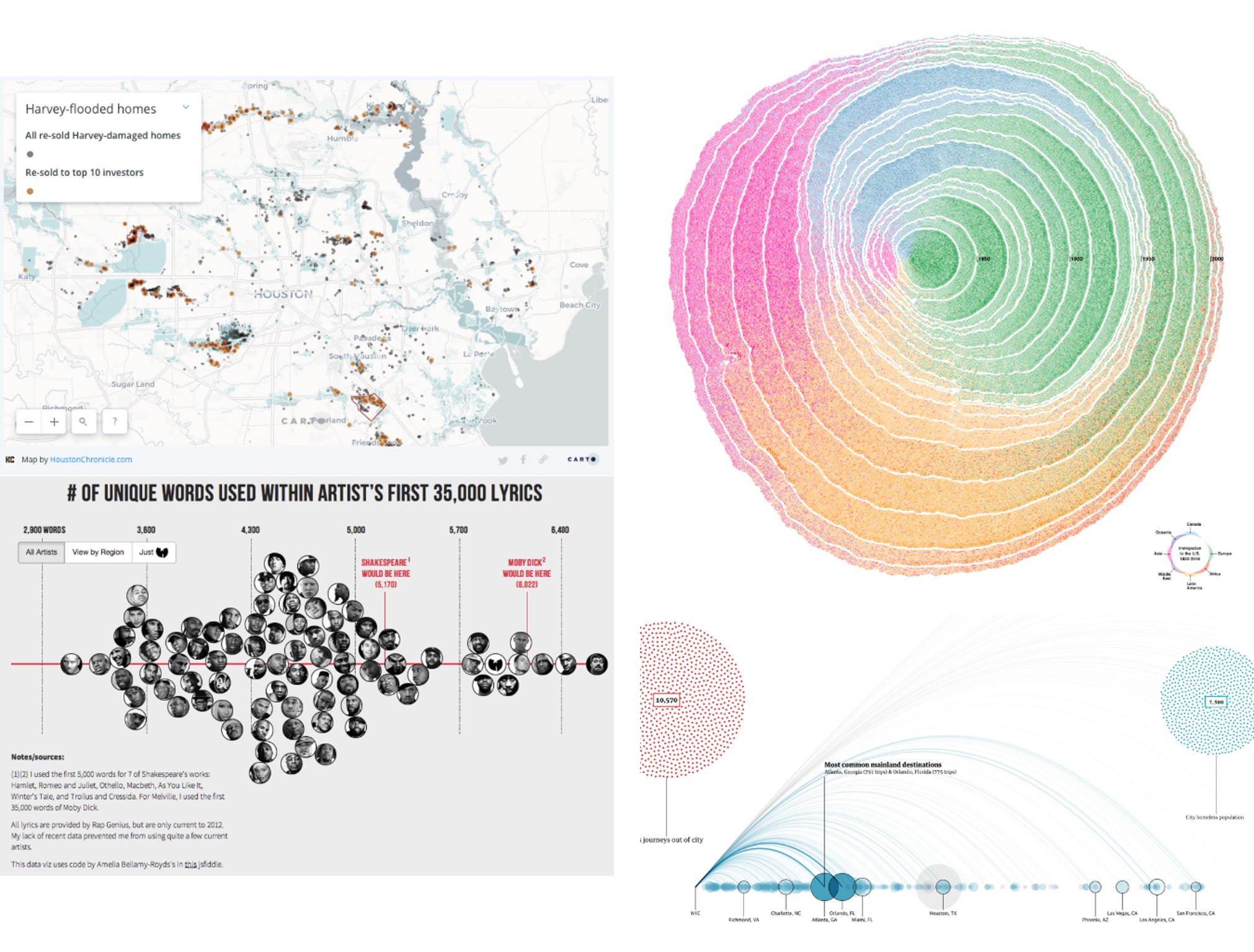
Figure 9.1: Submissions to the Kantar Information is Beautiful awards are diverse, including topics as wide-ranging as how the houses in Houston damaged by Hurricane Henry have been scooped up by investors (top left), the history of U.S. immigration by continent represented as rings in a tree (top right), the number of unique words in each rapper’s first 35,000 lyrics (bottom left), and how American municipalities bus homeless individuals to other places (bottom right). (Credit: , Cruz et al., , Matthew Daniels)
9.1 Worked Example and Learning Objectives
In this chapter we will learn five advanced visualization techniques. Using these tools requires a bit more thought and consideration about how to best represent your data, but most only call for a few lines of code. Conveniently, nearly all of them use additional packages that build on the syntax of ggplot2. We will learn about:
- Multiplots, which combine multiple graphical components into one image;
- Streamgraphs, which are interactive representations of the frequency of categories over time;
- Heat maps, which are visually appealing representations of the relationships between two sets of categories;
- Correlograms, which are visual representations of the strength of correlations between multiple variables;
- Animations, which place multiple visualizations in a sequential order to show change, often over time;
- and, of course, we will consider conceptually when it is appropriate and necessary to use these sorts of tools and when something simpler might suffice.
We will again illustrate these techniques with 311 case records as we are already familiar with some of the nuances of these data, though this time we will use the version curated by BARI, which has additional geographic information. Also, to take advantage of the time-stamps in the data, we will do a small amount of pre-processing and require(lubridate) and require(tidyverse).
Link: https://dataverse.harvard.edu/dataset.xhtml?persistentId=doi:10.7910/DVN/CVKM87. You may also want to familiarize yourself with the data documentation posted there or the worked example in Chapter 3.
Data frame name: CRM
require(lubridate)
require(tidyverse)
CRM<-read.csv("Unit 2 - Measurement/Chapter 09 - Advanced Visualization/Example/311 Cases 2015_2019 Unrestricted.csv")
CRM$OPEN_DT <- as_datetime(CRM$OPEN_DT)
CRM$year <- year(CRM$OPEN_DT)
CRM$month <- month(CRM$OPEN_DT)
CRM$day <- day(CRM$OPEN_DT)
CRM$Snow<-str_detect(CRM$TYPE,'Snow')
9.2 Data Visualization: How and Why?
They say that a picture is worth a thousand words, and good data visualization can be worth thousands and thousands of data points. Effective data visualizations are capable of thoroughly communicating information in captivating ways that are accessible to audiences of all levels of data literacy. This has inspired visualizers—who in some ways are their own entire sub-class of analyst—have developed innumerable new and compelling ways to represent data graphically, and these tools have rapidly become widespread. Many organizations have also turned to Tableau as a straightforward cookbook for making data visualizations. Those with the capacity for custom analysis in R leverage ggplot2, which as we have seen includes dozens of different techniques. And there are many, many additional packages for R that enable more sophisticated visualizations, most of which capitalize on the syntax of ggplot2 . The five that we will learn about in this chapter are but a small subset of what is possible. You will note throughout, however, that these tools are very specific about the data structure needed to inform the construction of the visualization, which means we will often need to create custom aggregations as we go (see Chapter 7 for a refresher, as these bits of code will only be referenced in brief).
When I think about advanced visualization, I am reminded of a quip that one of our more illustrious, senior professors made to us young quantitative types when I was in graduate school. “If you need an overly complex statistical tool to analyze your data, your question is too complicated to be worth asking.” We all laughed, but there was an important lesson in here: focus your attention on the insights you want to pursue, and the methods will follow. If the question requires a simple set of tools, then that is what you should use. Do not prioritize sophisticated techniques for their own sake. The same is true for advanced visualizations. Animations, streamgraphs, and multiplots are great tools, but they have to be aligned to the question. Sometimes they will be flashy—little more than technical showboating—without making the information any more accessible. Sometimes, they will even obscure or distract from what you are trying to accomplish. For this reason, when describing each of the five techniques we will start by identifying when it is most appropriate, and maybe even certain times when you might be better off using a different technique.
9.3 Multiplots
Sometimes a story calls for more than one graphic, but we want those graphics coordinated in a single visual. For example, one of the visualizations in Figure 9.1 was a combination of three different graphics describing the tendency of municipalities to bus homeless individuals to larger cities (in fact, what you see there was a subset of even more visualizations in that graphical collage). This is called a multiplot, or a single visualization that coordinates two or more graphics. This is a relatively simple extension of standard visualizations, but one should always consider whether multiple graphics help add detail to the story or can either distract or overwhelm the audience.
The process of making a multiplot has two steps. First, we need to make the individual graphics that we want to compose the multiplot. Second, we need the gridExtra package, which can organize those graphics into a grid (Auguie 2017).
9.3.1 Making Individual Graphics
First, making our individual graphics will require skills we have learned in previous chapters. Suppose we want to visualize the quantity of 311 cases by neighborhood, using BRA_PD (“planning districts” defined by the Boston Planning Redevelopment Agency, formerly known as the Boston Redevelopment Authority (BRA), which largely conform to the historical neighborhoods of the city), and see how these counts evolve over time. To make this more tractable, we are going to subset to 10 major neighborhoods that capture the demographic and economic diversity of the city.
require(gridExtra)

nbhd_data <- CRM %>%
  filter(BRA_PD %in% c('Back Bay/Beacon Hill',
              'Allston/Brighton','Central', 'Roxbury',
              'North Dorchester', 'South Dorchester',
              'South End', 'West Roxbury','East Boston',
              'Charlestown'), LocationID!=302615000) %>%
  group_by(BRA_PD, year) %>%
  summarise(count_per_nhood = n())
We have now created nbhd_data, which consists of counts of 311 reports by neighborhood for each year. We might then create a bar plot that represents total cases by neighborhood.
p1 <- ggplot(nbhd_data, aes(x=BRA_PD,
                    y = count_per_nhood, fill = BRA_PD)) +
  geom_bar(stat="identity") + xlab("") + ylab("") +
  theme(legend.position = "none",
        axis.text.x = element_text(angle = 45, hjust=1))
p1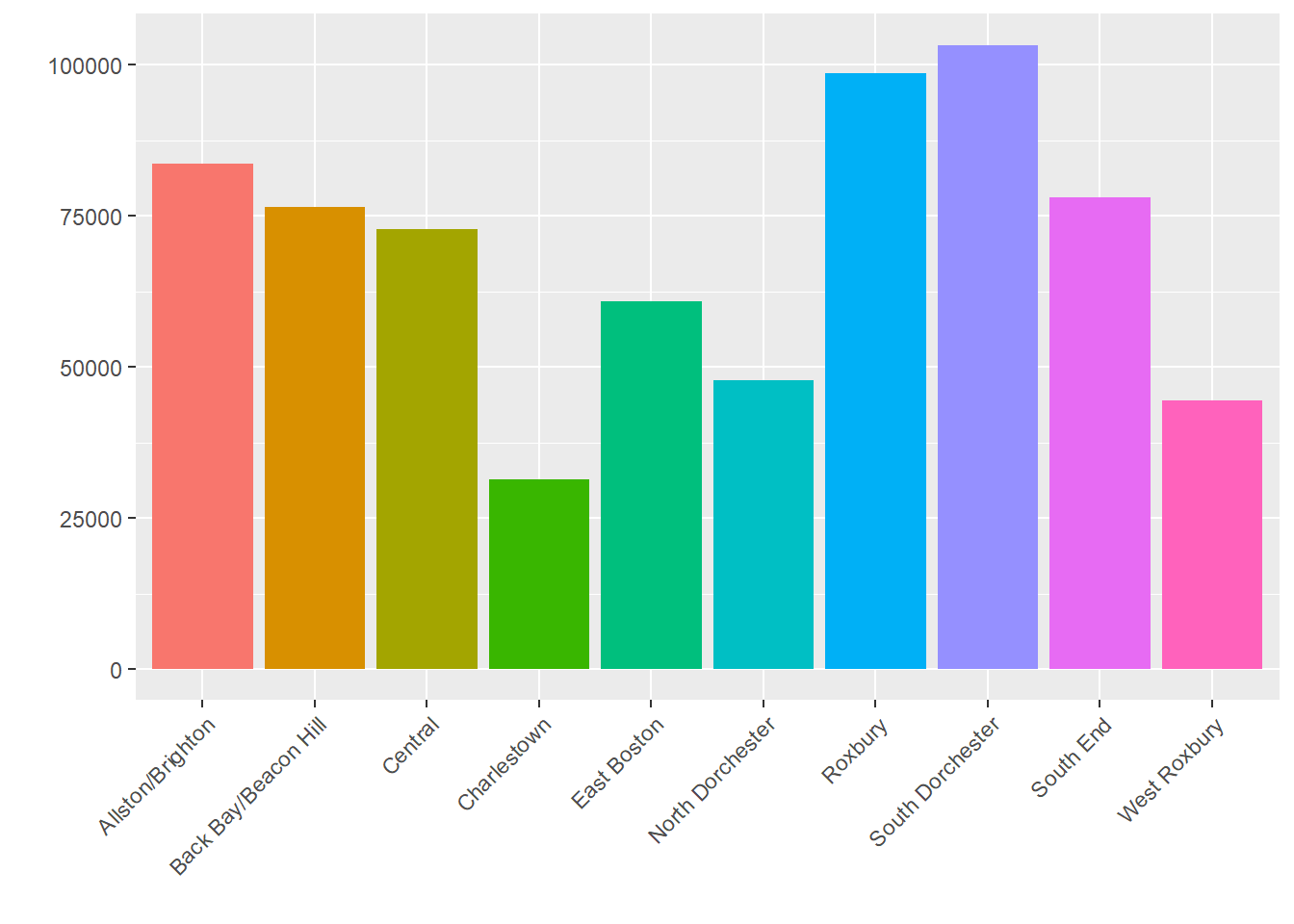
We can also create a line plot with change over time for each neighborhood.
p2 <- nbhd_data %>%
  ggplot( aes(x=year, y=count_per_nhood, group=BRA_PD,
              color=BRA_PD)) +
  geom_line() + xlab("") + ylab("") +
  theme(axis.text.x = element_text(angle = 45, hjust=1))
p2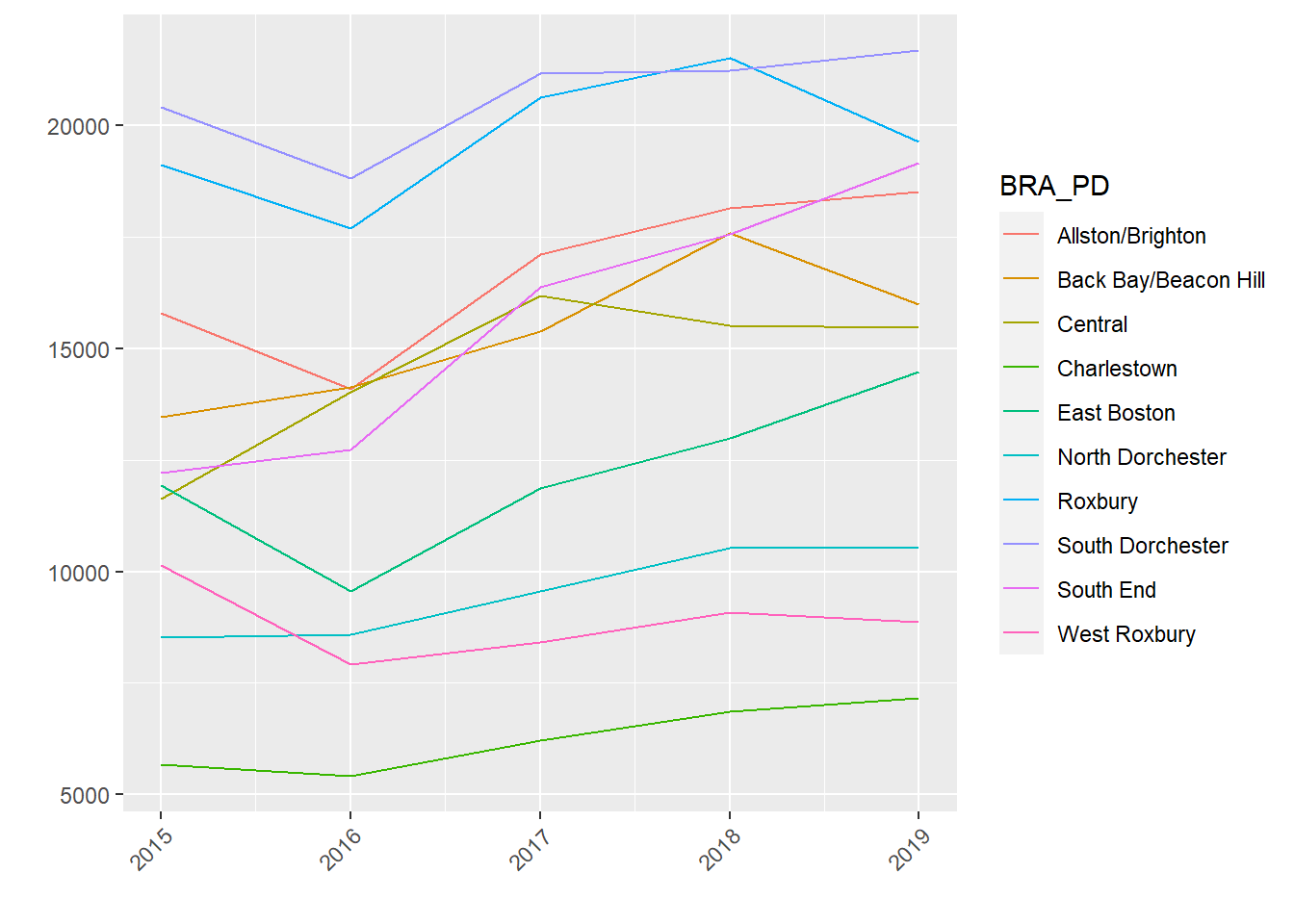
9.3.2 Coordinating Individual Graphics in a Multiplot
Now suppose we want to put those two graphics together in a single graphic. This can be done with the grid.arrange() command from gridExtra.
grid.arrange(p2, p1, nrow = 1, widths=c(250,150))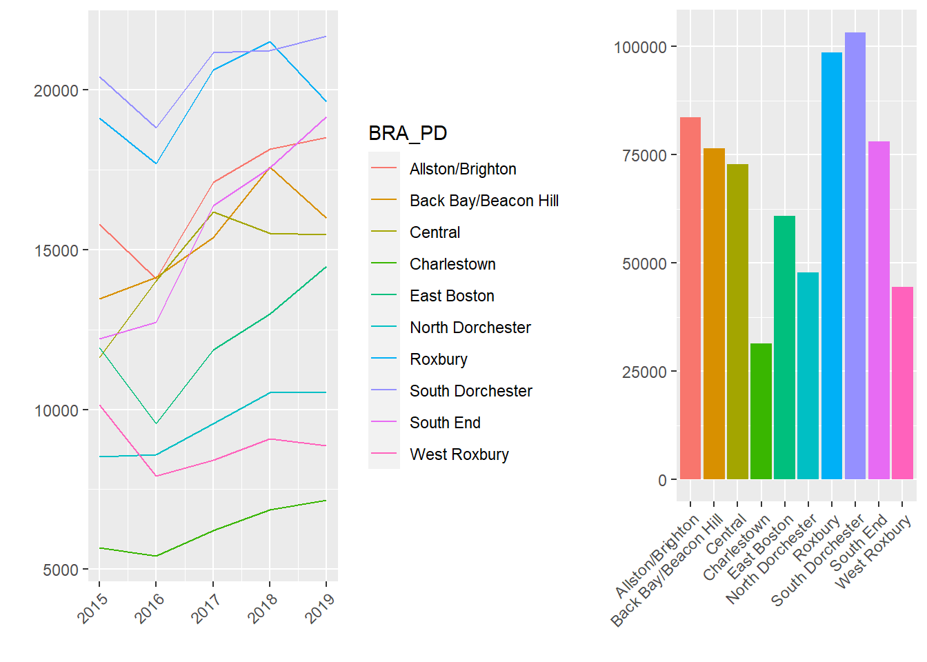
How did that work? All we had to do was tell grid.arrange() the graphics we wanted to bring together in the multiplot. In this way it capitalizes on the capacity of ggplot2 to create graphics as objects. We told it how many rows we wanted, which is more relevant if we have more than two graphics. There are multiple ways to customize the organization of a multiplot. Here I have used the widths= argument to accommodate the different widths of the two original graphics. (Try without this command and see what happens.)
Substantively, seeing these two graphs side-by-side helps us understand the spatial and temporal trends of 311 reports. On the right, we see that some neighborhoods produce many requests for services (e.g., South Dorchester) and others generate relatively few (e.g., Charlestown). It is not immediately clear whether this is a function of population, area, or need, however. We see on the left, though, that over time the demand for 311 services has climbed across the board. Nonetheless, these rises have been steadier in some areas (e.g., South End) than others (e.g., Charlestown).
9.4 Streamgraphs
Suppose we want to go beyond the superficial coordination of the multiplot and combine time and space simultaneously. This can be accomplished with a streamgraph, which layers counts by categories across time (or some other numeric variable, but most often time). A streamgraph is especially fun because it can be interactive, with the viewer being able to click on layers of the stream and turn on and off specific categories to see how they contribute to the overall pattern. The downside of streamgraphs is when there are so many categories as to overwhelm the graphic, or either the categories or the timespan lacks variation. Streamgraphs can be made with the fittingly titled package streamgraph (Rudis 2019), though it has been made by a developer who has not put the package on CRAN. Thus, we have to use the following code to access it from GitHub.
devtools::install_github("hrbrmstr/streamgraph")require(streamgraph)9.4.1 Executing a Streamgraph
Returning to our previous example, it might be interesting to look at something more specific than the total volume of 311 requests. A given case type, like snow removal requests, might tell a more detailed story about variations in space and time. We then need to recreate our aggregate data set, this time filtering for cases whose TYPE references snow.
stream_data <- CRM %>%
    filter(BRA_PD %in% c('Back Bay/Beacon Hill',
              'Allston/Brighton','Central', 'Roxbury',
              'North Dorchester', 'South Dorchester',
              'South End', 'West Roxbury','East Boston',
              'Charlestown'), LocationID!=302615000) %>%
   group_by(BRA_PD, year) %>%
   summarise(Snow = sum(str_detect(TYPE,'Snow')))
## `summarise()` has grouped output by 'BRA_PD'. You can override
## using the `.groups` argument.Note that this data frame contains the three basic elements required by a streamgraph: (1) time or other continuous variable that we want to be the basis of the x-axis, or the length of the stream, as it were (i.e., year); (2) a numeric variable for the y-axis, which reflects the width of the stream (i.e., snow); and (3) a categorical variable that will differentiate the layers of the stream (i.e., BRA_PD). We are now ready to run the streamgraph command, whose customizations are constructed with piping.
pp <- streamgraph(stream_data, key="BRA_PD", value="Snow",
                  date="year", interactive = TRUE,
                  height="300px", width="1000px") %>%
  sg_legend(show=TRUE, label="names: ") %>%
  sg_axis_x("%Y")
pp
## Warning in widget_html(name = class(x)[1], package = attr(x,
## "package"), : streamgraph_html returned an object of class `list`
## instead of a `shiny.tag`.The result is a rather colorful interactive graph. We can see multiple layers, each of which corresponds to one of our ten neighborhoods. Notably, some are thicker than others, reflecting greater need in some neighborhoods than others. Also, see how the graph is really thick in 2015, nearly absent in 2016, and then rebounds more modestly in the years that follow. This reflects the annual patterns of snow in Boston. 2015 saw a record-breaking amount of snow; 2016, not so much.
Streamgraphs are interactive, as well. By mousing over them we can see the counts of snow removal requests for each neighborhood in each year. We can scroll left to right to see the full timespan. Last, we can use the drop-down menu to highlight particular categories (i.e., neighborhoods) in the data. Again, this can be generalized to any count variable for any category. Technically we can also make the x-axis represent any continuous numeric variable we want, though it would have to, like time, make sense to represent as the stages of a stream.
9.5 Heat Maps
Sometimes we want to look at the distribution of two variables together. We have seen this previously with two-variable tables in Chapter 4, which contain counts for the intersection of each value of the two variables. This is also known as a crosstab. Technically, this is exactly what we have done in this chapter so far as we have created data frames with counts of cases by neighborhood in each year. It may be more engaging and immediately interpretable, however, to represent this graphically. This is what a heat map does by translating the numbers in a crosstab into colors proportional to their size. Heat maps, though, may not be as effective when one of the variables is dominated by one or two values, as these will obscure any of the richness of the crosstabs—which is the whole reason we would want to use a heat map in the first place. Heat maps are made with ggplot2’s geom_tile() command.
9.5.1 Heat Map for Two Categorical Variables
Building further on our example from the streamgraph, let us consider the distribution of multiple case types, including snow removal, graffiti removal, and some other key issues, across neighborhoods. We will first need to create a data frame that has counts organized by these two variables (BRA_PD and TYPE). We will again subset to 10 key neighborhoods and only 6 key case types.
heat_data <- CRM %>%
      filter(BRA_PD %in% c('Back Bay/Beacon Hill',
                  'Allston/Brighton','Central','Roxbury',
                  'North Dorchester','South Dorchester',
                  'South End','West Roxbury','East Boston',
                  'Charlestown'),LocationID!=302615000,
             TYPE %in% c("Graffiti Removal",
                  "Poor Conditions of Property", 'Bed Bugs',
                  'Request for Snow Plowing', 'Rodent Activity',
                  'Improper Storage of Trash (Barrels)')) %>%
  group_by(TYPE, BRA_PD) %>%
  summarise(Frequency = n())
## `summarise()` has grouped output by 'TYPE'. You can override
## using the `.groups` argument.We can then create a heat map using geom_tile() with our two main variables as x and y and Frequency, or our count variable, as the fill= argument.
p <- ggplot(heat_data, aes(x=BRA_PD, y=TYPE,
                    fill= Frequency)) + geom_tile() +
  theme(axis.text.x  = element_text(angle=45, hjust = 1,
                        vjust=1, size=8),
                axis.text.y  = element_text(size=8)) +
  ylab("") + xlab("")
p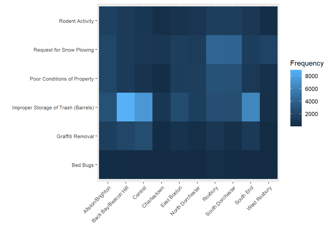
We can see here a few interesting trends. First, improper storage of trash is the most frequent complaint in most if not all neighborhoods. This is especially true for Back Bay/Beacon Hill and South End, which are high-density downtown neighborhoods. But these neighborhoods do not necessarily have the most cases for all types. We see that Roxbury and South Dorchester, which are outside of downtown but have large populations and high levels of economic disadvantage, have the most complaints regarding poor conditions of property.
9.6 Correlograms
Our heat map revealed an interesting pattern. It appears that issues with trash disposal were not entirely correlated with those reflecting blight and dilapidation of properties. Is it possible that different case types might cluster across neighborhoods in different ways? A correlogram will help us to zoom out and view the strengths of the relationships between multiple variables, quantified as correlation coefficients. We will learn more about correlation coefficients and what they mean in Chapter 10, but for now just know that they range from -1 to 1; a positive value indicates that two variables rise and fall together and a negative value indicates that as one goes up the other goes down; and larger absolute values mean the positive or negative relationship is stronger (i.e., more consistent). Correlograms can be made using the ggcorrplot package (Kassambara 2019). They are generally a strong tool provided the question is, “How do a bunch of variables relate to each other?”, but they can be difficult to interpret if there are too many variables.
9.6.1 Creating a Correlogram
To create a correlogram, we first need a set of variables that we want to correlate for a given unit of analysis. In this case, our variables are counts of different case types and our unit of analysis is the neighborhood. Because we no longer need to limit to a subset of neighborhoods to make the graphics readable, we will expand to all places.
require(ggcorrplot)
correl_data <- CRM %>%
  filter(!is.na(BRA_PD)) %>%
   group_by(BRA_PD, year) %>%
   summarise(graffiti = sum(TYPE == "Graffiti Removal"),
    poor_cond = sum(TYPE == "Poor Conditions of Property"),
    bedbugs = sum(TYPE == 'Bed Bugs'),
    snow = sum(TYPE == "Request for Snow Plowing"),
    trash = sum(TYPE == "Improper Storage of Trash (Barrels)"),
    rodents = sum(TYPE == "Rodent Activity"))
We then need to create a correlation matrix, which quantifies the strength of relationship between all variables as correlations. This is done by using the corr() command on all variables except the first (which is the BRA_PD identifier).
corr <- cor(correl_data[,-1])We are now ready to create a correlogram based on this correlation matrix.
ggcorrplot(corr, hc.order = TRUE,
  type = "lower",
  lab = TRUE,
  lab_size = 3,
  method="circle",
  title="Correlations between 311 Case Types by Neighborhood")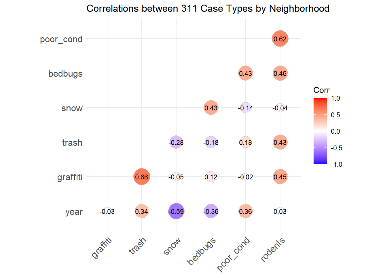
The function takes the values directly from the correlation matrix, but we have customized in a few ways. We have specified that the variables be ordered in a way that highlights groups of variables that correlate strongly with each other (hc.order=TRUE), that the correlations be represented below the diagonal (type=”lower”; because we do not need them reproduced in both halves), that the values be printed on the graph (lab=TRUE) at a size of 3, and that the magnitude of the correlations be reflected in the size of circles (method=”circle”).
Looking at this graph confirms our suspicion that the poor disposal of trash and the prevalence of poorly maintained properties do not coincide much at all, featuring one of the smallest values in the chart. There are also some interesting relationships that tell a fuller story. The prevalence of poorly maintained properties in a neighborhood coincide with more rodent activity and bed bugs, which stands to reason. Meanwhile, poor trash disposal correlates strongly with graffiti. This appears to reflect the two constructs we met in Chapter 6 of neglect of private spaces and denigration of public spaces. Last, snow tends to correlate with the first group, though it is not clear why this would be the case, except if those areas also have more people and roads (and more residential roads, which are often plowed after main arteries and thereby elicit more calls for plowing).
9.7 Animations
Some might say that animations are the holy grail of data visualization. Instead of a single, static graphic, they move! They change, showing shifts in the data over time (or some other variable). Think about how impressed your audience will be! To the uninitiated, animations seem really complex, but they are not actually that difficult to create. To understand why, it helps to think back to those little flipbooks you might have had as a kid for animating a short scene, or to documentaries about how cartoons are made. What we see as continuous movement is actually many individual images viewed one-at-a-time in a high-speed sequence. In the same way, data animations are multiple graphics shown one-at-a-time according to a logical sequence (most often a timeline). We can do this in R with the gganimate package (Pedersen and Robinson 2020). We will also need the gifski package to render the graphics into an animated .gif (Ooms 2021).
While animations are one of the most sophisticated visualization techniques, they also call for the greatest caution. Analysts must always ask themselves if an animation is making the patterns in the data more accessible, or if it is just superfluous window-dressing that may do more to distract than to enhance. We will consider this as we walk through two examples.
9.7.1 Animating a Bar Graph
Keeping in mind that an animation is essentially stapling together a series of related graphics, let us start simple and create a single, static graph upon which we might want to build. We will again subset to a handful of neighborhoods and case types, though we do not need to aggregate this time around.
require(gganimate)
require(gifski)
options(scipen=10000)

data_animate <- CRM %>%
      filter(BRA_PD %in% c('Back Bay/Beacon Hill',
                  'Allston/Brighton','Central','Roxbury',
                  'North Dorchester','South Dorchester',
                  'South End','West Roxbury','East Boston',
                  'Charlestown'),LocationID!=302615000,
             TYPE %in% c("Graffiti Removal",
                  "Poor Conditions of Property", 'Bed Bugs',
                  'Request for Snow Plowing', 'Rodent Activity',
                  'Improper Storage of Trash (Barrels)'))
We can now create a bar chart of the number of records per case type.
ggplot(data_animate, aes(x=TYPE)) +
  geom_bar(stat='count') + coord_flip()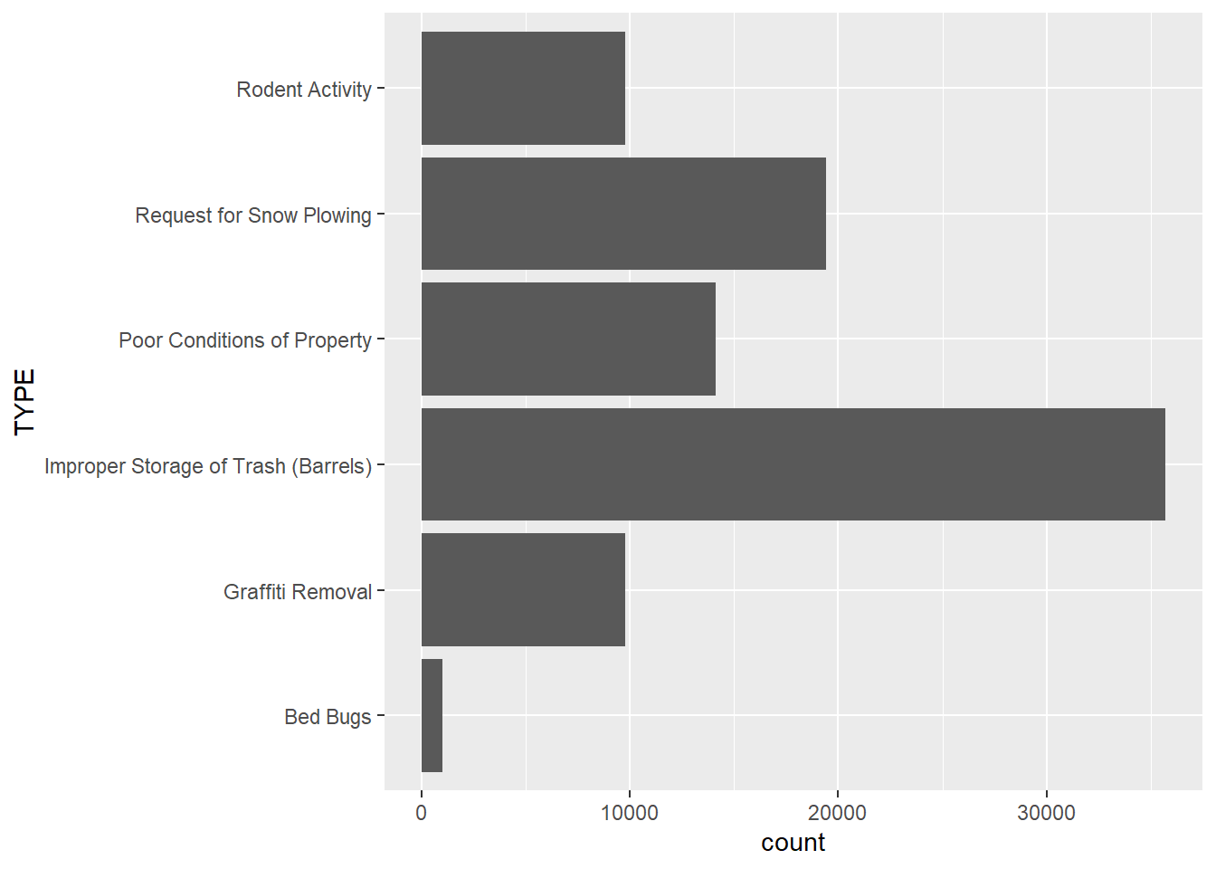
This describes a pattern that we surmised from the heat map in Section 9.5: trash disposal issues are the most common of the case types we have chosen, followed by requests for snow plowing and poor conditions of properties. Bed bugs are the least common. But has this distribution shifted over time?
p <- ggplot(data_animate, aes(x=TYPE)) +
  geom_bar(stat='count') + coord_flip() +
  transition_states(
    year,
    transition_length = 2,
    state_length = 1
  ) +
  ease_aes('sine-in-out') +
  labs(title = 'Number of cases: {closest_state}')

animate(p, duration = 10, fps = 20, width = 400, height = 400,
        renderer = gifski_renderer())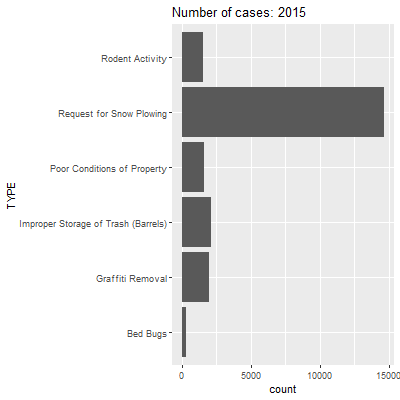
This code has a lot of components, so let us walk through it. We start with the same commands for the bar graph through coord_flip(). We then have a command for transition_states(), which is from the gganimate package. The arguments here are for: (1) the variable over whose values we want to repeatedly remake our graph (i.e., year); (2) how long we want transitions between images to take (transition_length=); and (3) the length that each image should stay stable (state_length=). The ease_aes() command specified a mathematical logic for making the movement between states smooth (here we use sine curves, which make change the slowest at the beginning and end of a transition). The next line of code features the animate() function, which specifies the object we just created (p), the duration, the frames per second (remember the analog to cartoons?), the width, height, and a renderer for stitching all of the pieces together. Here we use gifski_renderer() for that purpose. Note that we also enter a dynamic field as part of the text in the label so that the title changes to reflect the data currently visible in the graph ({closest_state}).
As we watch this animation, we see that a lot of case types stay relatively stable between years. The most striking changes are in requests for snowplows and improper storage of trash. For the former, we have already seen that 2015 had way more requests for snowplows because of a record-breaking amount of snowfall that winter. For the latter, it is not clear why this might be the case. It could be that trash storage was less of a problem in 2015, but it is more likely that something changed in how the 311 system coded these types of issues at that time. We can also save this as a .gif that you can insert into a presentation or other medium.
anim_save("Unit 2 - Measurement/Chapter 09 - Advanced Visualization/Example/type barplot x year.gif")
While we are at it, what about animating the same graphic across neighborhoods?
p <- ggplot(data_animate, aes(x=TYPE)) +
  geom_bar(stat='count') + coord_flip() +
  transition_states(
    BRA_PD,
    transition_length = 2,
    state_length = 1
  ) +
  ease_aes('sine-in-out') +
  labs(title = 'Number of cases: {closest_state}')

animate(p, duration = 10, fps = 20, width = 400, height = 400,
        renderer = gifski_renderer())
Here we see a lot more action, and it corresponds to the relationships we saw previously between case types in the heat map and correlogram. Reports of improper storage of trash are remarkably high in Back Bay and Beacon Hall, but this is tempered in places like Roxbury and South Dorchester, where complaints about the upkeep of properties and snowplows become more prevalent, both in a relative and absolute sense.
9.7.2 Animating a Line Graph
Let us make one more animation, one that illustrates a different gganimate() command. Whereas we previously used the transition_states() command to animate a series of replications of the same graph, the transition_reveal() command allows us to reveal the elements of a graph sequentially. This is often used for line graphs as it can “draw” the lines step-by-step.
We can start by creating a line graph that shows the monthly levels of calls by three neighborhoods: Roxbury, which is a majority-minority residential neighborhood; Back Bay/Beacon Hill, which is an affluent downtown neighborhood; and West Roxbury, which is an affluent, predominantly White neighborhood with a suburban feel.
data_git <- CRM %>%
  filter(BRA_PD %in% c("Roxbury", "Back Bay/Beacon Hill",
                       "West Roxbury")) %>%
  group_by(BRA_PD, month) %>%
  summarise(count_per_nhood = n())
## `summarise()` has grouped output by 'BRA_PD'. You can override
## using the `.groups` argument.data_git %>%
ggplot( aes(x=month.abb[month], y=count_per_nhood,
group=BRA_PD, color=BRA_PD)) +
geom_line() +
geom_point() +
scale_x_discrete(limits = month.abb) +
ggtitle("Changes in the number of reported requests
in three neighborhoods during the year") +
theme(plot.title = element_text(size=9)) +
ylab("") +
xlab("Month")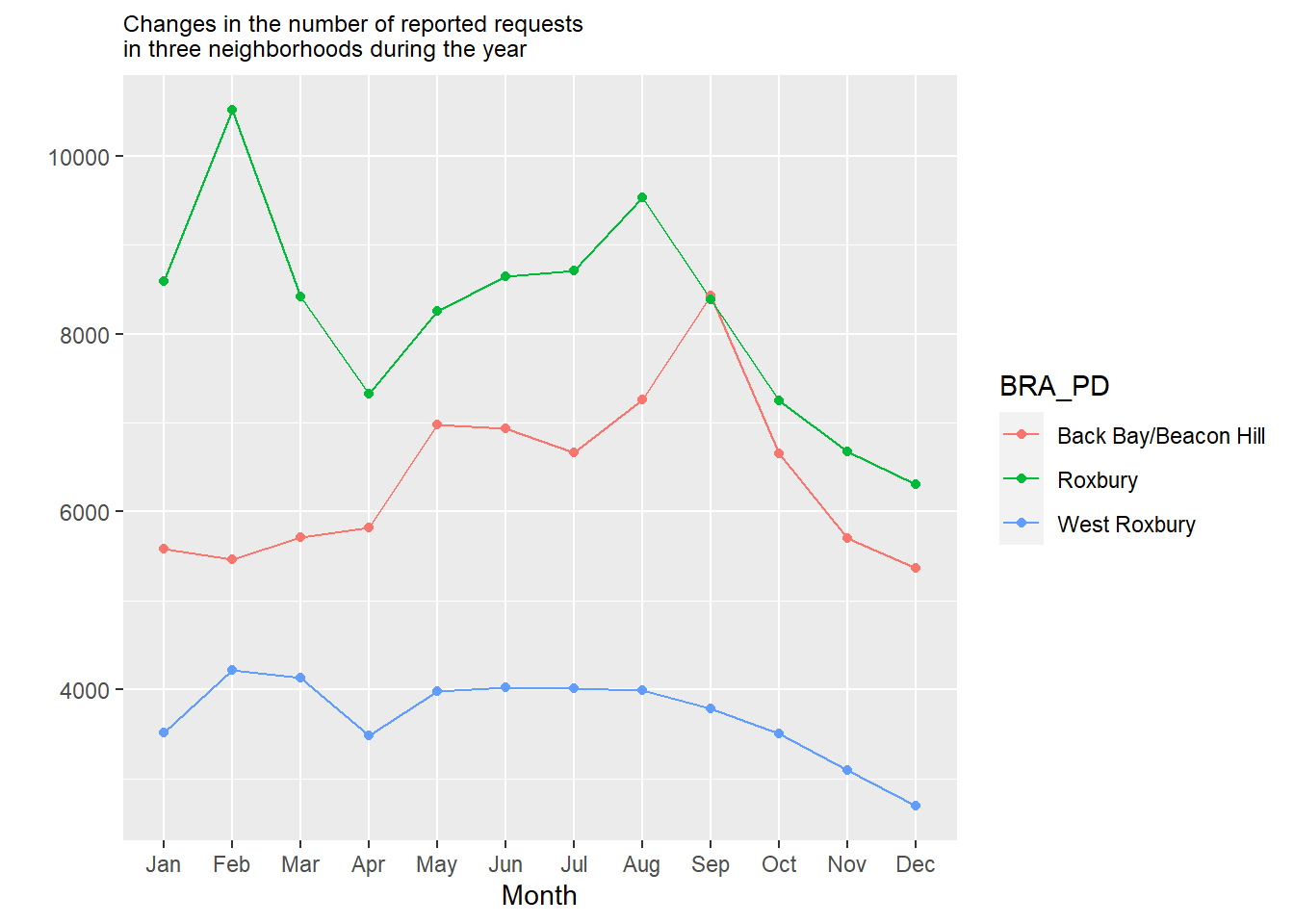
We see here that Roxbury generally has more requests, especially in February, likely owing to the uptick of snowplow requests in residential neighborhoods at that time. Back Bay/Beacon Hill sees a sharp rise in September, probably in response to the influx of college renters and the “move-in” season. Meanwhile, West Roxbury is relatively quiet, with just a moderate uptick in the snowy parts of the winter.
Now, let’s turn this into an animation using the transition_reveal() command, with the month variable as our order.
p2<-data_git %>%
  ggplot( aes(x=month.abb[month], y=count_per_nhood, group=BRA_PD, color=BRA_PD)) +
  geom_line() +
  geom_point() +
  scale_x_discrete(limits = month.abb) +
  ggtitle("Changes in the number of reported requests
          in three neighborhoods during the year") +
  theme(plot.title = element_text(size=9)) +
  ylab("") +
  xlab("Month") +
  transition_reveal(month)

animate(p2, duration = 10, fps = 20, width = 400, height = 400,
        renderer = gifski_renderer())
Again, we can save this as a .gif file.
anim_save("Unit 2 - Measurement/Chapter 09 - Advanced Visualization/Example/neighborhood cases x month.gif")
9.7.3 Animations Redux
We have now animated bar graphs and line graphs. Fun and fancy, right? It is worth scrutinizing this process to think about what we learned about animations in general. I would suggest three main takeaways. One is that animations are simpler than they seem, both conceptually and technically (they can be finicky, though; you are bound to run into errors as you try this on your own). They are simply the act of stitching together a series of graphs based on a template, and they only require a few specialized commands. This is extensible to all sorts of ggplot() objects, including maps. Second is that they, like many graphics, suffer when there is too much complexity. If we had too many stages, categories, or other elements, they would lose their interpretability. This is especially true here given that the audience is trying to capture information as the graphic moves between states. Unlike a static graph, what you see now will be replaced by different information in a moment. Third is the related question of whether an animation in fact helps to communicate the information. I would argue that the animation of the bar graph over neighborhoods was striking, potentially making it worth the extra sophistication. I am not entirely convinced that revealing the lines sequentially by month in the line graph was necessarily the best way to present that information, especially because the lines disappeared at the end. A talented visualizer must always consider this potential weakness of animation to be little more than a fancy technique for its own sake.
9.8 Summary
We have now learned how to do a series of advanced visualizations that you can apply to any data set you might like. These are also just a start—there are so many other techniques out there that you might use. As you seek these out, you will be able to incorporate many of them seamlessly into your toolbox as they build on the syntax of ggplot2. Just keep in mind two things. First, these tools are very particular about how data translates into a visual and require you to reconfigure your data to meet those expectations, often with aggregations. Second, like my graduate school professor would happily remind you (and me, for that matter), always think about what information you are trying to communicate and how the visualization you create will help you to do so. There is no need to make fancy visuals for their own sake if they do not accomplish that fundamental goal. To summarize, you have learned in this chapter how to create:
- Multiplots, which combine multiple graphical components into one image;
- Streamgraphs, which are interactive representations of the frequency of categories over time;
- Heat maps, which are visually appealing representations of the relationships between two sets of categories;
- Correlograms, which are visual representations of the strength of correlations between multiple variables;
- Animations, which place multiple visualizations in a sequential order to show change, often over time.
You have also learned the importance of determining when it is appropriate and necessary to use these sorts of tools and when something simpler might suffice.
9.9 Exercises
9.9.1 Problem Set
- For each of the following visualizations, describe (a) the type of relationship it is best equipped to communicate, (b) when you want to avoid it, (c) the package and function(s) needed to create it, and (d) the data structure or variables needed.
- Animation
- Correlogram
- Heat map
- Multiplot
- Streamgraph
- For each of the following, use the 311 records to make a new version of graphics from the worked example using new variables and/or subsets.
- Animation
- Correlogram
- Heat map
- Multiplot
- Streamgraph
- Visit the Kantar Information is Beautiful website and browse some of the submissions. Identify 3 that you find interesting and believe we have not yet learned the techniques for making. See if you can determine the name of that type of graphic and what package or command might make the same graphic in R (Hint: some submissions will have GitHub pages or other resources that make their code public).
- Extra: See if you can execute that type of graphic on the 311 records or another data set.
9.9.2 Exploratory Data Assignment
Complete the following working with a data set of your choice.
- Choose at least three of the visualization techniques presented in this chapter and execute them on your data set.
- Be sure to interpret the results. In doing so, justify for the reader why this advanced technique helps us to better understand the data.
- Extra: Browse the submissions on the Kantar Information is Beautiful website and identify one type of visualization which we have not yet learned how to make. See if you can determine the name of that type of graphic and what package or command might make the same graphic in R (Hint: some will have GitHub pages or other resources that make their code public). Apply that technique to your data set, interpret the results, and justify that technique’s value for revealing that particular piece of information.